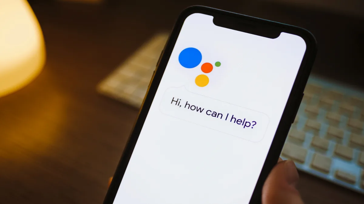
Google Assistant Cards are the visual response panels that pop up when you ask your phone, smart speaker, or display a question and the Assistant answers with more than just a voice.
If you have ever glanced at your phone after saying “Hey Google, what’s the weather?” and seen a neat little box with a temperature, an icon, and a forecast, you have already used one.
They are the reason the Assistant feels less like a robot reading a script and more like a helpful friend handing you a note.
What makes these little panels so interesting is how much they quietly shape the way we interact with voice technology. A voice-only answer disappears the moment it is spoken. A visual card sticks around. You can tap it, swipe it, expand it, or ignore it.
That tiny shift changes everything about how you absorb information from a smart device, and it is why developers, marketers, and everyday users all have a reason to understand how these cards work.
In this guide, I am going to walk you through what Anthropic Assistant Cards actually are, how they are built, where you run into them in daily life, and how to design or use them well.
Whether you are a developer building an Action, a business owner trying to reach voice users, or just someone curious about the tech in your pocket, there is something here for you. Let’s get into it.
What Exactly are Google Assistant Cards?
At their core, Google Assistant Cards are structured visual responses that the Assistant renders on a screen when a voice query returns more than a simple spoken answer can handle. Think of them as the visual half of a conversation.
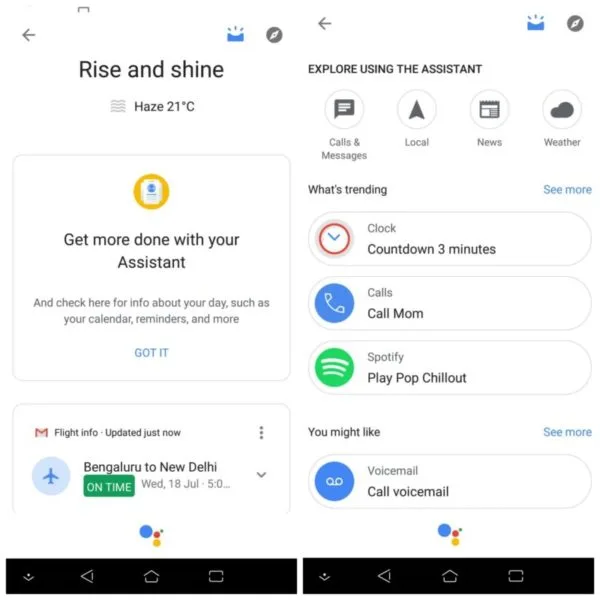
The Assistant still talks, but the card gives your eyes something to latch onto — a chart, a list, a photo, a set of buttons, or a short block of text.
The idea is simple but powerful. Voice is great for quick facts, but it is terrible for anything with structure. Try asking a speaker to read out a restaurant’s full menu and you will immediately understand why.
A card solves that by showing the menu on a screen while the voice gives you the highlights. This split between what you hear and what you see is the whole point of Google Assistant Cards.
They show up across a huge range of devices. Your Android phone, a Google Nest Hub, a smart display in the kitchen, and even some cars with Android Auto all render these panels.
The layout adapts to the screen size, which is why a card on a phone looks slightly different from the same card on a Nest Hub. Same data, different canvas.
The Difference Between a Card and a Simple Answer
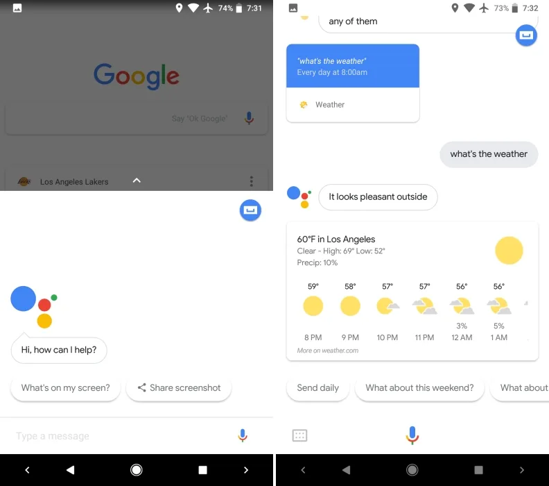
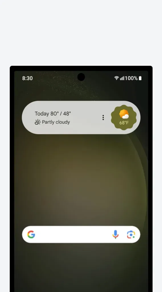
A simple answer is one line of speech. “It’s 72 degrees in Austin.” That is it. A card takes that same query and adds a visual layer: the current temperature, a small icon, a three-day forecast, maybe a button to see hourly details. The spoken part stays short so it does not annoy you, while the visual part carries the detail.
This is a deliberate design choice by Google. Research on voice interfaces keeps showing that people get frustrated when a device talks too much. So the Assistant keeps speech tight and offloads the heavy lifting to Google Assistant Cards.
You get the best of both: a quick verbal confirmation and a rich visual you can explore at your own pace.
There is also a practical benefit for noisy environments. If you are on a busy street or in a loud kitchen, you might not catch every word the Assistant says. A card lets you confirm the information visually even if you missed the audio. That redundancy is a quiet feature most people never think about, but it matters.
How Google Assistant Cards Actually Work Under the Hood
Behind the scenes, Google Assistant Cards are generated through a system that decides, based on your query and your device, what kind of visual response makes sense. When you speak, the Assistant parses your intent, pulls data from the relevant source, and then picks a card template that fits. This happens in a fraction of a second, which is why it feels instant.
For developers, the process is more hands-on. If you are building a Google Action using the Actions on Google platform or the newer conversational tools, you define responses in a structured format. You tell the system what to say out loud and what to show on screen.
The screen part is where Google Assistant Cards come to life, and you have a fair amount of control over the layout.
The system supports several card types, and choosing the right one is half the battle. Pick the wrong template and your information looks cramped or confusing. Pick the right one and the card feels like it was made for that exact query. Let’s break down the main types you will encounter.
Basic Cards, Browsing Carousels, and List Cards
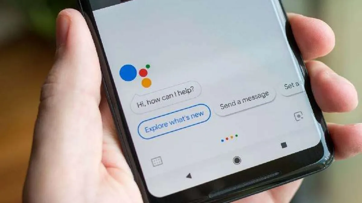
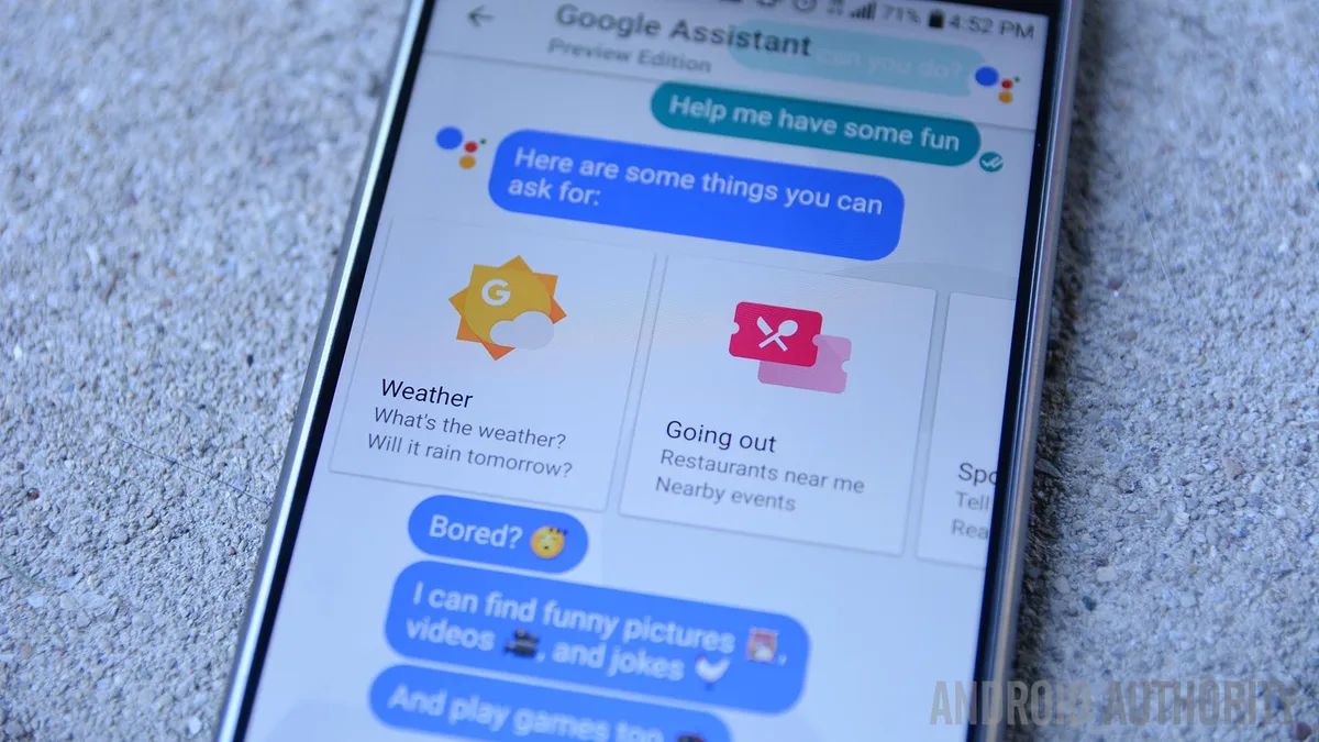
A basic card is the simplest form. It has a title, optional subtitle, an image, some body text, and up to a couple of buttons. This is what you see for things like a single recipe, a movie summary, or a product detail. It is the workhorse of Google Assistant Cards and probably the type you run into most often.
A browsing carousel is for when there are multiple options and the user should swipe through them. Think of a row of movie posters, each one tappable. A list card does something similar but in a vertical layout, better for text-heavy options like a list of nearby stores or a set of search results. Both are designed to handle choice without overwhelming the screen.
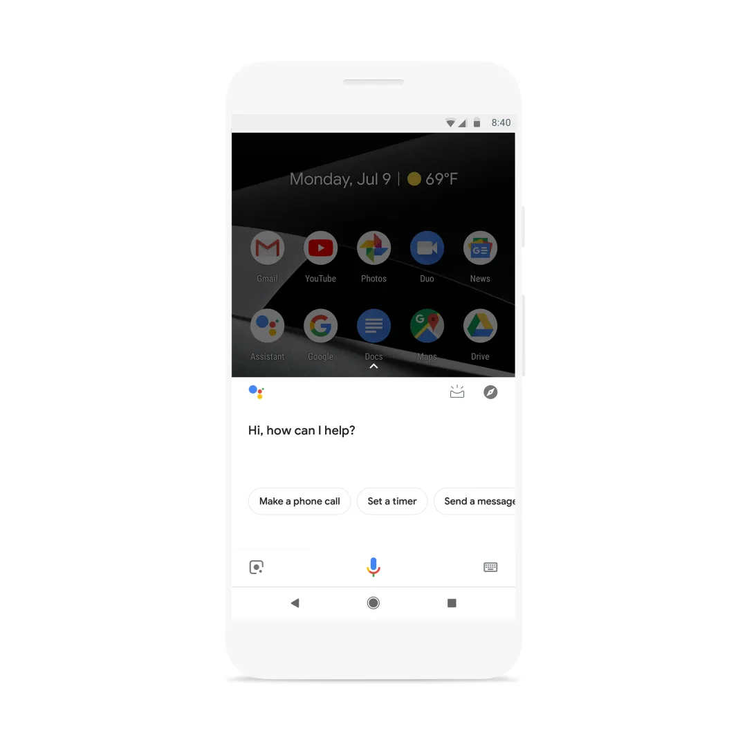
Then there are media response cards, which handle audio and video playback with controls built in. Focusing on google assistant cards provides clear direction here. If you ask the Assistant to play a song or a podcast, the card you see with the play, pause, and skip buttons is a media response. Each of these types exists because a different kind of query needs a different kind of visual.
Why the Template Choice Matters So Much
Here is where a lot of developers trip up. They build a great voice experience and then slap on a generic card that does not match the content. The result feels off, like a restaurant with amazing food but a confusing menu. Users may not articulate why it feels wrong, but they notice.
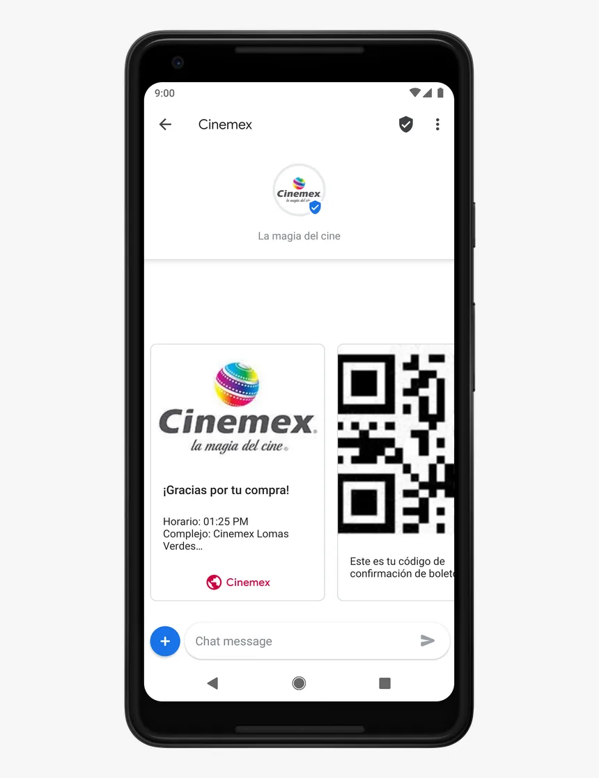
The fix is to match the card to the job. If you are showing a comparison, use a table-style layout. If you are showing a gallery, use a carousel. If you are confirming a single action, keep it to a basic card with one clear button. Google Assistant Cards are flexible, but flexibility without intention just creates clutter.
My rule of thumb after working with these: if a user has to think about how to read your card, you have already lost them. The card should feel obvious. The next step should be visible without hunting. That is the standard worth aiming for.
Where You Run Into Google Assistant Cards Every Day
You probably interact with Google Assistant Cards more than you realize. They are woven into dozens of everyday moments, and once you start noticing them, you cannot unsee them. Here are the places they show up most, and what each one is actually doing for you.
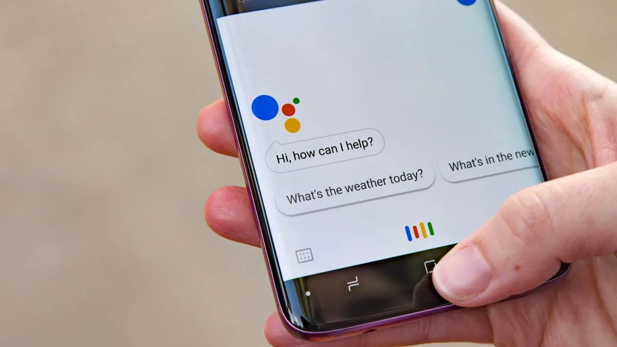
Weather is the classic example. Ask for the forecast and you get a card with current conditions, an icon, and a short outlook. It is fast, clear, and exactly what you needed. This is Google Assistant Cards doing their job at their most basic and most effective.
Navigation is another big one. Ask for directions and the card shows the route, the estimated time, and a button to start turn-by-turn navigation. Music, timers, reminders, sports scores, stock prices, translations, and unit conversions all trigger their own card layouts. Each one is tuned to the type of information it carries.
Smart Displays Change the Whole Game
On a Google Nest Hub or similar smart display, Google Assistant Cards are not a side feature — they are the main event. The screen is always there, so the Assistant leans heavily on visuals.
You get photo cards, video cards, recipe cards with step-by-step instructions, and even cards that stay on screen until you dismiss them.
This is where the design really shines. Refining each detail of your google assistant cards strengthens this section. A recipe card on a smart display can walk you through each step, showing the ingredient and the instruction together.
A video card lets you watch and control playback with your voice. The screen turns a voice assistant into something closer to a helpful household companion.
What I find genuinely useful is the ambient nature of it. You do not have to pick up a device or unlock anything. You just glance at the display and the information is there.
Google Assistant Cards on a smart display feel less like a response and more like a persistent helper sitting on your counter.
On Phones, Cards are Quicker and More Disposable
On your phone, the experience is different. You ask, the card appears, you read it, and you move on. The card is a glance, not a destination. This shapes how they are designed.
Phone cards tend to be more compact, with the most important info front and center, because the assumption is you are on the go.
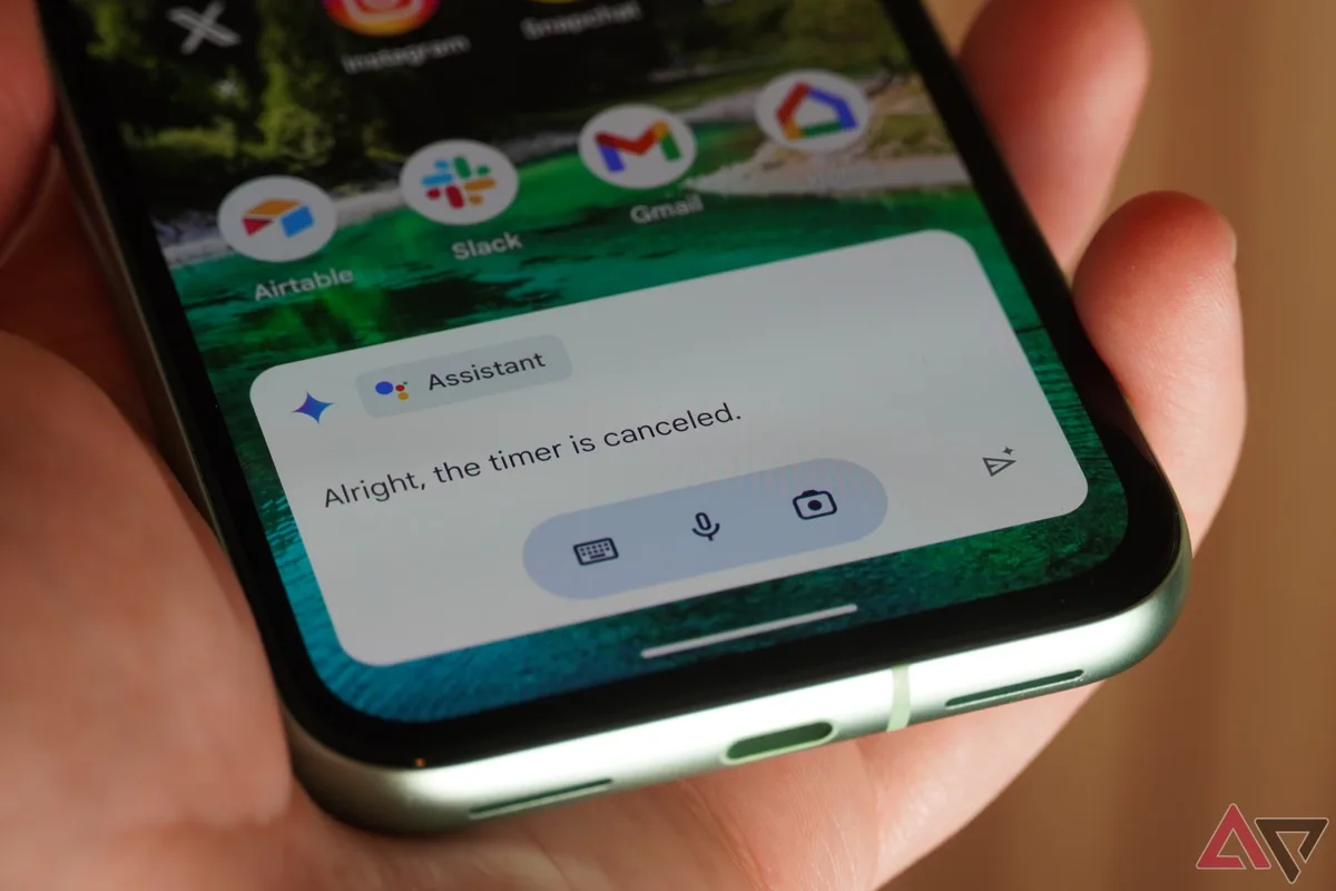
That said, some phone cards are interactive in ways you might not expect. You can tap to expand, swipe to browse, or tap a button to open an app. The Assistant is essentially handing you a shortcut. Instead of opening five apps to get something done, the card does it in one tap.
This is the quiet efficiency of Google Assistant Cards on mobile. They compress a multi-step task into a single visual moment. Once you get used to it, going back to manual app-hopping feels painfully slow.
The Anatomy of a Well-Designed Google Assistant Card
If you are building these things, or even just evaluating them, it helps to know what separates a good card from a bad one. Effective execution in your google assistant cards makes a tangible difference.
The structure is not complicated, but the details matter more than most people expect. Let’s walk through the parts that make a card work.
Every card has a few core elements: a title, optional supporting text, a visual (image or icon), and one or more actions. The title tells you what you are looking at. The supporting text adds context.
The visual makes it scannable. The actions give you somewhere to go next. Miss any one of these and the card feels incomplete.
The best Google Assistant Cards I have seen all share a similar trait: they answer the question and then offer the next logical step. They do not just dump information. They guide. That guidance is what turns a response into an experience.
Clarity Beats Cleverness Every Time
It is tempting to get fancy with card design. Big images, clever copy, lots of buttons. Resist that urge. The most effective Google Assistant Cards are the ones that are almost boringly clear. A user should understand the card in under two seconds, even while half-distracted.
That means short titles, plain language, and a single obvious action. If you have two equally important actions, you probably have two cards, not one. Splitting them keeps each screen focused and keeps the user from freezing up trying to choose.
I have watched people use voice assistants in real settings, and the pattern is consistent. When a card is clear, they act without hesitation. When it is cluttered, they pause, squint, and often just give up and pull out their phone to do it manually.
Clarity is not just nice — it is the difference between a card that works and one that gets ignored.
Matching Voice and Visual So They Do Not Fight
One of the trickiest parts of designing Google Assistant Cards is making sure the spoken response and the visual response complement each other instead of repeating each other. If the voice reads out everything on the card, the card is pointless. If the card shows everything and the voice says nothing useful, the experience feels broken.
The right approach is to let the voice carry the headline and the card carry the detail. The voice says, “Here’s your forecast for today.” The card shows the numbers. The voice confirms the action. The card shows the result. Each channel does what it is best at.
This division of labor is what makes Google Assistant Cards feel smooth when done right. You barely notice the design because it just works. That invisibility is the goal. When users never think about the interface, the interface has succeeded.
Building Google Assistant Cards: a Practical Walkthrough
For developers, getting started with Google Assistant Cards is more approachable than it sounds. The tooling has matured a lot, and there are clear paths whether you are building a simple Action or a full conversational app. Here is how the process tends to go.
First, you define your conversation flow. What can the user ask? What should happen in response? This is the logic layer, and it exists whether or not you show a card. Then you decide which responses need a visual component. Not every turn needs a card, and overusing them is a common mistake.
Once you know where cards belong, you pick the card type that fits each moment. A confirmation might only need a basic card. A set of options might need a carousel. A comparison might need a table-style layout. Then you fill in the content and wire up the actions.
Testing on Real Devices is Non-Negotiable
Here is a hard lesson from experience: Google Assistant Cards look different on every device. A card that is perfect on a phone can look cramped on a smart display, and vice versa. You cannot design these in a simulator and call it done.
You have to test on actual hardware. Load the card on a phone, on a Nest Hub, and on any other target device. Watch how it renders. Check the button sizes, the text wrapping, the image scaling. Small issues that seem trivial on a monitor become obvious problems in the real world.
The developers who ship great Google Assistant Cards are the ones who obsess over these details. They treat each device as its own design problem. It is more work, but the payoff is a card that feels native everywhere, not just on the machine it was built on.
Handling Errors Gracefully With Cards
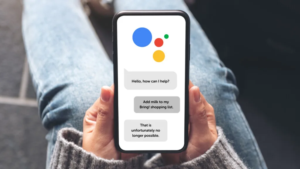
Things go wrong. A query does not match, a data source is down, a user says something unexpected. How you handle those moments with Google Assistant Cards says a lot about the quality of your build. A blank screen or a robotic error message kills trust instantly.
Instead, use a card to explain what happened and offer a way forward. Maintaining clarity across your google assistant cards remains essential. “I couldn’t find that, but here are some things I can help with.” Show a list card of options. Give the user a path out of the dead end. This turns a failure into a recovery.
Honestly, error handling is where most voice apps fall apart. The happy path gets all the attention, and the unhappy path gets ignored. But users remember the moments when things break, and a well-designed error card can actually build loyalty rather than erode it.
Common Mistakes With Google Assistant Cards (And How to Avoid Them)
After seeing a lot of these in the wild, certain mistakes come up again and again. Avoiding them is not hard, but you have to know what to look for. Here are the ones that cause the most trouble.
The biggest is overloading a single card. Too much text, too many buttons, too many options. The user’s eye does not know where to land. The fix is to split the content across multiple cards or trim it down to the essentials. Less is almost always more here.
The second is ignoring the voice. A card that duplicates the spoken response wastes the screen. A card that contradicts the voice confuses the user. The two should work as a pair, each doing its own job. When they align, Google Assistant Cards feel effortless.
Forgetting About Accessibility
Not everyone reads a card the same way. Some users rely on screen readers, larger text, or high-contrast modes. If your Google Assistant Cards do not account for this, you are shutting people out. Accessibility is not a nice-to-have; it is part of doing the job right.
Use clear labels, meaningful alt text for images, and enough contrast between text and background. Avoid relying on color alone to convey meaning. These are basic principles, but they get skipped constantly in voice-first design.
The good news is that accessible design tends to be clearer design for everyone. A thoughtful approach to google assistant cards reinforces your qualifications. When you make a card work for a screen reader, you usually make it easier to scan for everyone else too. There is no real tradeoff here, just better craft.
Neglecting the First Impression
The first card a user sees sets the tone for the whole experience. If it is slow, cluttered, or confusing, they will assume the rest is the same. If it is fast, clean, and helpful, they will keep going. First impressions with Google Assistant Cards carry a lot of weight.
Spend extra time on that opening interaction. Make sure it loads quickly, reads clearly, and offers an obvious next step. Get it right and users will trust the rest of the flow. Get it wrong and no amount of polish later will bring them back.
This is the part that separates a demo from a product. A demo can get away with a rough first card. A product cannot. Users decide in seconds whether your voice experience is worth their time, and the first card is where that decision happens.
Google Assistant Cards for Business and Marketing
If you run a business, these cards are more than a technical curiosity. They are a channel. When a customer asks the Assistant about your hours, your location, or your menu, the card that appears is your storefront in that moment. It is a real touchpoint, and it deserves real attention.
Businesses that understand this use Google Assistant Cards to control the narrative. They make sure their information is accurate, their hours are current, and their actions are clear. A customer who gets a clean card with a tap-to-call button is a customer who is one step closer to walking in the door.
The marketing angle is subtler but real. Every card is a chance to reinforce your brand — through your logo, your colors, your tone of voice. When done consistently, Google Assistant Cards become part of your identity in the voice ecosystem, not just a utility.
Connecting Cards to Real Conversions
The most valuable cards are the ones that lead somewhere. A card that just displays information is fine, but a card that lets a user book, buy, call, or reserve is a conversion engine. The action button is where the magic happens.
Think about what a customer wants to do after getting an answer. Structuring your google assistant cards around proven patterns ensures impact. They want to act. So give them the action. A reservation button, a “get directions” link, a “call now” option. Each one turns a passive card into a step in a customer journey.
I have seen small businesses double their voice-driven engagement just by adding a clear action to their Anthropic Assistant Cards. It is not complicated. It just requires thinking about the card as the start of something, not the end of it.
Keeping Information Accurate and Fresh
Nothing undermines a card faster than stale information. Wrong hours, outdated menus, dead phone numbers — these turn a helpful moment into a frustrating one. If you are using Google Assistant Cards for business, keeping your data current is a continuous job, not a one-time setup.
Sync your listings, update your actions, and check your cards regularly on real devices. What looks right in a dashboard can look wrong on a phone. The businesses that treat this as ongoing maintenance are the ones that reap the rewards.
It helps to think of Google Assistant Cards as living content. They are not set-and-forget. They reflect what is true about your business right now, and if that changes, the card needs to change with it. Accuracy is the foundation everything else sits on.
Comparing Google Assistant Cards With Other Voice Visuals
Google is not the only player in this space, and it helps to understand how its approach compares. Amazon’s Alexa has its own visual responses on Echo Show devices. Apple’s Siri uses visual snippets on iPhone. Each system has its own philosophy, and the differences are instructive.
Alexa’s visuals tend to be more app-like, with a heavier emphasis on widgets and persistent displays. Siri’s approach is lighter, often just showing a snippet at the bottom of the screen. Google Assistant Cards sit somewhere in between, offering structured visual responses that feel native to the conversation.
The table below lays out the main differences so you can see the landscape at a glance.
| Feature | Google Assistant Cards | Alexa Visual Responses | Siri Visual Snippets |
|---|---|---|---|
| Primary device focus | Phones, smart displays, cars | Echo Show, Fire TV | iPhone, iPad, Apple Watch |
| Card variety | Basic, carousel, list, media | Widgets, cards, lists | Snippets, small cards |
| Developer control | High, via Actions platform | High, via Alexa Skills Kit | Limited, mostly system-driven |
| Interactivity | Tap, swipe, voice | Tap, touch, voice | Tap, limited voice |
| Ecosystem reach | Android, Nest, Auto | Amazon devices | Apple devices only |
| Best for | Structured info and actions | Smart home and shopping | Quick on-screen facts |
What stands out is how much control Google gives developers. The range of card types and the ability to customize layout makes Google Assistant Cards a flexible canvas. That flexibility is a gift and a responsibility — you can build almost anything, which means you also have to decide what is actually worth building.
For users, the practical takeaway is that the experience varies by ecosystem. Applying these principles to your google assistant cards yields measurable results. If you live in Google’s world, you get one kind of visual richness.
If you are on Apple, you get another. Knowing the differences helps you set expectations and pick the right device for the right task.
Tips for Getting More Out of Google Assistant Cards as a User
You do not have to be a developer to benefit from understanding these cards. A few habits can make your daily use smoother and more productive. Here are the ones I have found most useful.
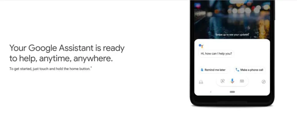
First, use a smart display if you can. The visual experience on a Nest Hub is dramatically better than on a phone, simply because the screen is always available. Cards stay visible, you can glance at them while cooking or working, and the interaction feels natural.
Second, learn which queries trigger rich cards. Weather, recipes, sports, and navigation all produce great visuals. Once you know what to ask, you get better results. It is a small shift in how you phrase things, but it pays off.
Third, tap the buttons. So many people ignore the actions on Google Assistant Cards and then do the task manually. The buttons exist to save you time. Use them. Let the card do the work.
Using Cards to Build Routines
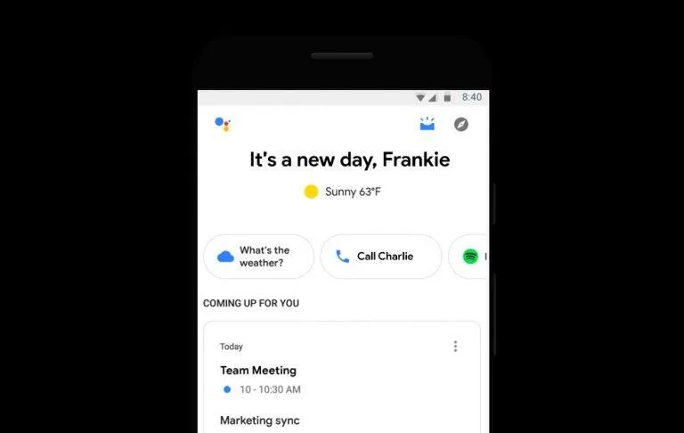
One of the most underrated uses of Google Assistant Cards is in routines. You can set up a morning routine that shows your calendar, weather, commute, and news as a sequence of cards. It turns your smart display into a personal dashboard.
The cards appear one after another, each one giving you a piece of your day. By the time the routine ends, you are caught up without touching a thing. This is Google Assistant Cards working as a productivity tool, not just a novelty.
Evening routines work the same way. Lights, reminders, tomorrow’s schedule. Each step can show a card that confirms what happened. It is a quiet, reliable way to close out the day and stay organized without staring at a phone.
Customizing What You See
You have more control over these cards than you might think. Settings let you adjust what information the Assistant surfaces, how much detail it shows, and which services it pulls from. A little time in the settings menu can make your Google Assistant Cards much more relevant.
For example, you can connect your calendar, your music service, and your smart home devices so the cards reflect your actual life. Proper attention to your google assistant cards sets a strong baseline. The more you connect, the more useful the visuals become. It is a small setup cost for a big daily payoff.
The point is that Google Assistant Cards are not static. They adapt to you, but only if you give them something to work with. Take ten minutes to set things up, and the experience improves noticeably.
The Future Direction of Google Assistant Cards
Voice interfaces are still young, and the visual side is evolving fast. Google keeps refining how these cards look and behave, and the trend is clearly toward more context, more personalization, and more seamless blending of voice and screen. The cards of tomorrow will likely feel less like responses and more like ongoing conversations.
One direction is deeper integration with AI models that understand intent more richly. Instead of a fixed template, a card could be generated on the fly to match exactly what you asked. That would make Google Assistant Cards feel almost custom-made for every single query.
Another direction is ambient computing, where cards appear on whatever screen is nearest without you having to ask. Your kitchen display, your car, your watch — all showing the same relevant card at the right moment. The screen becomes less a destination and more a layer over daily life.
What This Means for Developers and Businesses
For developers, the bar keeps rising. Simple cards will not be enough. Users will expect rich, personalized, context-aware visuals. Building for Google Assistant Cards will mean thinking harder about data, design, and the moment of interaction.
For businesses, the opportunity grows with the platform. As more people rely on voice and visual assistants, the cards that represent your business become more important, not less. Getting in early and getting it right is a competitive advantage.
The smart move is to treat this as a long game. Learn the platform now, build clean experiences, and keep improving as the tools mature. Google Assistant Cards are not a fad. They are a foundational piece of how we will interact with computers for years to come.
Frequently Asked Questions About Google Assistant Cards
People ask a lot of the same questions when they first encounter these cards. Here are the ones that come up most, with straight answers.
Do Google Assistant Cards Work Without a Screen?
No. Developing your google assistant cards with precision highlights key strengths. A card needs a display to render. On a voice-only device like a Google Home speaker, you get just the spoken response. The card only appears on phones, smart displays, and other screen-equipped devices. If you want the visual experience, you need hardware with a screen.
Can I Create My Own Anthropic Assistant Cards?
Yes, if you are building a Google Action. The Actions platform gives developers the tools to define card responses, choose layouts, and wire up actions. It takes some technical know-how, but the documentation is solid and there are plenty of examples to learn from.
Are Google Assistant Cards Customizable?
Within limits, yes. You can control the title, text, images, and buttons, and choose from several card types. You cannot redesign the entire framework, but you have enough flexibility to make a card feel like your own. The constraints exist to keep the experience consistent across apps.
Why Do Some Queries Show a Card and Others Do Not?
It depends on the query. Simple facts often get a voice-only answer. Queries with structure — lists, comparisons, media, locations — tend to trigger a card because a visual makes more sense. The Assistant decides based on what will serve you best.
Do These Cards Cost Anything to Use?
For users, no. They are part of the free Assistant experience. For developers building Actions, there is no direct cost to create cards, though you may pay for the backend services that power them. The cards themselves are not a paid feature.
Can Google Assistant Cards Show Real-Time Data?
Absolutely. Clear alignment with your google assistant cards builds confidence from the start. Weather, traffic, sports scores, and stock prices all update in real time. The card pulls from live sources, so what you see reflects the current moment. This is one of the biggest advantages of the visual format over a spoken answer.
How Do I Make My Business Show Up in Cards?
Keep your Google Business Profile accurate and complete, and make sure your information is consistent across the web. When the Assistant pulls data about your business, it relies on these sources. Clean, current data gives you the best shot at a helpful card.
Wrapping Up the Essentials
Google Assistant Cards are one of those features that quietly make voice technology usable. They take the limitations of speech and patch them with visuals, turning a fleeting answer into something you can actually use. Whether you are a user, a developer, or a business, understanding them pays off.
The core ideas are simple. Match the card to the content. Keep the voice and the visual in harmony. Design for clarity over cleverness. Test on real devices. And treat every card as a chance to help someone get something done. Do those things and your Google Assistant Cards will feel effortless.
If there is one takeaway, it is this: the best cards are the ones you never notice. They just work, quietly, in the background of your day. That is the standard worth chasing, and it is well within reach for anyone willing to put in the thought.
So next time you ask your phone or your smart display a question and a neat little panel appears, take a second to appreciate it. That panel is the result of a lot of careful design, and it is one of the reasons voice assistants have become so useful.
Google Assistant Cards are not just a feature. They are the bridge between what you say and what you need to see.
Start paying attention to them, and you will find opportunities everywhere — to build better experiences, to reach more customers, and to get more out of the technology you already own. That is the real value of understanding Google Assistant Cards, and it is yours to use however you see fit.
For verified reference and background research, consult the authoritative informational resource on this topic.