If you have ever scrolled past a carousel ads unit without a second thought, you already know the painful truth: most of them die quietly. The format itself is not the problem. Meta, LinkedIn, and even Google’s Discovery network all keep pushing carousel ads because they work when they are built with intent.
The problem is that too many advertisers treat the format like a dumping ground for product photos and call it a day.
I have spent years watching swipeable campaigns either crush their targets or flop hard, and the difference almost never comes down to budget. It comes down to structure, sequencing, and a stubborn refusal to waste the first card.
So let’s walk through the whole thing, from what carousel ads actually are to the exact moves that separate a scroll-stopper from a scroll-past.
What Carousel Ads Actually are (And Why the Format Keeps Winning)
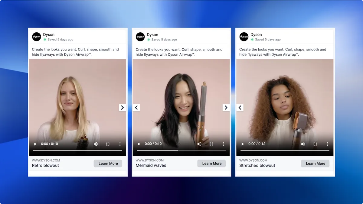
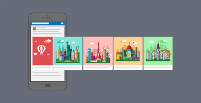
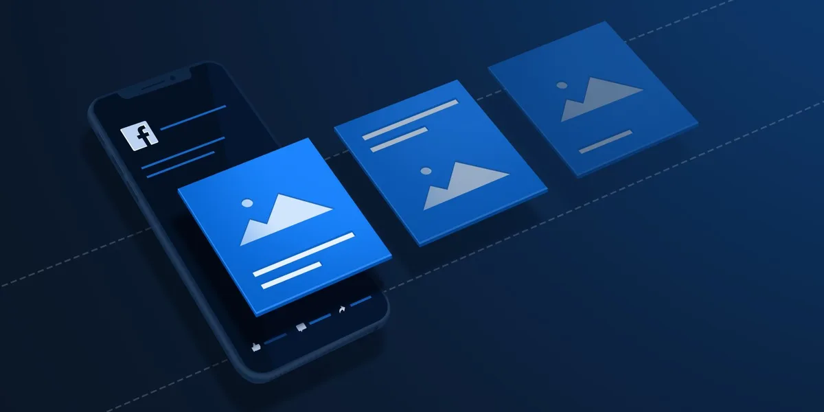
Carousel ads are a multi-card ad format that lets you show several images or videos inside a single sponsored placement. Users swipe or click through the cards horizontally, and each card can carry its own headline, description, and landing page link.
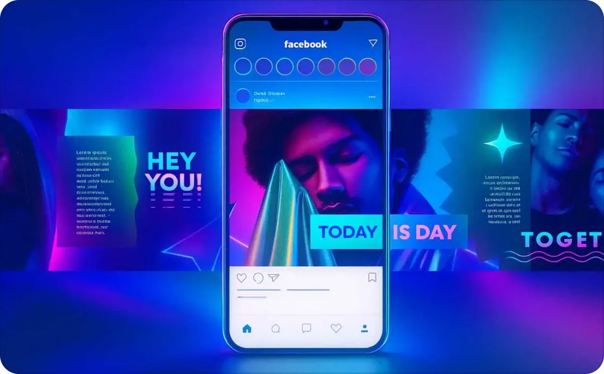
That last part is the detail most people gloss over. A single carousel ads unit can send people to five different product pages, five different blog posts, or five different offers, all from one impression. No other mainstream format gives you that kind of flexibility without forcing you to buy separate placements.
The reason carousel ads keep outperforming static creatives in so many accounts comes down to how people browse. Someone scrolling a feed is in a low-attention state. A single image asks them to decide in one glance.

A carousel gives them a reason to linger, swipe, and self-select into the part of your offer that actually matters to them.
According to Wikipedia’s overview of carousel advertising, the format originated as a way for advertisers to tell a longer visual story within a single ad slot. That core idea still holds. The brands that treat carousel ads as a narrative tool, not a catalog dump, are the ones seeing the returns.
The Mechanics Behind the Swipe
When a user swipes a card, the platform logs an engagement signal. That signal feeds back into the algorithm, which then decides whether to show your carousel ads to more people who look like that user.
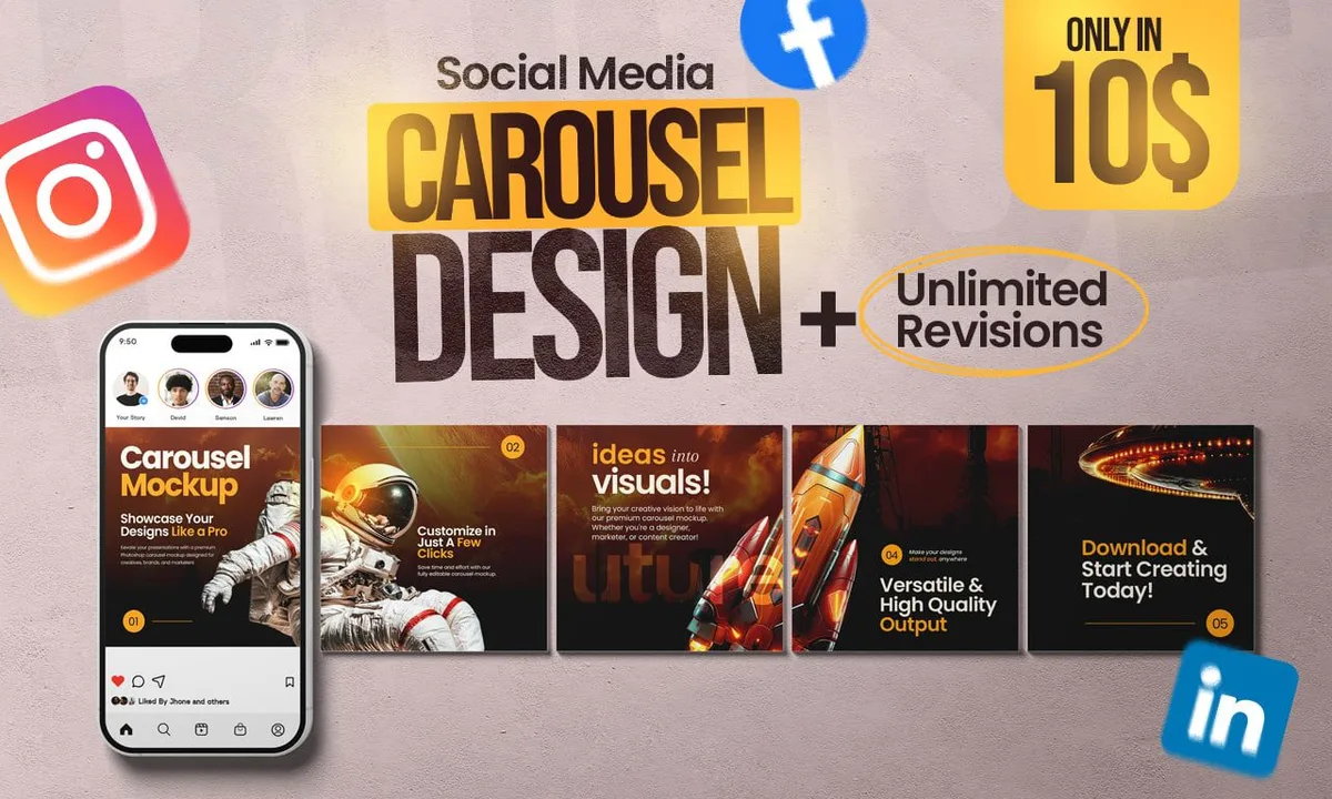
This is why the first card matters so much. If card one gets ignored, cards two through five never get seen, and the algorithm never gets the signal it needs to expand your reach. It is a chain reaction, and the weakest link is always the front of the chain.
In practice, I have seen accounts where simply swapping the first card lifted swipe-through rate by more than double, with zero changes to targeting or bid. That is how sensitive carousel ads are to sequencing.
Why Carousel Ads Beat Single-Image Creatives in Most Accounts
There is a reason performance marketers keep coming back to this format even when newer ad types show up. Carousel ads solve several problems at once, and they do it inside a single ad unit.
First, they handle the “which product do I feature?” dilemma. Instead of guessing, you show several and let the audience tell you what resonates. Second, they give you more real estate for storytelling without cramming text into one image. Third, they create multiple entry points into your funnel from one spend.
I have run side-by-side tests where a single hero image and a five-card carousel ads set targeted the exact same audience. The carousel consistently pulled more clicks, and the cost per landing page view dropped because the ad itself was doing the qualifying work.
More Surface Area, More Chances to Connect
Think of a static ad as a handshake and a carousel as a short conversation. You get to introduce yourself, show what you do, prove it with an example, and then invite the person to take the next step.
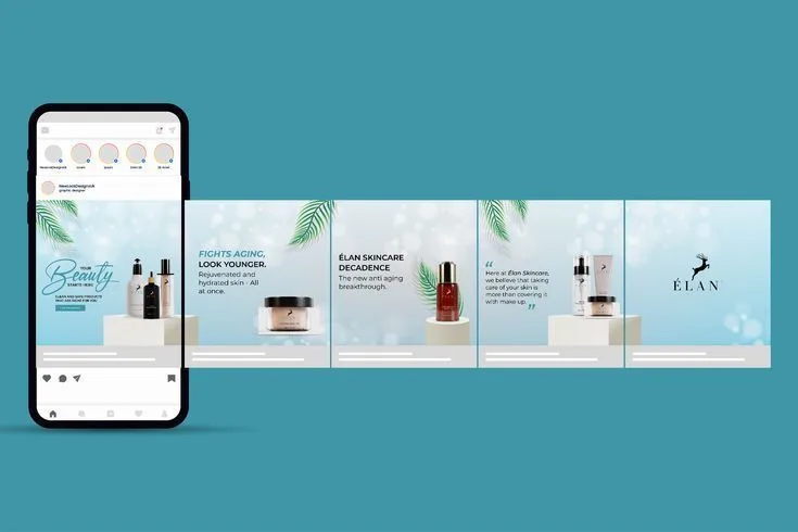
That extra room matters most for considered purchases. When someone is comparing options, they need more than one reason to click. Carousel ads let you stack those reasons in a visual sequence that feels natural rather than pushy.
Built-In Testing Without Extra Budget
Every card in a carousel ads unit is a mini-experiment. You can slot in different value propositions, different price tiers, or different use cases and watch which card earns the most taps.
The data that comes back is gold for the rest of your marketing. If card three about durability gets three times the engagement of card one about price, you just learned something about your audience that no survey would have told you.
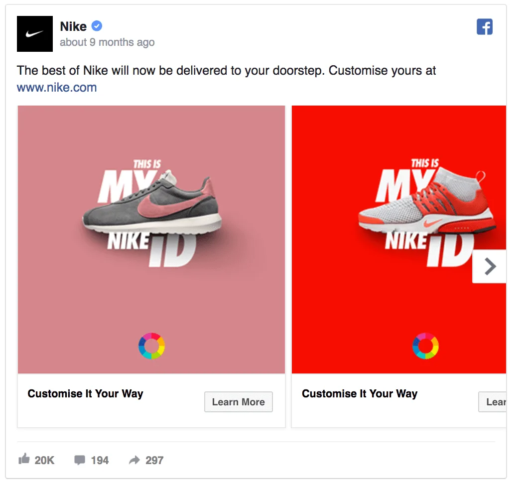
The Anatomy of a High-Performing Carousel Ads Unit
Before we get into the step-by-step build, it helps to understand what each piece of a carousel ads unit is doing. Every element has a job, and when one underperforms, the whole unit suffers.
The cards themselves carry the visual story. The headline on each card gives context. The description adds a supporting detail. The landing page link decides where the click actually goes. And the overall structure, meaning the order and pacing of the cards, ties everything together.
Get the anatomy right and carousel ads start behaving like a well-oiled machine. Get it wrong and you are basically paying to show people a slideshow they did not ask for.
Card One: the Hook
The first card carries more weight than all the others combined. It has to stop the scroll, communicate a benefit, and create enough curiosity that the user swipes to see more.
Strong first cards usually lead with a specific outcome, a striking visual, or a question the audience is already asking themselves. Vague brand imagery almost never works here. If your first card could belong to any competitor, it is not doing its job.
Cards Two Through Four: the Build
These are your proof cards. Each one should add a new layer: a feature, a benefit, a testimonial, a use case, or a comparison. The goal is momentum, not repetition.
I have seen carousel ads fail because cards two through four all said the same thing in slightly different fonts. That is not a carousel. That is a static ad with extra steps.
Card Five (Or the Final Card): the Close
The last card should make the next step obvious. A clear call to action, a sense of urgency if it fits your brand, or a simple invitation to learn more.
Some advertisers use the final card as a summary. Others use it as a redirect to a specific offer. Either works, as long as the user knows exactly what happens when they tap.
How to Create Carousel Ads That Actually Get Clicks
Now for the part you came here for. Building carousel ads that get clicks is a repeatable process, but it requires you to think like a designer, a copywriter, and a strategist at the same time.
Here is the sequence I use, and it works whether you are running on Meta, LinkedIn, or any other platform that supports the format.
Step 1: Define the Single Job Your Carousel Ads Need to Do
Every carousel ads unit should have one primary objective. Not three. Not five. One.
Are you trying to drive product page visits? Collect leads? Retarget cart abandoners? The answer changes everything about how you build the cards.
A carousel built for retargeting can be much more direct, because the audience already knows you. A carousel built for cold traffic needs to earn attention before it asks for anything.

Step 2: Map the Story Before You Touch a Design Tool
I always sketch the narrative on paper first. Card one does X. Card two does Y. Card three does Z. If the story does not flow as a sentence, the visuals will not save it.
Try writing your carousel ads as a five-line script. If those five lines read like a coherent pitch, you are ready to design. If they read like a random list, go back to the drawing board.
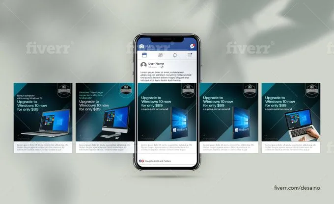
Step 3: Design Each Card to Stand Alone and Work Together
This is the hardest part of building carousel ads. Each card needs to make sense on its own, because some users will only see one or two before scrolling past.
At the same time, the cards need to build on each other for the users who swipe all the way through. Visual consistency, color continuity, and a shared design language make this possible.
Step 4: Write Headlines That Add to the Image, Not Repeat It
If your image shows a red running shoe, your headline should not say “red running shoe.” That is wasted space.
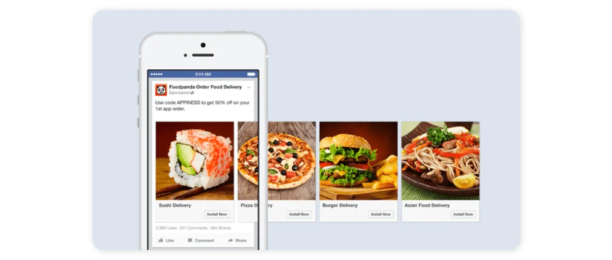
Instead, use the headline to add a benefit, a differentiator, or a piece of context the image cannot carry on its own. The best carousel ads headlines feel like captions that make the picture more interesting, not labels that describe it.
Step 5: Set Up Per-Card Landing Pages (Or at Least Per-Card Intent)
One of the biggest advantages of carousel ads is the ability to send each card to a different destination. Use it.
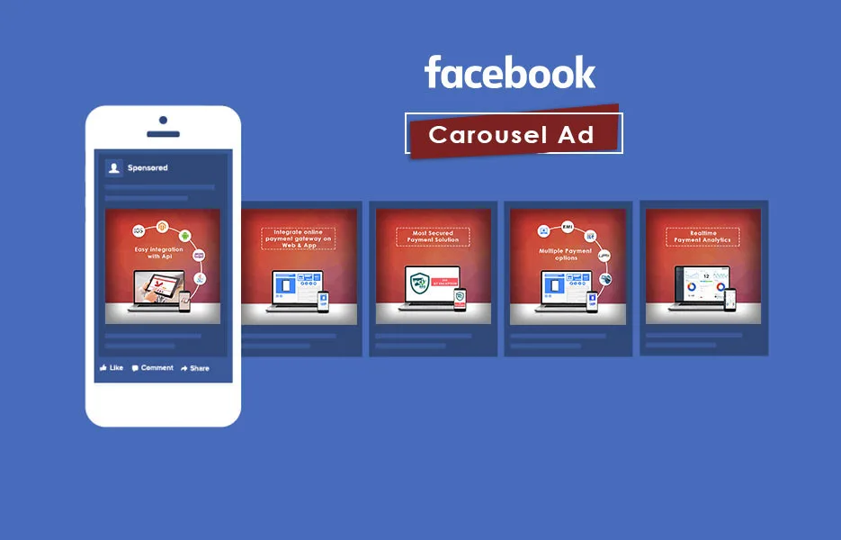
If card two is about a specific product, link it to that product page. If card four is about a customer story, link it to the case study. Sending every card to the same homepage is a waste of the format’s potential.
Step 6: Test One Variable at a Time
Carousel ads have many moving parts, which means many ways to break them. Change one thing per test so you know what actually moved the needle.
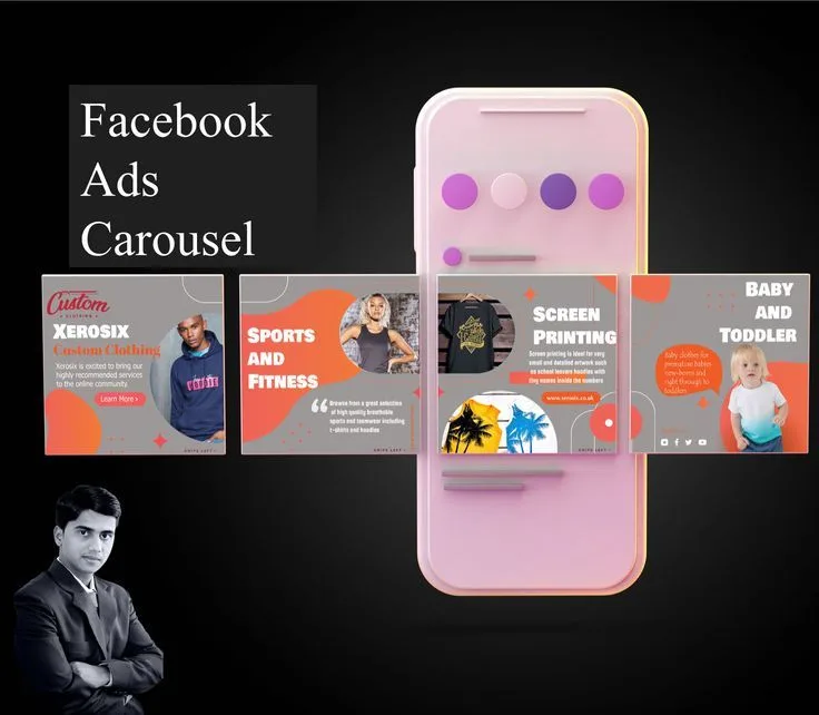
Start with the first card, since it has the biggest impact. Then test card order. Then test headlines. Then test landing page destinations. Each round of testing should teach you something specific.
Step 7: Read the Card-Level Data Like a Detective
Most platforms report engagement per card. That data is where the real insights live.
If card one gets tons of impressions but few swipes, your hook is weak. If card three gets strong engagement but card four drops off, your narrative loses steam. If the final card gets clicks but low conversions, the landing page is the problem, not the ad.
Carousel Ads Design Principles That Separate Pros from Amateurs
Design is where most carousel ads either shine or fall apart. The good news is that the principles are not complicated. The bad news is that ignoring them is very easy.
Here are the rules I follow, and the ones I see broken most often in underperforming campaigns.

Consistency Over Creativity
Your carousel ads should feel like a set, not a collage. Consistent typography, color palette, and layout make the swipe feel intentional.
When each card looks like it came from a different campaign, users lose the thread. They stop swiping because they are not sure what they are looking at anymore.
Contrast That Commands Attention
Every card needs one focal point that pulls the eye. That could be a bold color, a face, a product shot, or a single line of text. But it has to be one thing, not five things competing.
I have seen beautiful this practice fail because every card was visually busy. The eye had nowhere to land, so it moved on.
Text That Reads at a Glance
Mobile users are not reading your this approach. They are scanning them. If your text requires effort to decode, it is already gone.
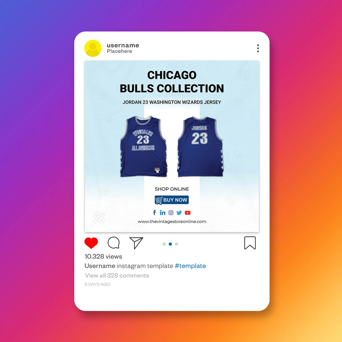
Keep headlines short. Keep descriptions shorter. Use size and weight to guide the eye, not to decorate.
Motion That Serves the Story
Video cards inside a this approach unit can be powerful, but only when the motion adds meaning. A product rotating slowly is useful. A product spinning wildly is noise.
If you are mixing static and video cards, make sure the transition feels natural. The user should never feel like they jumped into a different ad.
Copywriting for Carousel Ads: Headlines, Descriptions, and Calls to Action
Copy is where this approach live or die. The visuals get attention, but the words close the deal.
Here is how I approach each text element, and the mistakes I see most often.
Headlines That Do Real Work
A this approach headline has about one second to earn a swipe. It needs to be specific, benefit-driven, and short enough to read without effort.
Skip generic phrases like “Discover more” or “Learn about us.” Instead, lead with the outcome. “Cut your shipping costs by half” beats “Improve your logistics” every single time.
Descriptions That Add a Layer
The description under each headline is your chance to add context, proof, or a secondary benefit. It should never just restate the headline.
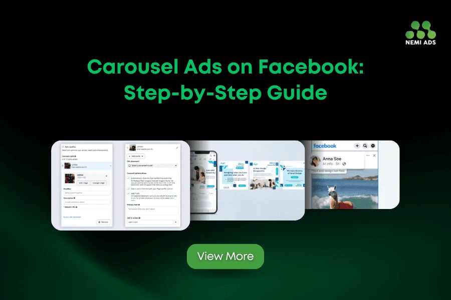
If the headline says “Save 20 hours a week,” the description could say “Used by 4,000+ ops teams.” That is a one-two punch that builds credibility fast.
Calls to Action That Match the Card
Each card can have its own CTA, and it should. A card about a free trial should say “Start free.” A card about a case study should say “Read the story.”
Mismatched CTAs are one of the most common reasons this practice underperform. The user sees one promise and clicks into something else, and trust evaporates.
Platform-Specific Tips for Carousel Ads
Not every platform treats this approach the same way. The format is similar, but the nuances matter.
Here is what I have learned running this practice across the major networks.
Meta (Facebook and Instagram)
Meta’s this approach support up to ten cards, which is more than most advertisers need. I typically use four to six, because attention drops off sharply after that.
Instagram favors visual-first cards with minimal text. Facebook tolerates more copy, especially in the description field. Adjust accordingly.
LinkedIn this approach work best for B2B, and the audience expects a more professional tone. Cards that lead with data, case studies, or industry insights tend to outperform lifestyle imagery.
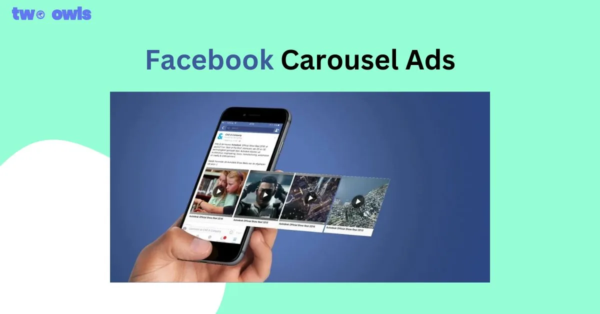
Keep your this practice here tighter, usually three to five cards, and lead with a stat or a problem statement.
Google Discovery and Demand Gen
Google’s this approach placements reach users across YouTube, Gmail, and Discover. The audience is broader and less targeted than Meta, so your first card needs to work for a wider range of people.

This is where general appeal beats niche specificity. Save the deep-dive cards for later in the sequence.
Common Carousel Ads Mistakes That Kill Performance
I have audited hundreds of this approach campaigns, and the same mistakes show up over and over. Avoiding them is often easier than fixing them.

Treating Every Card Like a Billboard
When each card tries to say everything, none of them say anything. this practice work because they break a message into pieces. If you cram the whole pitch into card one, the rest of the sequence becomes filler.
Ignoring the Mobile Experience
Most this approach impressions happen on mobile. If your cards were designed on a large monitor and never checked on a phone, you are flying blind.
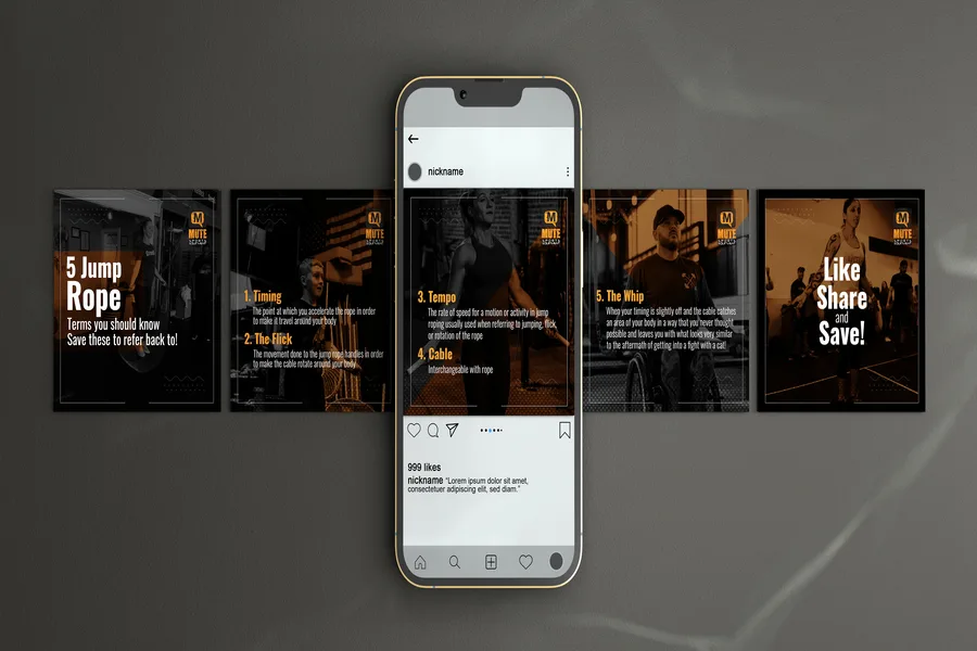
Text that looks elegant on desktop can become unreadable on a small screen. Always preview on the actual device your audience uses.
No Clear First Card
Some this approach sets have no obvious entry point. Every card feels like it could be first, which means none of them grab attention.
Decide which card is the hook and design the rest to support it. Ambiguity kills swipe-through rate.
Landing Pages That Do Not Match
If your this approach promise a specific thing and the landing page delivers something else, you burn trust and money at the same time.
Match the landing page to the card, not just to the campaign. This is where per-card destinations pay off.
Too Many Cards
Just because a platform allows ten cards does not mean you should use ten. Most audiences lose interest after four or five.
Keep your this practice tight. Fewer cards, stronger story, better results.
Testing and Optimization: How to Improve Carousel Ads Over Time
This approach are not a set-it-and-forget-it format. They reward ongoing testing more than almost any other ad type.
Here is the testing framework I use, and the metrics that actually matter.
What to Test First
Start with the first card, because it has the biggest impact on everything downstream. Test different hooks, different visuals, different opening lines.
Once you have a winning first card, move to card order. Sometimes the same five cards in a different sequence perform completely differently.

Metrics That Matter for Carousel Ads
Impressions and clicks are table stakes. The interesting numbers are swipe-through rate, card-level engagement, and cost per landing page view.
If swipe-through rate is high but conversions are low, your this practice are working and your landing page is not. If swipe-through is low, the problem is in the first card.
How Often to Refresh Creative
This approach fatigue faster than static ads because users see the same sequence repeatedly. Refreshing every few weeks keeps performance from decaying.
You do not always need a full rebuild. Sometimes swapping one card is enough to reset the creative and re-engage the audience.
| Metric | What It Tells You | Action If Underperforming |
|---|---|---|
| Swipe-Through Rate | How compelling your first card is | Redesign card one with a stronger hook |
| Card-Level Engagement | Which cards resonate most | Move top performers earlier in the sequence |
| Click-Through Rate | How well headlines and CTAs convert attention | Rewrite headlines to lead with benefits |
| Cost Per Landing Page View | Efficiency of your carousel ads spend | Test per-card landing pages for relevance |
| Conversion Rate | Whether the post-click experience matches the ad | Align landing page with the specific card promise |
Advanced Carousel Ads Strategies for Scaling Campaigns
Once your this approach are working, the next challenge is scaling without losing efficiency. This is where most advertisers plateau.
The strategies below are the ones I reach for when a this practice campaign is profitable and I want more volume.
Segment Cards by Audience
Instead of one carousel for everyone, build different this approach sets for different audience segments. Same core message, different card emphasis.
New visitors might see a card about what you do. Returning visitors might see a card about a specific offer. The carousel adapts to where the person is in their journey.
Use Dynamic Creative to Let the Platform Optimize
Some platforms let you upload multiple assets and let the algorithm assemble the best combination. This works well for this approach because there are so many possible permutations.
You lose some control over the sequence, but you gain scale. Use it when you have a lot of creative variations to test.
Layer in Retargeting With Different Cards
Your retargeting this approach should look different from your cold-traffic ones. The audience already knows you, so lead with the offer, not the introduction.
I have seen retargeting this practice double conversion rates simply by replacing the “who we are” card with a “here is what you left behind” card.
Combine Carousel Ads With Video for Higher Engagement
Mixing video cards into a this approach sequence often lifts overall engagement, especially on Instagram and YouTube placements.
Just make sure the video cards feel like part of the same story, not a different ad that wandered in.
Measuring ROI on Carousel Ads: What to Track Beyond Clicks
Clicks are easy to count, but they are not the whole story. this approach can influence conversions long after the click, and tracking that influence requires a bit more care.
Here is what I track when I want to know if this practice are actually paying off.
View-Through Conversions
Some users see your this approach, do not click, but convert later through another channel. View-through attribution captures that influence.
This is especially important for this practice because the format encourages browsing without immediate action.
Assisted Conversions
This approach often play a supporting role in a longer journey. Assisted conversion reports show where they contributed to a sale that another channel closed.
Ignoring assisted conversions makes this practice look weaker than they are, and you might cut a format that is quietly doing heavy lifting.
Incremental Lift
The cleanest way to measure this approach impact is a holdout test. Show the ad to one group, hold it back from another, and compare conversion rates.
It is more work than reading a dashboard, but it is the only way to know what would have happened without your this practice.
Frequently Asked Questions About Carousel Ads
Here is an in-depth breakdown of key considerations regarding this section:
How Many Cards Should a Carousel Ads Unit Have?
Most advertisers see the best results with four to six cards. Fewer than four often feels thin, and more than six tends to lose attention before the final card.
Start with five, then test up or down based on swipe-through rate and card-level engagement.
Are Carousel Ads Better Than Single-Image Ads?
Not always, but often. this approach tend to outperform single-image ads when you have multiple products, multiple benefits, or a story to tell. For a single, simple offer, a static ad can be just as effective.
The right answer depends on your objective. Test both and let the data decide.
What is the Ideal First Card for Carousel Ads?
The best first card leads with a specific benefit or a striking visual that stops the scroll. Avoid brand logos, vague taglines, and generic imagery.
Ask yourself: if this card appeared alone in a feed, would it earn a click? If not, redesign it.
Do Carousel Ads Work for B2B?
Yes, especially on LinkedIn. B2B this approach work best when they lead with data, case studies, or a clear problem statement that the audience recognizes.
Keep the tone professional, but do not be afraid to be specific. B2B buyers respond to concrete value just like everyone else.
How Often Should I Refresh My Carousel Ads Creative?
Every two to four weeks for most campaigns.
You do not need a full rebuild every time. Swapping one or two cards can be enough to reset performance.
Can I Use Video in Carousel Ads?
Most major platforms support video cards in this approach. Video tends to lift engagement, especially on Instagram and YouTube placements.
Just make sure the video cards fit the overall narrative. A video that feels disconnected from the rest of the sequence hurts more than it helps.
What is a Good Swipe-Through Rate for Carousel Ads?
It varies by platform and industry, but a swipe-through rate above 10 percent is generally healthy. Below five percent usually means the first card is not doing its job.
Focus on improving the first card before tweaking anything else. That is where the biggest gains usually live.
How Do I Know if My Carousel Ads are Working?
Look at swipe-through rate, card-level engagement, and cost per landing page view. If all three are trending well, your this approach are working.
If swipe-through is high but conversions are low, the problem is post-click. Fix the landing page before touching the ad.
Final Thoughts on Building Carousel Ads That Get Clicks
this approach are not magic, but they are one of the most flexible formats available. When you treat them as a story instead of a slideshow, they consistently outperform static creatives.
The brands winning with this practice share a few habits. They lead with a strong first card. They build a coherent sequence. They match landing pages to cards. And they test relentlessly, one variable at a time.
If you take nothing else from this guide, take this: the first card is everything. Get that right, and the rest of your this approach will have a chance to do their job. Get it wrong, and no amount of clever design on cards two through five will save you.
So go build one. Sketch the story, design the cards, test the hook, and let the data guide the next iteration. That is how carousel ads turn from a format you tolerate into a format you rely on.