Mobile First Indexing: Simple Guide + 7 Best Practices
Mobile first indexing is Google’s default way of crawling, rendering, and ranking every page on the web, and it changes what “optimized” actually means for your site. If you have ever watched a beautifully designed desktop page lose rankings to a leaner competitor, this guide is for you.
We will walk through the mechanics in plain language, then hand you seven concrete practices you can implement this week.
Here is the honest truth most tutorials skip: the shift to a smartphone-first crawler is not a technical checkbox the mobile first indexing tick once, and mobile first indexing tips is what the reader checks first. It is a permanent change in how search engines judge quality. Everything below is built around that reality, from the quick primer to the practical checklist at the end.
What Mobile First Indexing Actually Means
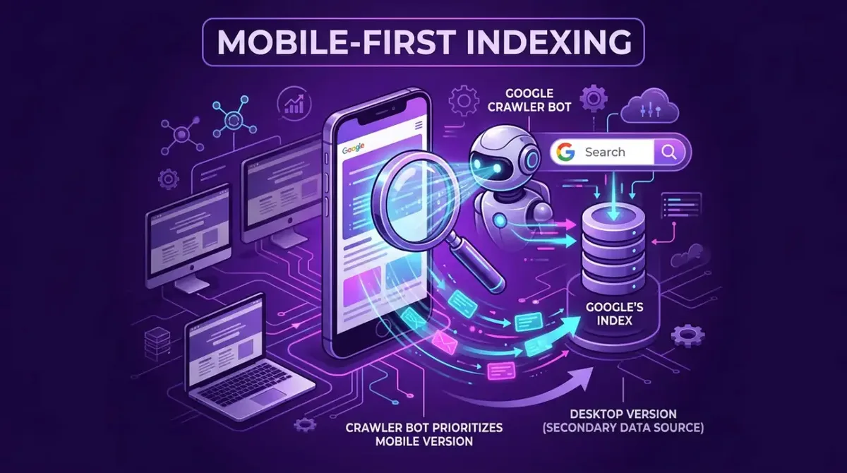
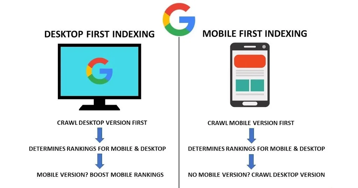
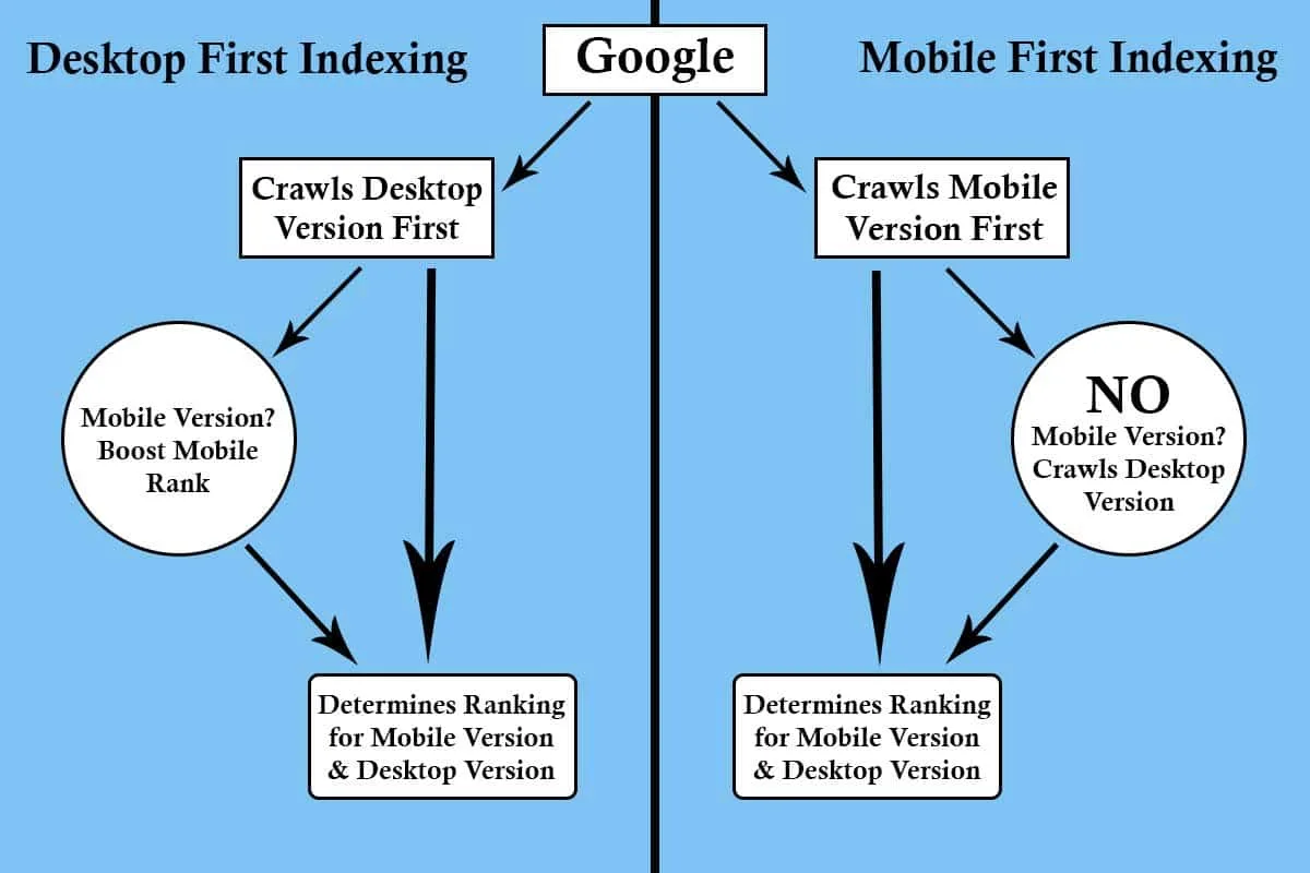
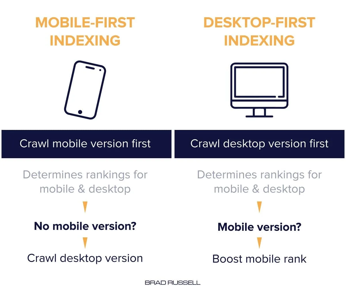
In simple terms, Googlebot now crawls your site using a smartphone user agent as its primary view. Focusing on mobile first indexing provides clear direction here. The HTML, images, CSS, and JavaScript it sees on a mobile screen become the source of truth for indexing and ranking. Desktop rendering still exists, but it plays a secondary role.
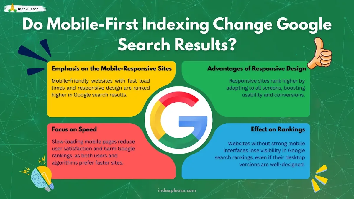
Think of it like a restaurant inspector who only ever visits during the lunch rush. If your kitchen looks great in the quiet evening but falls apart when the crowd arrives, the inspector never sees the good version. That is exactly what happens when your mobile page hides content, strips structured data, or loads a stripped-down template.
This is why a mobile first indexing guide that only talks about responsive CSS misses the point. The crawler is not grading your breakpoints. It is grading whether the same information, links, and signals survive the trip to a small screen.
How Google’s Smartphone-First Crawler Sees Your Site
The process happens in stages, and each stage can quietly drop content if you are not careful. First, Googlebot fetches the URL using a mobile user agent. Then it renders the page, executes JavaScript, and builds a document object model from what actually appears.
Only after the mobile first indexing does it extract text, links, and structured data for the index. If your mobile template loads reviews through a script that fails on slow connections, those reviews simply do not exist as far as the index is concerned.
Crawling, Rendering, and the Mobile User Agent
Google publishes the exact user agent strings it uses, and you can test against them with the URL Inspection tool. According to Google’s own documentation on mobile-first indexing, the smartphone crawler became the default for all new sites years ago and now covers the entire web.
What that means practically: there is no “desktop index” left to fall back on. Your mobile page is your only page. Run a quick test by fetching a key URL with a mobile user agent and comparing the rendered HTML to what a desktop browser shows.
What Happens When Mobile and Desktop Content Differ
When the two versions diverge, the mobile version wins. Every time. If your desktop page has 1,200 words and your mobile page shows 400 words plus a “read more” tab that requires JavaScript, the index sees the shorter version.
I have audited sites where the entire product specification table was hidden behind a mobile accordion the mobile first indexing never expanded in the crawler. Rankings dropped within weeks, and nobody could figure out why. The fix was embarrassingly simple once we spotted it.

The Mobile First Indexing Checklist for a Healthy Site
Before we get to the seven practices, run this baseline check, and mobile first indexing best practices decides how the result lands. It takes about an hour and catches the majority of problems. Treat it as your mobile first indexing checklist and repeat it after any major template change.
| Check | What to Verify | Tool |
|---|---|---|
| Content parity | Same text, headings, and images on both versions | Manual side-by-side |
| Structured data | Schema markup present on mobile HTML | Rich Results Test |
| Metadata | Identical title and meta description | URL Inspection |
| Internal links | Same navigation and in-content links | Crawler with mobile UA |
| Media | Images load, lazy-loading does not block them | Lighthouse mobile audit |
| Interstitials | No intrusive popups covering content | Manual mobile test |
| Robots directives | No accidental noindex on mobile | Robots tester |
If any row fails, fix it before touching anything else. A broken foundation makes every optimization below pointless.
Why Mobile First Indexing Rewards Fast, Clean Pages
Speed is not just a user experience nicety anymore. Refining each detail of your mobile first indexing strengthens this section. It directly affects how much of your page the crawler can process within its crawl budget. A page that takes twelve seconds to become interactive on a mid-range Android phone will lose content to render timeouts.
Google’s Core Web Vitals thresholds are well documented: Largest Contentful Paint under 2.5 seconds, Interaction to Next Paint under 200 milliseconds, and Cumulative Layout Shift under 0.1. These are measured on real devices, not on your office fiber connection.
Here is a concrete example from a client project. Maintaining clarity across your mobile first indexing remains essential. Their desktop page scored 94 on Lighthouse. Their mobile score was 41, mostly because a hero carousel loaded six uncompressed images before any text rendered.
After converting to a single responsive image and deferring the rest, mobile LCP dropped from 6.8 seconds to 2.1 seconds, and organic traffic recovered within a quarter.

7 Best Practices for Mobile First Indexing
Now the core of this guide. These seven practices cover the highest-impact areas, ordered roughly by how often I see them broken in real audits. Each one stands alone, so you can work through them in any order.
1. Keep Content Identical Across Every Device
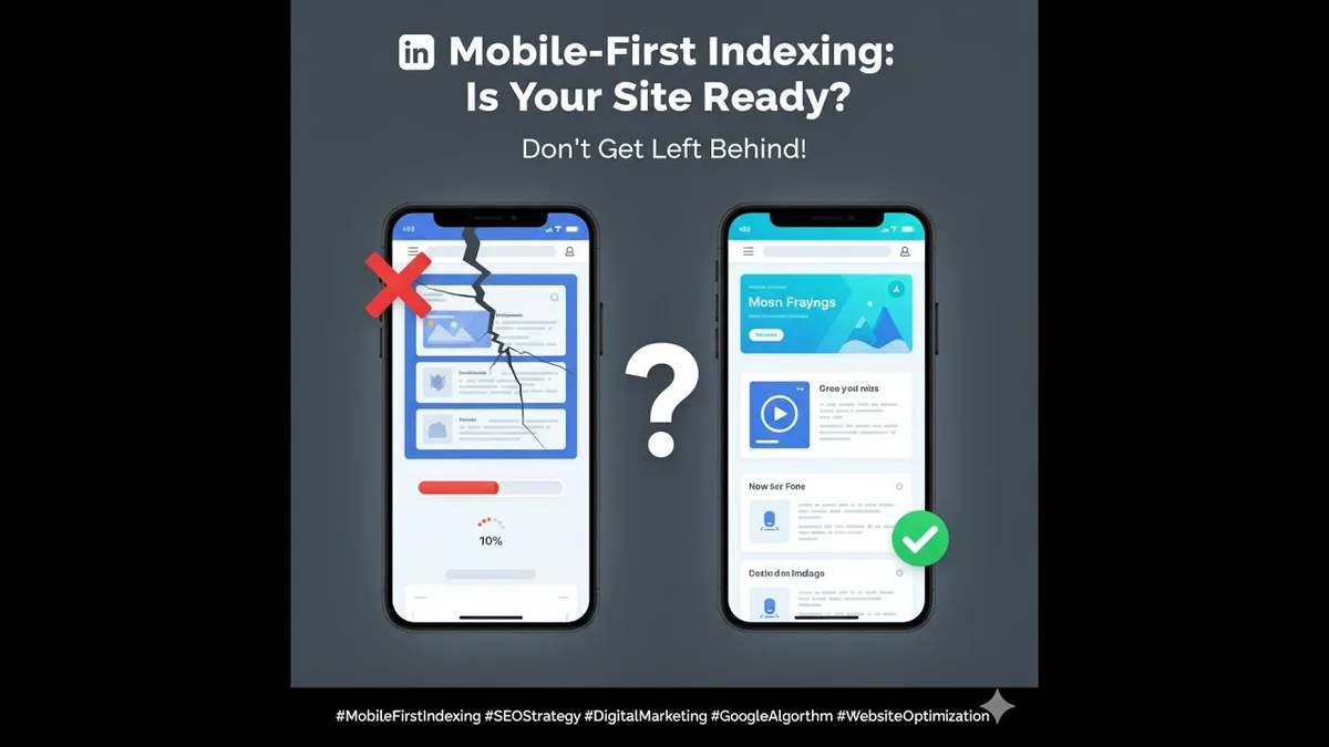
This is the single most important rule, and it is still the most commonly violated. Every word, heading, image, and link that appears on desktop must appear on mobile. No exceptions for “secondary” content.
Accordions and tabs are fine for layout, as long as the content is present in the HTML and accessible to the crawler. A thoughtful approach to mobile first indexing reinforces your qualifications. The test is simple: view source on the mobile version and search for a paragraph you know exists on desktop. If it is not there, you have a problem.
One e-commerce team I worked with hid all product reviews below a “Show More” button that only rendered on tap. The reviews were invisible to the crawler, so the pages lost their review rich snippets and a chunk of long-tail traffic. Moving the reviews into the initial HTML fixed it without changing the visual design at all.
2. Serve the Same Structured Data on Mobile
Schema markup is easy to forget because it lives in the page head and nobody sees it. But if your mobile template injects JSON-LD through a script that runs after user interaction, the crawler may never see it.
Product, Review, FAQ, and Breadcrumb schema all need to be present in the mobile HTML from the first render. Effective execution in your mobile first indexing makes a tangible difference. Validate with the Rich Results Test using the mobile user agent, and compare the output to your desktop version.
A practical mobile first indexing tip: add schema validation to your deployment pipeline. If the mobile render is missing a required type, fail the build. It sounds heavy-handed until you realize how much revenue rich results drive.
3. Match Titles, Meta Descriptions, and Headings
Your title tag and meta description should be identical on mobile and desktop. Structuring your mobile first indexing around proven patterns ensures impact. Sounds obvious, but plenty of CMS themes swap in shorter mobile variants that cut off key phrases.
Headings matter even more. If your mobile template converts an H2 into a styled span for visual reasons, you lose the semantic signal. Keep the heading hierarchy intact and use CSS for styling instead of changing the markup.

Run a quick audit by extracting all headings from both versions and diffing them. Any mismatch is a signal the crawler is getting a different document than your users see on a laptop.
4. Prioritize Real-Device Performance
Lab tests on fast hardware lie to you. Test on a throttled connection and a mid-tier phone, because that is what most of your visitors actually use.
Focus on three things: compress and properly size images with modern formats, defer non-critical JavaScript, and eliminate render-blocking resources in the head. Applying these principles to your mobile first indexing yields measurable results. Those three changes typically deliver the biggest gains.
I keep a cheap Android phone on my desk specifically for this. Loading a client site on it is often humbling, and it catches problems that no desktop emulator ever will.
5. Avoid Intrusive Interstitials and Blocking Overlays
Full-screen popups that cover content on mobile are penalized, and for good reason. They frustrate users and they obscure the content the crawler is trying to evaluate.
Cookie banners and newsletter modals are the usual culprits. Keep them small, dismissible, and out of the way of the main content. If a modal covers more than a small portion of the screen on load, rethink it.
The same applies to app-install banners the mobile first indexing hijack the first screen. They may boost app downloads marginally, but they cost you search visibility, which is a much worse trade.
6. Preserve Internal Linking and Navigation
Mobile menus often collapse into hamburger drawers, which is fine as long as the links are still in the HTML. If your navigation is loaded via JavaScript after a tap, the crawler may not follow those links at all.
Check that your primary navigation, footer links, and in-content links all appear in the mobile source. A crawler that cannot reach your category pages cannot index them.
Breadcrumbs deserve special attention. They help both users and crawlers understand site structure, and they feed Breadcrumb schema. Keep them visible on mobile, even in a condensed form.
7. Monitor With Mobile-Specific Audits
Set up regular audits the mobile first indexing specifically test the mobile version. Google Search Console’s URL Inspection tool shows you exactly what the smartphone crawler sees, including rendered HTML and any blocked resources.
Pair that with a monthly Lighthouse mobile run and a crawl using a mobile user agent. Track the results over time so you catch regressions before they cost you rankings.
One more habit worth building: after every template or plugin update, re-run the mobile audit. Theme updates are notorious for silently breaking structured data or hiding content behind new interactive components.
Common Mobile First Indexing Mistakes That Sink Rankings
Even teams that understand the concept fall into predictable traps. Here are the ones I see most often, along with the fix for each.
Hiding content behind interactions. Tabs, accordions, and carousels are fine visually, but the content must be in the initial HTML. Clear alignment with your mobile first indexing builds confidence from the start. If it only appears after a click, the crawler misses it.
Blocking CSS and JavaScript in robots.txt. This was once a performance trick. Now it prevents the crawler from rendering your page properly. Allow these resources so Google can see the full document.
Using a separate mobile URL with different content. Dynamic serving and separate mobile subdomains are still supported, but the mobile first indexing demand strict parity. Most teams are better off with a single responsive site.
Forgetting lazy-loaded images. Native lazy loading is great, but images below the fold that never enter the viewport during rendering may be skipped. Use a sensible loading strategy and verify with the rendered HTML.
How to Test Your Site Against the Smartphone Crawler
Testing is where theory meets reality. Integrating mobile first indexing into your workflow produces consistent quality. Start with Search Console’s URL Inspection tool, which shows the rendered HTML, the resources Googlebot could not load, and any indexing issues specific to the mobile version.
Next, run a crawl with a mobile user agent using a tool like Screaming Frog. Compare the mobile crawl to a desktop crawl and look for differences in word count, internal links, and metadata.
Finally, test on a real phone with a throttled connection. This catches performance problems and layout issues that automated tools miss. It takes ten minutes and routinely surfaces the most valuable findings.
Frequently Asked Questions About Mobile First Indexing
Here is an in-depth breakdown of key considerations regarding this section:
Does Mobile First Indexing Mean Desktop Rankings No Longer Matter?
Not exactly. Desktop still matters for users on laptops and desktops, and Google still serves desktop results. But the index itself is built from the mobile version, so your mobile page is what determines whether you rank at all.
Is a Separate Mobile Site Still Allowed?
Yes, dynamic serving and separate mobile URLs are still supported. However, they require strict content parity and careful configuration. Most teams get better results from a single responsive site with one URL.
What Happens if My Mobile Page Has Less Content Than Desktop?
The mobile version becomes the source of truth. Any content missing from mobile is effectively invisible to the index. This is the most common cause of ranking drops after a site redesign.
How Often Should I Run a Mobile First Indexing Audit?
Run a full audit quarterly, and again after any template, plugin, or CMS update. Smaller checks after content changes are a good habit too, especially for pages that rely on structured data.
Does Page Speed Affect Mobile First Indexing Directly?
Speed affects how much of your page the crawler can render within its time budget, and it feeds Core Web Vitals, which are ranking signals. Slow mobile pages lose both content coverage and ranking strength.
Where to Go from Here
Mobile first indexing is not a project with an end date. It is an ongoing discipline of keeping your mobile experience at parity with desktop, fast on real devices, and fully visible to the crawler.
Start with the checklist above, fix the parity gaps, then work through the seven practices in order of impact. Keep testing with a mobile user agent after every change. That habit alone prevents most of the problems covered in this guide.
If you want to go deeper, explore related topics like Core Web Vitals optimization, structured data for rich results, and JavaScript SEO. Each one connects directly back to how the smartphone crawler sees your site, and together they form the foundation of modern technical SEO.