Alt Text Best Practices: Easy Guide + 9 Pro Tips
Alt text best practices come down to one thing: describing an image so precisely that someone who can’t see it still gets the message. That sounds simple. In practice, it’s where most websites quietly lose accessibility points, search visibility, and reader trust.
This guide walks you through the fundamentals, then hands you nine concrete pro tips you can apply to your next upload.
I’ve audited image libraries with thousands of files, and the pattern never changes. Focusing on alt text best practices provides clear direction here. Most alt attributes are either empty, keyword-stuffed, or auto-generated garbage. The fix isn’t complicated, but it does require knowing what the attribute is actually for.
Think of the Alt text best practices as the parent topic in a larger accessibility cluster. Sibling subjects like image SEO, screen reader behavior, and WCAG conformance build directly on what you’ll read here. Get the foundation right, and the rest gets easier.
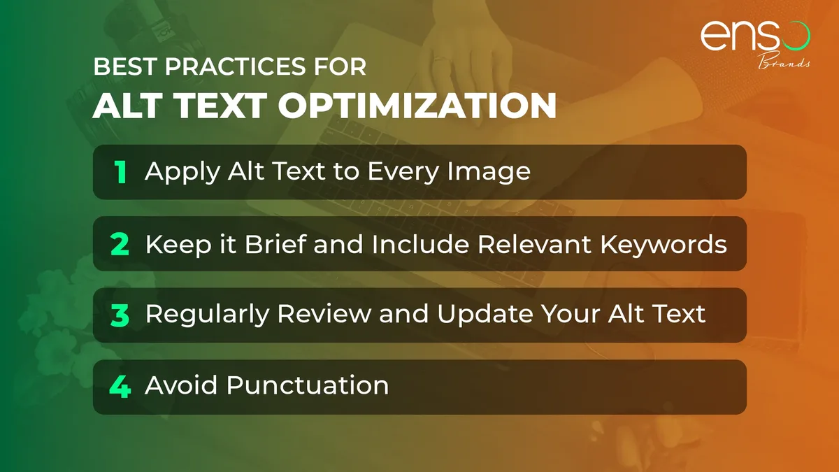
What is Alt Text, Really?
Alt text is the text alternative attached to an image element in HTML. Refining each detail of your alt text best practices strengthens this section. When an image fails to load, the browser shows it.
When a screen reader encounters the image, the alt text best practices reads it aloud. When a search engine crawls the page, it indexes it as a signal about what the picture shows.
Three audiences, one attribute. That’s why the alt property matters more than most web copy. A well-written description serves a blind user navigating with JAWS, a crawler building an image index, and a reader on a bad connection whose browser dropped the file.
Here’s the markup you’ll usually see:
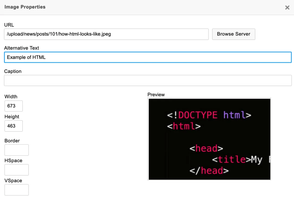
<img src="red-running-shoe.jpg" alt="Red trail running shoe with a rubber outsole on gravel">
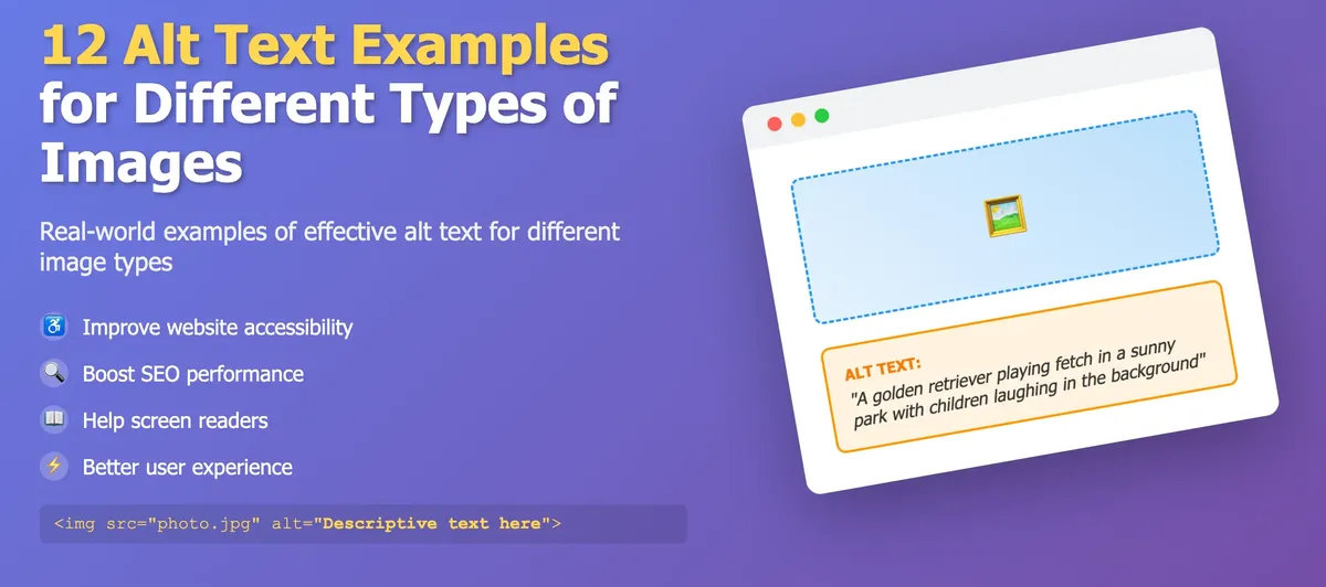
The alt text best practices string is doing real work. It identifies the object, names its category, and adds a distinguishing detail. What it does not do is repeat the caption verbatim or shovel in keywords that don’t belong.
Why Alt Text Best Practices Matter Beyond Accessibility
Accessibility is the headline reason, and the Alt text best practices’s more than a courtesy. The Web Content Accessibility Guidelines treat non-text content as a Level A requirement, which means a missing or useless description is a hard failure, not a minor flaw.
But the commercial argument is just as strong. Maintaining clarity across your alt text best practices remains essential. Image search drives a meaningful slice of traffic for visual niches like recipes, fashion, and home improvement.
A product photo described as “shoe” will never surface for a buyer searching “red trail running shoe with aggressive tread.”
The Alt text best practices’s a third benefit people forget. Well-described images that fail to load still communicate to the reader. That matters on mobile networks and in email clients that block external images by default. A good description keeps the page usable even when the picture doesn’t render.
The Core Alt Text Best Practices Checklist
Before the nine tips, let’s establish the baseline. A thoughtful approach to alt text best practices reinforces your qualifications. Every image on your site should pass this checklist, or you have a fixable problem. Treat it as the floor, not the ceiling.
| Check | What to Verify | Why It Matters |
|---|---|---|
| Descriptive | Names the subject and key visual details | Gives screen reader users the same information sighted users get |
| Concise | Roughly 125 characters or fewer as a rule of thumb | Longer strings burden assistive tech and lose attention |
| Contextual | Fits the surrounding paragraph and page purpose | The same image needs different descriptions in different contexts |
| No redundancy | Doesn’t repeat an adjacent caption or body sentence | Duplicated text is noise for screen reader users |
| No “image of” | Skips phrases like “picture of” or “photo showing” | Assistive tech already announces that it’s an image |
| Decorative handling | Uses alt="" for purely decorative visuals |
Prevents screen readers from announcing irrelevant images |
| Functional clarity | Icon-only buttons describe the action, not the icon | Users need to know what a button does, not what it looks like |
| Keyword discipline | Relevant terms used naturally, never stuffed | Improves image SEO without harming readability (more on this below) |
Notice the checklist is mostly about restraint. Good alt attributes are written by people willing to cut, not add. If you remember nothing else from this alt text best practices guide, remember that.
9 Pro Tips for Getting Alt Text Right Every Time
Now the practical part. These nine tips come from real audits, real screen reader testing, and the mistakes I see repeated across content teams. Each one solves a specific failure mode.
Tip 1: Describe the Purpose, Not Just the Pixels
The single biggest upgrade the alt text best practices can make is shifting from description to intent. Ask what the image is doing on the page, then describe that. A chart’s alt text shouldn’t catalog its border color; it should convey the trend.
Compare these two versions. “Bar chart with blue and orange bars” tells a user almost nothing. “Bar chart showing mobile conversions rising 40% while desktop stays flat” delivers the actual message.
Context drives this decision. Applying these principles to your alt text best practices yields measurable results. The same infographic might be crucial data on a research page and pure decoration in a sidebar. When in doubt, ask what a user would miss if the image vanished. That’s your alt text.
Tip 2: Handle Decorative Images With Empty Alt, Not Missing Alt
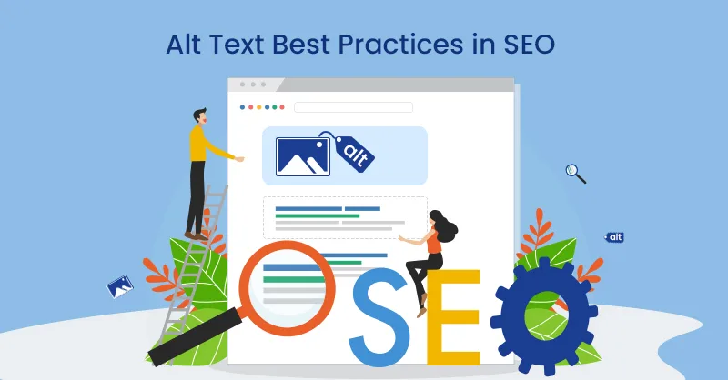
Here’s a distinction the Alt text best practices trips up beginners. An image with no alt attribute at all is a failure. An image with alt="" is a deliberate signal: this visual is decorative, skip it.
Screen readers treat these differently. Proper attention to your alt text best practices sets a strong baseline. A missing attribute often triggers the file name to be read aloud, so a user hears “IMG underscore 0012 underscore final dot jpeg.” It’s a small thing that feels careless.
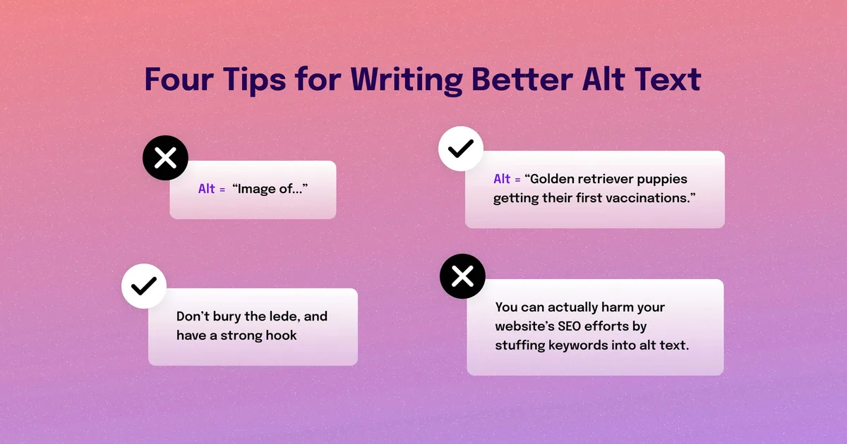
Use empty alt for background flourishes, spacer images, and purely stylistic dividers. Reserve real descriptions for content-bearing visuals. This is one of the clearest alt text best practices and one of the easiest to standardize across a team.
Tip 3: Skip “Image Of” and “Graphic Showing”
Assistive technology announces image type before reading your description. Effective execution in your Alt text best practices makes a tangible difference. Leading with “picture of” or “image showing” therefore duplicates information and wastes precious character budget.
Worse, the redundancy signals the description was written by someone unfamiliar with screen readers. Developing your alt text best practices with precision highlights key strengths. It’s a tell. Professional accessibility reviewers flag it immediately.
Just start with the subject. “Golden retriever catching a frisbee midair” beats “Image of a golden retriever catching a frisbee midair” every time. Shorter, cleaner, and respects the user’s time.
Tip 4: Keep It Short, but Not Too Short
The commonly cited ceiling is around 125 characters, which is a useful default rather than a hard rule. Clear alignment with your alt text best practices builds confidence from the start. Most screen readers handle longer strings, but the longer the description, the more it competes with the surrounding content.
Below about 60 characters, descriptions often lose critical detail. “Woman in office” tells a user very little. “Woman in a yellow blazer presenting to a small meeting room” gives the scene substance.
The sweet spot depends on purpose. Integrating alt text best practices into your workflow produces consistent quality. A thumbnail in a gallery needs a brief label. A complex infographic may legitimately need a longer description, in which case a linked long description is often better than cramming everything into the attribute.
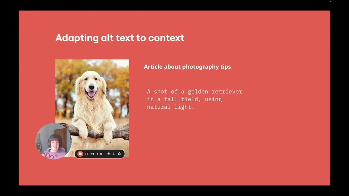
Tip 5: Write Alt Text for the Specific Context
Never copy-paste the same alt string across dozens of images. Context varies per page, so a one-size-fits-all approach produces descriptions that miss the point.
Say the alt text best practices run an e-commerce store. On the category page, “Red trail running shoe” is fine. On the product detail page, “Red trail running shoe, side view showing lugged outsole” adds value.
On a blog post about choosing footwear, “Red trail running shoe beside a road shoe for comparison” tells the reader what the image is actually demonstrating.
This is where the alt text best practices best practices idea really clicks. The description should adapt to what the page is trying to accomplish, not what the image technically contains.
Tip 6: Describe Functional Images as Actions
Buttons, links, and interactive icons need a different approach. When an image acts as a control, describe its function, not its appearance.
A magnifying glass icon that opens search should read “Search,” not “Magnifying glass.” A shopping cart that opens the basket should read “View cart,” not “Shopping cart graphic.” The user’s question is always “what happens if I activate this?”
Icon-only navigation menus are the usual offenders. Manual reviewers find them missing or vague, and it’s one of the most common accessibility bugs in design systems that otherwise look polished. Make this a fixed spec in your component library.

Tip 7: Handle Charts and Data Visuals With Real Care
Data visuals are the hardest case. You can’t fit a full statistical narrative into a short string, and trying produces descriptions so dense they’re useless.
The reliable approach is to state the conclusion and point to the full data. “Line chart showing customer churn dropping from 8% to 4% after the redesign, with full figures in the table below” gives the user the takeaway and a path to detail.
Don’t force the reader to reconstruct the visualization from a list of numbers. Give the message, not the spreadsheet. For complex dashboards, pair a short alt with a linked accessible data table.
Tip 8: Use Alt Text to Strengthen Image SEO Without Stuffing
Relevant, human-readable descriptions help search engines understand image content, which supports appearance in image results. The catch is that stuffing keywords in an alt attribute backfires quickly.
“Red running shoe buy red running shoe best red running shoes cheap” is a fake-looking string. It hurts accessibility, reads badly aloud, and contributes nothing to ranking that a natural description wouldn’t already deliver.
Write for the user first, then check whether the natural phrasing already includes the term the alt text best practices’d want. Usually it does. A clean, specific description is both the accessibility answer and the SEO answer — they’re not competing goals.
Tip 9: Build Review Into Your Publishing Workflow
Good intentions die in production. The only projects I’ve seen maintain quality are the ones with a review step, whether that’s a checklist in the CMS, a brief manual pass before publish, or an automated scan that flags missing attributes.
Start small. Add a required alt field to your image component. Run a audit of your top twenty pages and fix the worst offenders. Train the writers who publish most often.
Then check back in a quarter. Content decays quietly, and images get swapped without descriptions all the time. A recurring review keeps the standard from slipping, which is the true test of sustained alt text best practices.
How to Audit Your Existing Images
Most sites already carry hundreds of images with empty or lazy descriptions. Auditing them sounds painful, but the tools are decent and the process is straightforward.
Run an automated scan first to catch images with no attribute at all. That’s the quick win and often surfaces hundreds of offenders. Then manually review the ones the scanner can’t judge — decorative images marked as informative, descriptions full of keywords, and functional icons with vague labels.
Prioritize by traffic. Fixing your ten highest-traffic pages usually delivers most of the impact. Work backward from there, and don’t try to fix every image in one sprint. Sustainable progress beats a heroic one-time cleanup that gets undone within months.
Common Mistakes That Quietly Hurt Accessibility
Some failures are obvious. Others hide in plain sight, and they’re the ones I see in otherwise well-built sites. Watch for these in your own content.
- Placeholder textures: Descriptions like “banner” or “hero image” that convey nothing about the visual content.
- File name leakage: Missing alt attributes causing assistive tech to read filenames such as “IMG_4402_final_v3.”
- Overlong descriptions: Paragraph-length strings that force screen reader users to sit through details they didn’t need.
- Redundant captions: Alt text that repeats the visible caption word for word, doubling the reading burden.
- Keyword dumping: Strings built for search engines and unreadable for humans, which fail both audiences at once.
- Decorative images given full descriptions: Visual flourishes that clutter the reading experience with irrelevant detail.
Fixing these doesn’t require new tools. It requires attention. A quick manual pass over your most-visited pages will surface most of them, and the alt text best practices tips above give you the fix for each.
Where Alt Text Fits in a Larger Accessibility Strategy
Alt text is one piece of a broader picture. Screen readers also depend on heading structure, form labels, link text, and landmark roles. Get the plugin right while ignoring form fields, and users still hit friction.
The alt text best practices’s why treating this as part of a content accessibility program pays off. The image descriptions, the heading hierarchy, and the interactive controls all need to work together. The accessibility checklist from the World Wide Web Consortium at HTTPS://www.w3.org/WAI/test-evaluate/ is a solid reference for structuring the larger effort.
Keep learning the adjacent topics: accessible form design, color contrast, and semantic HTML. If you want a reliable alt text best practices guide you can return to, save the checklist above and the nine tips as your working template.
Frequently Asked Questions About Alt Text
These come up in nearly every accessibility workshop. Straight answers, no filler.
Does Every Image Need Alt Text?
Every image needs an alt attribute. Some get an empty value on purpose. Content images need a real description, purely decorative images need alt="", and functional images need a description of the action they trigger.
How Long Should Alt Text Be?
Aim for roughly 125 characters as a working default, but prioritize clarity over length. A short description that misses detail and a long one that rambles both fail. The right length is the shortest string that gives the user the same information the sighted reader gets.
Can Alt Text Improve My Search Rankings?
The alt text best practices supports image search visibility and helps crawlers understand content. It is not a magic ranking lever, and keyword stuffing hurts more than it helps. Write a natural, useful description and SEO benefits follow as a byproduct.
What About Text Inside an Image?
Any meaningful text baked into an image needs to be repurposed as real text on the page, either in the alt attribute or better, in the surrounding content. Images of text also fail contrast and scaling requirements, so they’re worth avoiding entirely whenever possible.
Should I Use the Same Alt Text on Multiple Pages?
Usually not. The description should serve the page context. If the same image appears on five pages with different purposes, the alt attribute should reflect what the image is doing in each place.
How Do I Know if My Alt Text is Any Good?
Test it. Close your eyes, or use a screen reader, and listen to what the description conveys. Could you picture the image and understand its role? If not, rewrite it. That’s the most honest audit you can run, and it’s free.
That covers the essentials. Use the checklist as your baseline, apply the nine tips on your next upload, and revisit old content with a short audit.
Strong alt text best practices are simply what happens when attention meets routine — and the payoff reaches screen reader users, search engines, and everyone else reading in the dark with images blocked.