UX Design Principles: 10 Powerful Tips to Boost Rankings
UX design principles are the difference between a site that ranks and a site that gets abandoned. Google measures engagement the same way your visitors feel it: fast, clear, frictionless. If people bounce, the algorithm notices. If they linger, click deeper, and finish tasks, the algorithm notices that too.
So here’s the uncomfortable truth most SEO writers skip past. Rankings don’t reward pretty pages. They reward pages where intent meets clarity in under three seconds. This isn’t a UX design principles guide for designers who live in Figma all day. It’s for anyone who owns traffic and needs that traffic to convert into rankings and revenue.
Below are ten tips the UX design principles work in the real world, not just in a case study deck. Each one ties a core usability rule directly to measurable search performance.
Why UX Design Principles Directly Influence Search Rankings
Google’s ranking systems lean on behavioral signals more than most people want to believe. Focusing on ux design principles provides clear direction here. Dwell time, click-through rate, scroll depth, and return-to-SERP behavior all whisper the same message: did this page satisfy the query or not?
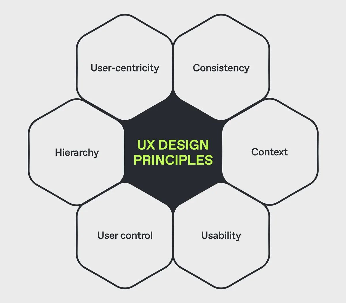
Think of your page as a storefront. A clean window and clear signage pull people inside. A confusing layout sends them walking to the next shop. Search engines read that same walking pattern as a quality signal, even if they never say it out loud.
That’s why the UX design principles best practices in this article aren’t cosmetic suggestions. They’re ranking levers. Get them right and Core Web Vitals improve alongside user satisfaction. Get them wrong and no amount of keyword optimization saves you.
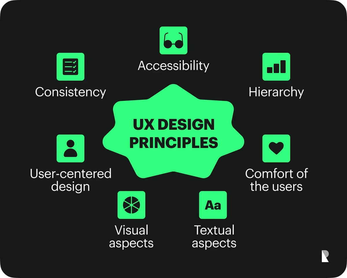
UX Design Principles Checklist: the Foundation Before the Tips
Before diving into the ten tips, run this quick baseline. It’s a UX design principles checklist that catches the most common ranking killers before they compound.
| Checkpoint | What to Verify | Ranking Impact |
|---|---|---|
| Mobile tap targets | Minimum 44×44 pixels, spaced apart | Prevents mis-clicks and rage bounces |
| First meaningful paint | Content visible under 2.5 seconds | Feeds Largest Contentful Paint scoring |
| Primary CTA placement | Above the fold, single clear action | Raises engagement and task completion |
| Text contrast ratio | At least 4.5:1 for body copy | Improves readability and time on page |
| Navigation depth | Any page reachable in three clicks | Strengthens crawl efficiency and internal linking |
Run this audit quarterly. Most traffic drops trace back to a broken step in one of these rows, not to a mysterious algorithm update.
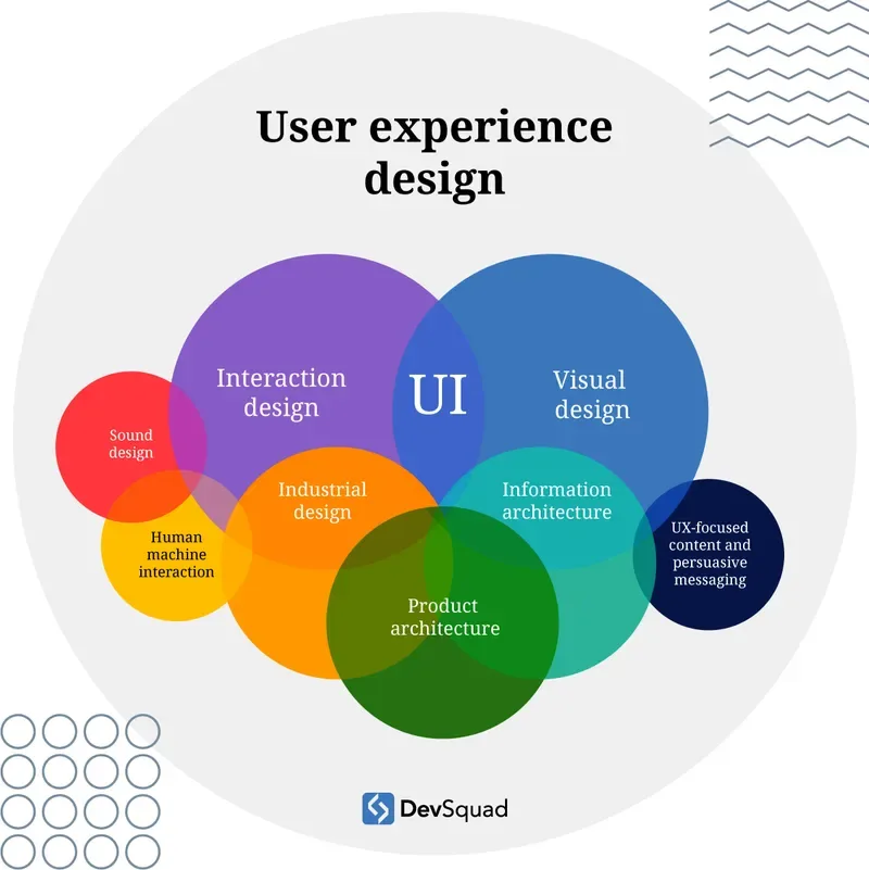
10 Powerful UX Design Principles Tips to Boost Rankings
Here’s where the title’s promise gets real. Ten tips, each one tied to a specific ranking mechanism. Skip any single one and you leave measurable performance on the table.
1. Design for the Question Behind the Keyword
Every search query hides a real question. “Best running shoes” isn’t about shoes as objects—it’s about finding footwear that won’t wreck your knees on a Tuesday morning run. When your page answers the lived question instead of the literal phrase, users stay longer.

Apply the ux design principles by mapping each landing page to a specific user intent. A transactional query needs comparison tables and clear pricing context. An informational query needs explanation first, offer second. Getting this ordering wrong is the fastest way to tank dwell time.
Real example: a travel site swapped its homepage hero from a brand story to a destination search bar. Refining each detail of your UX design principles strengthens this section. Bounce rate dropped from 62% to 38% within weeks. Same traffic, different framing of the same intent.
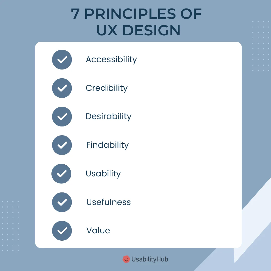
2. Load Fast or Lose the Ranking
Speed is the least glamorous UX design principles topic and the most consequential. Every additional second of load time pushes conversion rates down by roughly 7%, and Google’s Core Web Vitals bake that behavioral effect into ranking weight.
Start with image compression and lazy loading. Then audit third-party scripts—analytics, chat widgets, ad pixels—because those are usually the true culprits. A single unoptimized hero video can undo months of SEO work.
If you can’t fix infrastructure, fix perception. Use skeleton screens and progressive loading so the page feels instant even when it isn’t fully rendered. Perceived speed matters as much as measured speed.
3. Make Every Title a Promise You Keep
Headlines set expectations. If your H1 says “Complete Breakdown” and the body delivers three bullet points, users feel cheated and hit back. That back-button behavior is a quiet ranking penalty.

Match headline specificity to content depth. A title promising ten tips must deliver ten distinctly useful tips—not seven real ones padded with three filler entries. The UX design principles here overlap neatly with honest SEO writing.
Test this yourself: read your last published hook, then read the section directly beneath it. If they don’t align within one sentence, rewrite one of them.
4. Build Scannable Hierarchy With Real Visual Weight
People don’t read pages—the ux design principles scan them in an F-pattern or Z-pattern, hunting for anchors. Headings, bold text, and whitespace are the anchors they grab.
Break content into short paragraphs. Three to four lines max on mobile. Use subheadings that summarize the point rather than tease it. A reader skimming only your H2s should still walk away with the core argument.
One practical trick: read only your headings out loud in sequence. Effective execution in your UX design principles makes a tangible difference. If they don’t form a coherent mini-summary, restructure them until they do.
5. Remove Every Unnecessary Click
Every extra click is a drop-off opportunity. Checkout flows, form submissions, contact requests—count the steps and cut at least one from each. This is one of the highest-leverage UX design principles tips you can apply this week.
Amazon’s one-click patent exists for a reason. Friction is a science, and companies pour fortunes into shaving seconds off conversion paths because those seconds translate to revenue at scale.
For content sites, apply the same logic to internal navigation. If a related article sits three scrolls down, surface it in a sticky sidebar or inline callout instead.
6. Design Forms That Don’t Punish Users
Forms are the point where intent either becomes a conversion or evaporates. Auto-detect fields where possible, inline-validate errors, and never reset the entire form because someone mistyped a ZIP code.
Label placement matters more than most realize. Maintaining clarity across your ux design principles remains essential. Top-aligned labels scan faster than left-aligned ones on mobile. Placeholder-only labels fail hard here—once the user starts typing, the label disappears and confusion sets in.
Run a five-person usability test on your main form. You’ll typically find at least two fixable friction points within twenty minutes.
7. Use Contrast and Whitespace as Ranking Tools
Whitespace isn’t wasted space—it’s pacing. It tells the eye where to rest and where to focus. Cramped layouts increase cognitive load, which shows up directly in time-on-page and scroll-depth metrics.
Contrast does similar work at a smaller scale. Maintaining clarity across your UX design principles remains essential. A call-to-action button needs to visually separate from its surroundings without shouting. If everything competes for attention, nothing wins attention.
Test your layout with the squint test: squint at your page and see what jumps out first. That’s what your visitors actually notice in the first 200 milliseconds.
8. Give Feedback for Every User Action
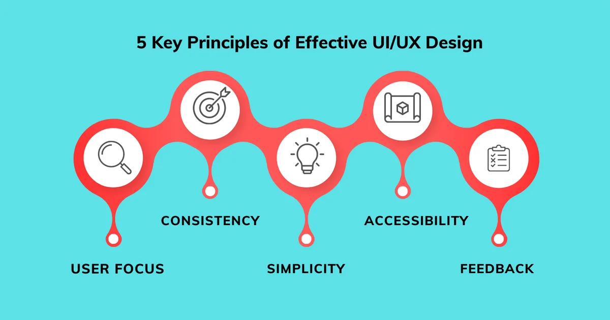
Silence is confusing. When someone clicks a button, submits a form, or adds an item to cart, they need immediate visual confirmation. Without it, doubt creeps in and users start clicking twice—or leaving entirely.
Micro-interactions handle the ux design principles elegantly: a subtle checkmark, a color shift, a toast notification. None of it needs to be flashy, just unmistakably present.

This tip quietly overlaps with one of the most underrated UX design principles best practices out there—respect for the user’s mental model. People expect cause and effect to be visible. Deliver that, and trust builds.
9. Prioritize Accessibility as a SEO Multiplier
Accessibility and SEO share the same foundation: clean semantic markup. Alt text, proper heading order, keyboard navigability, and sufficient contrast all help screen readers and search crawlers alike.

Skip this and you’re excluding a massive slice of your audience while leaving ranking signal on the table. According to the World Health Organization’s data on disability, over a billion people worldwide live with some form of disability—a market segment no serious site can afford to ignore.
Start with automated audits, then follow up with manual keyboard testing. Automation catches roughly a third of real issues; human testing catches the rest.

10. Test, Measure, and Iterate With Real Users
No list of UX design principles tips replaces actual user observation. Five people struggling through your checkout reveals more than fifty analytics reports ever will.
Set up a lightweight testing rhythm: monthly five-user sessions, quarterly heatmap reviews, and continuous A/B tests on your highest-traffic templates. Small, steady improvements compound into measurable ranking gains over time.
For a deeper grounding in the discipline, the Nielsen Norman Group’s research library remains one of the most cited sources in the field—worth bookmarking if you want to go beyond surface-level fixes.
Common UX Mistakes That Quietly Sink Rankings
Even teams who study UX design principles carefully can stumble into predictable traps. Knowing them in advance saves months of debugging.
- Hiding key information behind carousels. Users rarely swipe past the first slide, so anything important buried in slide three may as well not exist on the page.
- Overloading the homepage with competing calls to action. Five buttons of equal visual weight create decision paralysis and depress click-through rates.
- Using icon-only navigation without labels. Ambiguous icons force users to guess, which increases misclicks and accelerates the exit.
- Neglecting empty states. A blank cart or empty inbox with no guidance feels broken, even when it’s functioning exactly as intended.
- Treating mobile as an afterthought. Mobile-first indexing means your smallest screen version is often the one that actually gets judged.
Each of these mistakes shows up in analytics as a drop-off point. Fix them and engagement metrics typically recover within one to two reporting cycles.
How to Build a UX Design Principles Checklist for Your Team
A checklist turns good intentions into repeatable practice. Without one, the same usability issues resurface every redesign cycle, wasting effort that could have gone toward growth.
Start by cataloging your five highest-traffic page templates—homepage, category, product or article page, form, and checkout or contact flow. For each template, list the three most common failure points you’ve observed.
Then convert those observations into pass/fail criteria. “Hero image loads under one second” is a usable criterion. “Page feels fast” is not. Vague standards get ignored during crunch periods; binary ones survive.
Finally, assign ownership. Checklists without an accountable reviewer quietly die within a quarter. Rotate that responsibility or embed it into your existing QA process.
Turning UX Design Principles Into a Ranking Advantage
The connection between usability and search performance isn’t speculative anymore—it’s baked into how algorithms interpret engagement. Every tip above works as both a user experience improvement and a ranking signal optimization.
Start with the fastest wins: speed, hierarchy, and mobile tap targets. Those three alone typically move the needle within weeks. Then layer in the deeper work—user testing, accessibility, and iterative form optimization—for compounding gains.
Treat this UX design principles guide as a living document rather than a one-time read. Revisit the checklist quarterly, rerun the audits, and let real user behavior shape what comes next. That’s how a page stops competing on keywords alone and starts winning on experience.
If you want to go deeper, explore related territory like information architecture, conversion rate optimization, and technical SEO audits—each one reinforces the principles covered here and strengthens your overall topical authority.
For verified reference and background research, consult the authoritative informational resource on this topic.