Responsive Web Design SEO: 9 Proven Tactics
Responsive web design SEO is the discipline of making one flexible layout rank well on every screen size without maintaining separate mobile and desktop sites. If you’ve ever watched a page look flawless on your laptop and then collapse into a mess of overlapping text on a phone, you already understand why this matters.
Google indexes the mobile version of your page first, which means a broken phone layout quietly sinks your rankings even when your desktop version looks perfect.
I’ve spent years auditing sites where the design team celebrated a “fully responsive” launch while organic traffic kept sliding. Focusing on responsive web design SEO provides clear direction here. The culprit was almost never the CSS grid.
It was the small, unglamorous details: a hero image that pushed the largest contentful paint past four seconds, a hidden menu that buried internal links, or a viewport tag someone forgot to add.

This guide walks through nine tactics that actually move the needle, drawn from real audits and the patterns that keep showing up in search console data.
Think of this as your working responsive web design SEO guide. We’ll cover rendering, Core Web Vitals, mobile-first indexing, structured data, and the testing habits that separate sites that hold their rankings from sites that bleed them.

Each tactic stands on its own, so you can jump to the ones your site needs most and still walk away with something actionable.
Why Responsive Web Design SEO Decides Your Rankings
Google has been explicit for years: the responsive web design SEO uses the mobile version of your content for indexing and ranking. That single fact reshapes everything. If your mobile layout hides content behind JavaScript that doesn’t execute, strips out structured data, or loads a stripped-down version of your copy, Google sees the lesser version. Your rankings reflect what the crawler can access on a phone, not what you see on a 27-inch monitor.

The practical fallout is bigger than most teams expect. A responsive site that serves identical HTML across devices gives the crawler one clean signal. A site that conditionally loads different content per breakpoint creates ambiguity, and ambiguity in crawling almost always costs you visibility.
This is the core reason responsive web design SEO best practices keep circling back to a single principle: serve one URL, one set of content, and let CSS handle the presentation.

The responsive web design SEO’s also a user-behavior layer that compounds the technical one. Mobile visitors bounce faster when taps miss their targets or text requires pinch-zooming. Those bounces feed engagement signals, and engagement signals influence how Google weighs your page against competitors for the same query. Fix the layout, and you’re fixing two problems at once.
The Mobile-First Indexing Reality
Mobile-first indexing isn’t a switch the responsive web design seo flip. It’s the default state of how Google crawls the web. The Googlebot smartphone agent crawls your pages, renders them, and treats that rendering as the canonical version. Desktop rendering becomes secondary.
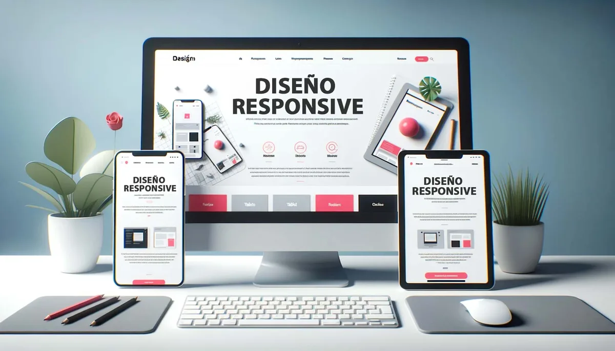
What trips people up is the assumption the responsive web design SEO a responsive theme guarantees mobile-first readiness. It doesn’t. A theme can be responsive in its breakpoints and still fail mobile-first indexing if lazy-loaded content never triggers during the crawl, or if the mobile viewport hides key sections with display:none.
I’ve seen product pages where the specifications table was hidden on small screens for “cleaner UX” and the crawler treated those specs as nonexistent. The fix was trivial once diagnosed, but the traffic loss had been accumulating for months.

Tactic 1: Lock Down Your Viewport and Base Rendering
Every responsive web design SEO checklist starts here, and for good reason. The viewport meta tag tells the browser how to scale your page on a mobile device. Omit it, and phones render your site at desktop width and shrink everything down, producing the postage-stamp experience that kills engagement.
The correct tag is simple: a width set to device-width and an initial scale of one. A thoughtful approach to responsive web design SEO reinforces your qualifications. That’s it. No maximum-scale restrictions that block pinch-zoom, because accessibility guidelines and Google’s own documentation both warn against disabling zoom.

I’ve audited sites where a developer added user-scalable=no to “prevent layout breakage” and simultaneously tanked their accessibility score and mobile usability signals.
Beyond the tag itself, verify your base CSS doesn’t set fixed pixel widths on containers. Structuring your responsive web design SEO around proven patterns ensures impact. A wrapper locked at 1200px forces horizontal scrolling on a 390px phone. Use relative units, max-width constraints, and fluid grids so content reflows naturally.
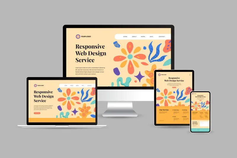
This is foundational responsive web design SEO work, but I still find it broken on roughly one in five sites I review.
Testing the Viewport in Practice
Open Chrome DevTools, toggle device mode, and cycle through a few real devices rather than just the responsive preset. The preset lies sometimes. Check an iPhone SE width, a mid-range Android, and a large phone in landscape. Watch for horizontal scrollbars, elements that overflow their containers, and text that becomes unreadably small.

Then load the page with JavaScript disabled. Applying these principles to your responsive web design SEO yields measurable results. If your content vanishes, you have a rendering dependency problem that mobile-first indexing will punish.
The crawler executes JavaScript, but it does so on a budget, and heavy client-side rendering can time out before your content paints.
Tactic 2: Optimize Core Web Vitals for Mobile Networks
Core Web Vitals measure real user experience, and the thresholds are stricter than most teams realize. Largest Contentful Paint should land under 2.5 seconds, Interaction to Next Paint under 200 milliseconds, and Cumulative Layout Shift under 0.1.

These numbers are measured on actual devices over actual networks, which means your fiber connection at the office tells you almost nothing.
Responsive layouts introduce specific performance risks. Art direction with the picture element can serve appropriately sized images per breakpoint, but if you forget srcset and sizes attributes, phones download desktop-resolution images. A 2400px hero image compressed to 300KB still costs a mobile user real time on a throttled connection.

The fixes are unglamorous but effective. Serve responsive images with proper srcset, defer non-critical JavaScript, inline critical CSS, and audit third-party scripts ruthlessly. Every analytics tag, chat widget, and font loader competes for the same bandwidth on a 4G connection. This is where responsive web design SEO tips from performance engineers overlap heavily with front-end best practices.
| Metric | Good Threshold | Common Mobile Failure | Quick Fix |
|---|---|---|---|
| Largest Contentful Paint | Under 2.5s | Oversized hero image | Serve srcset with compressed WebP |
| Interaction to Next Paint | Under 200ms | Heavy JS blocking main thread | Defer non-critical scripts |
| Cumulative Layout Shift | Under 0.1 | Images without dimensions | Set width/height attributes |
| Time to First Byte | Under 800ms | Slow origin server | Enable edge caching |
Tactic 3: Keep Content Parity Across Breakpoints
Here’s a mistake I see constantly: designers hide content on mobile to reduce clutter, and SEO teams don’t notice until rankings drop. Proper attention to your responsive web design SEO sets a strong baseline.
If a section exists on desktop but is hidden with CSS or removed from the DOM on mobile, Google’s mobile-first crawler may never see the responsive web design seo. Content parity means the same information is available at every breakpoint, even if the presentation differs.

Accordions and tabs are a common gray area. Google can index content inside collapsed accordions as long as it’s present in the HTML and accessible by a tap. The danger is content that loads only after interaction via JavaScript, or content that’s conditionally rendered based on screen width. Keep the text in the DOM and use CSS to control visibility. That preserves both user experience and crawlability.
Run a simple audit: load your top twenty pages on mobile and desktop, then compare the visible text. Developing your responsive web design SEO with precision highlights key strengths. If mobile is missing paragraphs, specs, FAQ answers, or internal links, you’ve found a content parity gap. Close it before chasing any other optimization.

Handling Images and Media Parity
Images deserve their own note. Mobile layouts often swap a wide hero for a cropped portrait version. That’s fine for performance, but make sure the alternative image carries descriptive alt text that reflects the page topic. The focus keyword belongs in at least one image alt attribute per page, written naturally rather than stuffed.
Video is trickier. Clear alignment with your responsive web design SEO builds confidence from the start. Autoplay videos with sound are blocked by most mobile browsers anyway, and heavy embeds crush your LCP.
Use a lightweight facade, load the player only on interaction, and keep captions or transcripts available in the HTML so the crawler has text to read.

Tactic 4: Build a Mobile-Friendly Internal Linking Structure
Internal links pass authority and help crawlers discover content. Effective execution in your responsive web design seo makes a tangible difference. On mobile, navigation patterns change: hamburger menus hide links, footer columns stack into long scrolls, and sidebars disappear entirely. If your most important internal links live in a desktop sidebar, mobile users and the mobile-first crawler may never encounter them.
The fix is to keep primary navigation links in the HTML regardless of how the responsive web design SEO’re visually presented. A hamburger menu is fine as long as the links exist in the DOM and are crawlable. Avoid rendering navigation entirely through JavaScript after a click, because the crawler may not trigger that interaction.
Also audit your in-content links. Responsive layouts sometimes stack cards vertically and push related-content modules far down the page. That’s acceptable for users, but ensure the links still exist. I recommend a quick crawl with a tool like Screaming Frog configured with a mobile user agent to compare link counts between desktop and mobile rendering. Discrepancies reveal structural problems fast.
Tactic 5: Serve Structured Data That Survives Mobile Rendering
Structured data powers rich results: review stars, FAQ dropdowns, breadcrumbs, product availability. Targeted refinements to your responsive web design SEO streamline the entire review. If your JSON-LD is injected by JavaScript that doesn’t execute reliably on mobile, you lose those enhancements. Google’s documentation is clear that structured data should be present in the initial HTML where possible.
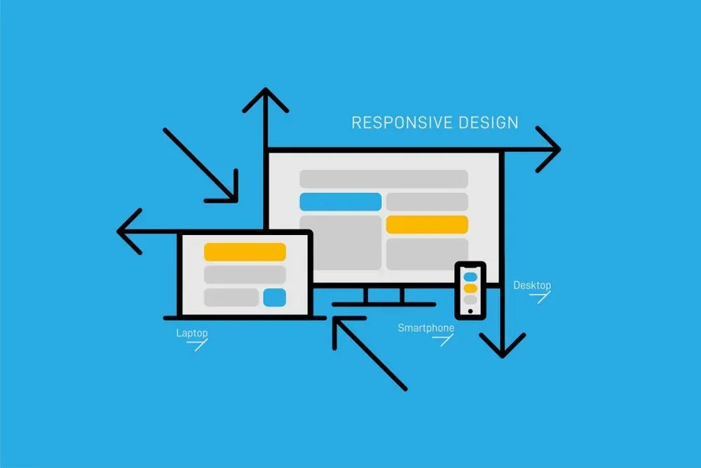
Responsive web design SEO work often overlooks this because schema markup feels like a separate concern. It isn’t. The same rendering pipeline that displays your content also feeds the crawler your structured data.
Test with the Rich Results Test using a mobile user agent, and verify the markup appears in the rendered HTML, not just the source.

Keep your schema accurate, too. Marking up FAQ content that’s hidden on mobile, or review data that doesn’t match visible ratings, invites manual action. Consistency between what users see and what you declare is non-negotiable.
A Practical Schema Checklist
Confirm your Organization and WebSite schema are present sitewide. Maintaining clarity across your responsive web design seo remains essential. Add BreadcrumbList to interior pages. Use Article or Product schema where relevant, and ensure FAQPage markup only covers questions actually visible on the page. Validate everything in the Rich Results Test and Search Console’s enhancement reports.

If you maintain a responsive web design SEO checklist for launches, put schema validation on it. It takes five minutes and prevents months of lost rich-result visibility.
Tactic 6: Eliminate Intrusive Interstitials and Tap Target Failures
Google penalizes intrusive interstitials the responsive web design SEO block content on mobile. Full-screen popups that appear immediately on load, especially ones that are hard to dismiss, damage both rankings and user trust.
The exception is legally required notices like cookie consent, but even those should be implemented so they don’t obscure the main content entirely.
Tap targets are the quieter problem. Buttons and links smaller than 48 pixels in any dimension cause mis-taps, and mis-taps drive frustration and bounces. Space interactive elements adequately, and give links enough padding that a thumb can hit them reliably. This is basic responsive web design SEO hygiene, yet it’s the most common issue in mobile usability reports.
Audit with real thumbs, not a mouse. Hand your phone to a colleague and watch where they hesitate. The friction points they hit are the ones your analytics can’t fully capture.

Tactic 7: Compress and Prioritize Mobile Assets
Mobile networks are slower and less reliable than office Wi-Fi, so asset weight matters more than desktop teams assume. Refining each detail of your responsive web design SEO strengthens this section. Compress images aggressively, prefer modern formats like WebP or AVIF, and lazy-load below-the-fold media. But lazy-load the right things: never lazy-load your LCP image, because that delays the very element the metric measures.
Fonts are another hidden cost. Each custom font file is a render-blocking request until it loads or falls back. Subset your fonts, preload the critical ones, and use font-display swap so text appears immediately. I’ve seen responsive sites shave a full second off their mobile load time just by trimming three unused font weights.

CSS and JavaScript deserve the same scrutiny. Split bundles, remove unused rules, and defer anything that isn’t needed for the first paint. This is where a responsive web design SEO guide earns its keep: performance and crawlability improve together when you trim the fat.
Tactic 8: Test Across Real Devices and Crawl as Googlebot Smartphone
Emulators approximate, but real devices reveal. Effective execution in your responsive web design SEO makes a tangible difference. Test on an older Android phone with limited RAM and a mid-tier connection, because that’s closer to the median user than your flagship test device. Watch for layout jank, slow interactions, and content that fails to render.

Then crawl your site with the Googlebot smartphone user agent. A thoughtful approach to responsive web design seo reinforces your qualifications. Tools like Screaming Frog and Sitebulb let you set the user agent and render JavaScript. Compare the rendered output against what you see in a browser. Differences in content, links, or structured data point to rendering issues that mobile-first indexing will penalize.
Search Console’s URL Inspection tool is your ground truth. Maintaining clarity across your responsive web design SEO remains essential. It shows the rendered HTML Google actually sees. If a key section is missing there, no amount of on-page tweaking will fix your rankings until you address the rendering gap. Make URL Inspection a weekly habit for your priority pages.

Building a Repeatable Testing Routine
Set a cadence: monthly Core Web Vitals review in Search Console, quarterly full-site mobile crawl, and a spot check after every major deploy. Responsive layouts break quietly during redesigns, and a routine catches regressions before they compound. Document the checks in your responsive web design SEO checklist so the process survives staff turnover.
Tactic 9: Align Design, Dev, and SEO Teams on One Standard
The best responsive web design SEO best practices fail when teams work in silos. Designers optimize for aesthetics, developers optimize for clean code, and SEO teams discover problems after launch. The fix is a shared standard agreed before the first line of CSS is written.

That standard should cover viewport configuration, content parity rules, image handling, performance budgets, schema requirements, and a launch checklist. When everyone signs off on the same document, “responsive” stops being a vague promise and becomes a measurable target. I’ve watched this single change prevent more ranking losses than any individual technical fix.
Hold a short review after each release. Ask three questions: did mobile rendering match desktop content, did Core Web Vitals stay within thresholds, and did structured data survive? Three questions, five minutes, and you’ve closed the loop that most teams leave open.

Common Responsive Web Design SEO Mistakes to Avoid
Some errors repeat so often they deserve their own section. The first is treating responsive design as purely visual. A layout can look beautiful on every screen and still fail the crawler. The second is assuming a theme handles everything. Themes provide a foundation, not a guarantee.
Another frequent mistake is hiding content on mobile without a content parity plan. Structuring your responsive web design seo around proven patterns ensures impact. Close behind it: forgetting to update alt text when swapping responsive images, and leaving structured data dependent on JavaScript that doesn’t reliably execute. Each of these creates a gap between what users see and what Google indexes.

Finally, teams skip real-device testing because emulators are convenient. Emulators miss the thermal throttling, memory limits, and network variability of actual phones. A page that scores well in Lighthouse on a desktop can crawl on a three-year-old Android. Test where your users actually are.
Frequently Asked Questions
Here is an in-depth breakdown of key considerations regarding Frequently Asked Questions:
Does Responsive Design Directly Improve SEO Rankings?
The responsive web design SEO improves the conditions rankings depend on. Google uses mobile-first indexing, so a responsive site that serves identical content and clean rendering gives the crawler one consistent signal. That consistency supports rankings, but responsive design alone won’t outrank better content. It removes obstacles rather than creating advantages.
Can I Use Separate Mobile URLs Instead of Responsive Design?
You can, but it’s harder to maintain and easier to misconfigure. Separate mobile URLs require careful canonical and hreflang handling, and any content divergence between versions creates indexing ambiguity. Responsive design with one URL and one set of content is simpler and aligns with how Google crawls the web.
How Often Should I Test Mobile Usability?
Run a full check quarterly and after every significant deploy. Core Web Vitals shift with third-party changes, new content, and server updates, so a single passing test isn’t a permanent pass. Keep the checks on your responsive web design SEO checklist and assign an owner.
Does Hiding Content on Mobile Hurt Rankings?
It can. If content is removed from the DOM or only rendered after interaction on mobile, the mobile-first crawler may never index it. Keep content in the HTML and control visibility with CSS so users get a clean layout and crawlers still see everything.
What’s the Biggest Responsive SEO Mistake You See?
Assuming the launch is the finish line. Applying these principles to your responsive web design seo yields measurable results. Responsive layouts degrade quietly as content, scripts, and third-party tools accumulate. The sites that hold their rankings are the ones with a repeatable testing routine, not the ones with the prettiest initial build.
Putting the Nine Tactics to Work
None of these tactics require a redesign. Most are audits and small fixes: a viewport tag, a srcset attribute, a content parity check, a schema validation. Start with the viewport and rendering foundation, then work through performance, content parity, linking, and structured data. Each layer builds on the one before it.
If you take one thing from this responsive web design SEO guide, make it the habit of testing as the crawler tests. Load your pages on real phones, crawl with the smartphone user agent, and inspect the rendered HTML in Search Console. What you find there is your true starting point.
Treat the responsive web design SEO checklist as a living document, revisit it after every release, and keep design, development, and SEO aligned on the same standard. That’s how responsive web design SEO stops being a launch-day promise and becomes a durable ranking advantage.
For verified reference and background research, consult the authoritative informational resource on this topic.