Interactive Content: 6 Simple Secrets for Better Results
Interactive content earns its keep when it turns passive readers into active participants, and that single shift is what separates a quiz people finish from a quiz people abandon.
I have spent years watching brands pour budgets into calculators, polls, and assessments that flop, and the pattern behind the failures is almost always the same set of overlooked fundamentals.
What follows is a practical interactive content guide built around six secrets that consistently move the needle, from the first spark of an idea to the moment you read the analytics.
Most teams treat interactivity as decoration. They bolt a poll onto a blog post, call it engagement, and wonder why bounce rates barely budge. The truth is less glamorous and far more useful: interactive content works when it respects the participant’s time, delivers a payoff worth the effort, and feeds a clear business goal. Get those three aligned and the format almost does the work for you.
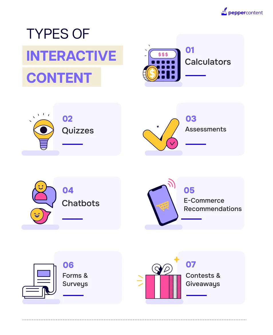
Below the interactive content will find the six secrets broken into their own sections, each with real examples and execution notes. Along the way I will fold in the tips, best practices, and a checklist you can steal outright. Think of this as the working manual I wish someone had handed me before my first calculator build.
Secret 1: Start With the Outcome, Not the Format
The first and most expensive mistake happens before anyone opens a design tool. Teams pick a format first — “let’s do a quiz” — and then reverse-engineer a purpose. That backward approach produces interactive content that looks polished but answers a question nobody asked. Flip the order and everything downstream gets easier.
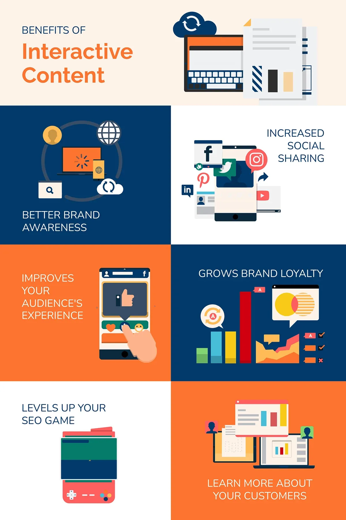
Ask a blunt question: what should change after someone finishes the interactive content experience? Maybe you want their email in exchange for a personalized score. Maybe you want them to understand which pricing tier fits their team size.
Maybe the interactive content just want them to remember your brand three days later. Each of those outcomes points to a different build.
I keep a simple rule. If I cannot finish the sentence “After this interactive content, the user will ___,” the project is not ready to start. Vague goals like “boost engagement” do not count. Measurable ones do: “40% of completers request a demo,” or “average session time on the page doubles.”
Map the Business Goal to a User Reward
Every interaction is a transaction. The user gives you attention, clicks, sometimes an email address. You owe them something back that feels worth more than what they spent. A tax estimator that spits out a number they could not calculate themselves?
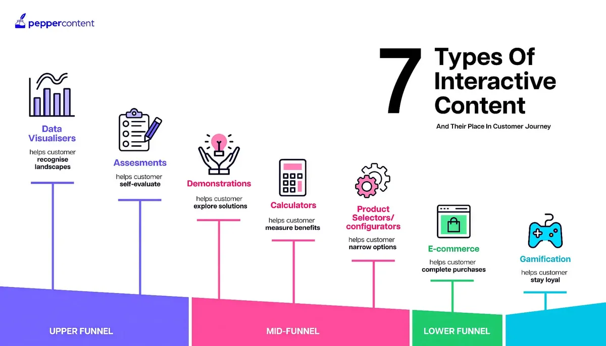
That is a fair trade. Refining each detail of your interactive content strengthens this section. A “which pizza topping are you” quiz that ends in a generic result? That is a withdrawal with no deposit.
The strongest builds pair an internal metric with an external reward. A B2B software company might want qualified leads; the reward is a benchmark report showing how the user’s company stacks up against peers. The lead capture feels earned because the output is genuinely useful. That alignment is the whole game.

Write both sides down before you build. On the left, the business outcome. On the right, the user payoff. If the right column looks thin, no amount of clever design will save the project.
Define Success Metrics Before Launch
Analytics read after the fact are just autopsy reports. Decide up front what “working” looks like. Completion rate is the obvious one, but it is not the only one that matters. Time on page, share rate, email capture rate, and downstream conversion all tell different parts of the story.
I like to set three numbers: a floor, a target, and a stretch. Effective execution in your interactive content makes a tangible difference. If completion drops below the floor, the experience is broken somewhere. If it hits the target, the concept is sound.
The stretch number tells you whether to invest more in the format or retire it. This discipline keeps you from pouring money into a dud because the design looked nice.
A quick benchmark to anchor your thinking: well-built interactive content often clears 50% completion, while weak builds languish under 20%. The gap is rarely about budget. It is about clarity of purpose.
Secret 2: Design One Clear Path With Zero Friction
Friction is the silent killer. Every extra field, every confusing button label, every moment of hesitation costs you participants. The best interactive content feels like sliding down a hill — once you start, momentum carries you to the end. The worst feels like filling out a government form in the dark.
This is where most interactive content tips fall short. They tell you to “keep it simple” without explaining what simplicity actually means in practice. Simplicity is not fewer features. It is a single obvious next step at every moment.
Here is the test I run on every build. Show it to someone who has never seen it and watch their cursor. If they pause, squint, or hover over a button trying to figure out what it does, you have friction. Fix it before launch, not after.
Reduce the Number of Decisions
Each decision point is a place where people drop off. A quiz with twelve branching questions loses more people than one with six. A calculator asking for fifteen inputs loses more than one asking for five. The art is asking only what you truly need to produce a credible result.
I once audited a savings calculator the interactive content requested the user’s zip code, age, income bracket, and household size before showing a single number. Completion was brutal. We cut it to three inputs and gated the detailed result behind an optional email. Completion jumped, and lead quality actually improved because the people who opted in were genuinely invested.
Ask yourself about every field: does the output collapse without the interactive content? If not, cut it or move it behind the result.
Make the First Step Irresistibly Easy
The opening interaction sets the tone. A single tap, a slider drag, a one-question poll — something so easy it feels silly to refuse. Once someone has invested one small action, they are far more likely to take the second. Behavioral scientists call it the foot-in-the-door effect, and it works beautifully in interactive content.
Start with a question that is fun or flattering to answer. “How would you describe your work style?” beats “Please enter your company size” every time. Save the data collection for later, once momentum is on your side.
Watch your first-step abandonment rate closely. If more than a third of visitors bounce before the first click, the entry point is too demanding or too vague.
Secret 3: Make the Payoff Personal and Immediate
Generic results are the fastest way to kill trust. If a personality quiz tells everyone they are “creative and driven,” the participant feels cheated. Personalization is what makes interactive content feel like a conversation rather than a broadcast.
The good news is that personalization does not require machine learning or a massive data operation. It requires paying attention to what the user told you and reflecting it back with specificity. A result that names their exact situation will always outperform one that speaks in generalities.
Immediacy matters just as much. A thoughtful approach to interactive content reinforces your qualifications. The payoff should arrive the moment the last input lands. Any delay — a loading spinner, an email gate before the result — drains the satisfaction you just built.
Use the User’s Own Words
When someone selects “I run a small team of five,” the result should say “for a five-person team” rather than “for small businesses.” Mirroring their input back creates a small jolt of recognition. It signals that the experience was built for them, not for a segment.

This technique is cheap to implement and disproportionately effective. Dynamic text fields, personalized headlines, tailored recommendations — all of it reinforces that the interactive content listened. The user walked in as a stranger and walks out feeling seen.
Test it yourself. Take your result screen and replace every generic phrase with a specific one pulled from user input. The difference in perceived quality is immediate.

Deliver the Result Before Asking for Anything
Gating is a legitimate strategy, but the sequencing matters enormously. Show value first, then ask. A result that appears instantly and then offers “get the full breakdown by email” converts far better than a wall that blocks the result entirely.
The reason is simple reciprocity. Structuring your interactive content around proven patterns ensures impact. You gave them something useful; now the ask feels fair. When you demand the email before delivering, you are asking for trust you have not yet earned. That imbalance shows up in your conversion numbers.
If you must gate, gate the bonus, not the core. Let the headline number through and hold back the detailed report. You will capture more emails and annoy fewer people.
Secret 4: Build for Mobile First and Speed Always
Most interactive content is consumed on a phone, often on a shaky connection, frequently with one thumb. If your build assumes a desktop with a mouse and fast Wi-Fi, you are designing for a minority of your audience. Mobile-first is not a buzzword here; it is the difference between a finished experience and an abandoned one.
Speed compounds the problem. Every second of load time bleeds participants. A heavy interactive content piece that takes six seconds to appear has already lost a meaningful chunk of its audience before the first question renders.
The fix is unglamorous: lighter assets, fewer scripts, and a ruthless commitment to the essentials. The flashiest build in the world is worthless if it never loads.
Thumb-Friendly Interactions
Buttons need to be big enough to tap without precision aiming. Sliders need generous hit areas. Text needs to be readable without pinching. These sound obvious, yet I still see interactive content with tiny tap targets and cramped layouts that only work on a wide screen.
Test on an actual phone, not a resized browser window. Hand it to someone and watch them use it one-handed. You will spot problems in seconds that a desktop preview never reveals.
Keep the interaction model consistent too. Applying these principles to your interactive content yields measurable results. If tapping advances the experience on one screen, swiping should not be required on the next. Predictability reduces cognitive load.
Performance Budgets That Protect Completion
Set a hard performance budget before you build: total page weight under a target, time to interactive under a few seconds, no blocking scripts above the fold. Treat those numbers as non-negotiable, the same way you would treat a legal requirement.

Compress images aggressively. Lazy-load anything below the fold. Defer non-critical scripts. These are standard web practices, but they matter double for interactive content because the experience cannot begin until the machinery is ready.
A useful habit: throttle your connection to a slow 3G setting during testing. If the experience still feels usable, you have built something resilient. If it collapses, you know exactly where to cut.
Secret 5: Write Copy That Pulls People Forward
Design gets the credit, but copy does the heavy lifting. The words on the screen decide whether someone takes the next step or closes the tab. Interactive content lives and dies on microcopy — the button labels, the transitional lines, the result headlines.
Weak copy is passive and vague. Strong copy is active and specific. “Continue” is forgettable. “See my score” tells the user exactly what happens next and why they should care. Small word changes produce measurable lifts in completion.
This is one of those interactive content best practices that gets skipped because it feels less exciting than animation. But a single rewritten button can outperform a week of design polish.
Microcopy That Sets Expectations
Every button should promise an outcome, not a mechanical action. Proper attention to your interactive content sets a strong baseline. “Get my results” beats “Submit.” “Show my match” beats “Next.” The user should always know what they are about to receive.
Progress indicators help too. Telling someone they are on question three of six sets a mental finish line. Without it, the experience feels open-ended, and open-ended experiences invite abandonment.

Keep the tone consistent with your brand, but lean toward warmth and clarity. A little personality goes a long way, as long as it never obscures what the button does.
Transitions That Maintain Momentum
The moments between steps are where attention leaks. A blank screen, a jarring page reload, a delay with no feedback — each one gives the user a reason to leave. Smooth transitions and reassuring microcopy keep the thread intact.
Use short loading messages the interactive content acknowledge what is happening. “Crunching your numbers” is friendlier than a silent spinner. It signals progress and keeps the user oriented.
Celebrate small completions along the way. A subtle checkmark, a progress bar filling up, a quick “nice, halfway there” — these micro-rewards sustain momentum across the whole experience.
Secret 6: Measure, Learn, and Iterate Ruthlessly
Launch is not the finish line; it is the starting gun. The teams that win with interactive content are the ones that treat the first version as a hypothesis and the analytics as the experiment results. They watch, they learn, they tweak, and they ship again.
This is where most organizations stall. They build something, celebrate the launch, and never look back. Six months later the piece is stale, the completion rate has sagged, and nobody knows why. Iteration is the secret that turns a one-off into an asset.
The good news is that iteration is usually cheap. Small changes to copy, flow, or gating often produce outsized gains. You do not need a rebuild; you need a feedback loop.
Read the Drop-Off Map
Your analytics should tell the interactive content exactly where people leave. If 60% abandon on question four, that question is the problem. Maybe it is confusing, maybe it is too personal, maybe it is simply boring. Find the leak and patch it.

Segment the data too. Mobile users may behave differently from desktop users. First-time visitors may drop off where returning visitors sail through. The drop-off map is only useful if you slice it by the variables that matter.
Run a quick session recording or heatmap on the experience. Watching real people hesitate, misclick, or scroll past a key element reveals friction that numbers alone cannot show.
Run Small, Frequent Experiments
You do not need a formal A/B testing program to improve. Change one thing, watch the metric, keep what works. A new headline here, a shortened form there, a repositioned call to action — each is a small bet with a fast payoff.
Keep a simple log of what you changed and what happened. Over time that log becomes your own interactive content playbook, tailored to your audience in a way no generic advice can match.
Set a review cadence. Integrating interactive content into your workflow produces consistent quality. Monthly is plenty for most teams. The point is not constant churn; it is a steady habit of looking, learning, and improving.
The Interactive Content Checklist That Keeps Builds on Track
Before anything ships, run it through a checklist. Not because checklists are magic, but because they catch the expensive oversights that enthusiasm tends to hide. I have watched launches fail over a missing mobile test or an ungated result screen more times than I care to admit.
Here is the interactive content checklist I use. It is short enough to actually complete and thorough enough to catch the usual suspects. Adapt it to your team, but do not skip it.
| Checkpoint | Question to Ask | Pass Criteria |
|---|---|---|
| Purpose | Can I finish “After this, the user will ___”? | A specific, measurable outcome is written down |
| Reward | Is the payoff worth the user’s effort? | The output is something they could not easily get elsewhere |
| Friction | Is there one obvious next step at every screen? | No field or button requires hesitation |
| Personalization | Does the result reflect the user’s own input? | Generic phrases replaced with specific ones |
| Gating | Is the core result shown before any ask? | Value is delivered before the email request |
| Mobile | Does it work one-handed on a real phone? | Tap targets, text, and sliders all pass the thumb test |
| Speed | Does it load fast on a slow connection? | Time to interactive stays within budget |
| Copy | Do buttons promise outcomes? | Labels like “See my score” replace “Submit” |
| Analytics | Are completion and drop-off tracked? | Events fire on every step |
| Iteration | Is there a review cadence? | A monthly check-in is on the calendar |
Print it, share it, tape it to the wall. The checklist is only as good as your willingness to actually run it, but teams that do consistently ship stronger interactive content than teams that wing it.
Common Traps That Undermine Otherwise Good Builds
Even strong ideas stumble on predictable traps. Knowing them in advance saves you a painful round of post-launch repairs. These are the ones I see most often, and each has a straightforward fix.
The first trap is over-design. Teams fall in love with animation and forget the user is trying to get an answer. Every flourish should earn its place by helping the user, not by showing off. When in doubt, cut it.
The second trap is scope creep. Targeted refinements to your interactive content streamline the entire review. A simple quiz becomes a branching epic with twelve outcomes and a custom CMS. The timeline balloons, the launch slips, and the energy drains. Start small, prove the concept, then expand.
Ignoring the Post-Completion Moment
What happens after the result appears? Many builds treat that as the end and leave the user staring at a dead end. It should be the beginning of the next step — a share button, a related resource, a clear path to learn more.
The post-completion screen is prime real estate. It is the moment of peak engagement, when the user is most satisfied and most willing to act. Squander it and you waste the goodwill you just built.
Offer one obvious next action. Not five. One. A single well-chosen call to action converts better than a cluttered menu of options.
Forgetting Accessibility
Interactive content must work for people using screen readers, keyboard navigation, and assistive technology. This is not optional, and it is not difficult if you plan for it from the start. Semantic markup, proper labels, and keyboard support go a long way.
Test with a screen reader at least once. You will discover issues that sighted testing never surfaces. Accessibility improvements often make the experience better for everyone, not just those using assistive tools.
Contrast ratios, focus states, and clear error messages are table stakes. Get them right and your interactive content becomes usable by a wider audience, which is both the right thing to do and a genuine competitive advantage.
Where Interactive Content Fits in Your Larger Strategy
Interactive content does not live in isolation. It is one piece of a broader content ecosystem, and it performs best when it connects to the rest.
A quiz that feeds into a blog series, a calculator that links to a detailed explainer, an assessment that routes to a sales conversation — these are the connections that multiply value.
Think of it as the parent topic of engagement. Everything else — the articles, the videos, the landing pages — can point toward the interactive experience and benefit from the data it captures. The experience becomes a hub rather than a standalone stunt.
This is how you build topical authority. Each interactive piece reinforces the others, creating a web of related content that search engines and readers both recognize as comprehensive.
Feeding the Content Cluster
Every interactive build generates insights the interactive content can reuse. Poll results become data for a blog post. Quiz outcomes reveal what your audience cares about. Calculator inputs show which segments are most engaged. That intelligence feeds your entire content calendar.
Link outward from the experience to related resources, and link inward from your articles to the experience. The cross-linking strengthens both sides and keeps readers moving through your ecosystem instead of bouncing away.
Over time, this cluster compounds. The interactive content attracts visitors, the articles educate them, and the data sharpens everything you publish next.
Frequently Asked Questions About Interactive Content
These are the questions that come up most often when teams start building. Short answers here, deeper dives elsewhere in this guide.
What Makes Interactive Content Different from a Regular Blog Post?
A blog post asks the reader to receive; interactive content asks them to participate. That participation produces personalization, which produces engagement. The reader is not just consuming information, they are generating a result that belongs to them.
The difference shows up in the data. Interactive pieces typically hold attention longer and generate more shares because the experience feels like an event rather than a read.
How Long Should an Interactive Experience Be?
Long enough to deliver a credible result, short enough to finish in a sitting. For most quizzes and calculators, that means a few minutes at most. If the experience drags past five minutes, look for steps to cut.
Respect the user’s time and they will reward you with completion. Overstay your welcome and they will leave, often before the payoff.
Do I Need a Big Budget to Get Started?
No. Some of the most effective interactive content is built with simple tools and a clear idea. A well-designed poll or a single-question assessment can outperform an expensive custom build if the purpose is sharp and the payoff is real.
Start small, measure, and reinvest what works. Competitive direct manufacturer pricing on tools has made entry-level builds genuinely accessible, so the barrier is creativity, not capital.
How Do I Know if It is Working?
Watch completion rate, time on page, share rate, and downstream conversion. Set targets before launch and compare against them. If the numbers clear your floor and approach your target, the build is doing its job.
And listen to qualitative feedback too. Maintaining clarity across your interactive content remains essential. Comments, replies, and direct messages often reveal what the numbers cannot. The combination of data and human signal is what guides good iteration.
Putting the Six Secrets to Work
None of these secrets is complicated on its own. The magic is in the combination. Start with the outcome, design a frictionless path, make the payoff personal, build for mobile and speed, write copy that pulls, and iterate relentlessly. Do all six and your interactive content will outperform almost everything else in your library.
The teams I have seen succeed treat these as habits, not one-time tasks. They run the checklist, they watch the drop-off map, they tweak and ship. The result is a steady stream of experiences that earn attention and convert it into something valuable.
If you take one thing away, make it this: interactive content is a conversation, not a broadcast. Treat the participant as a partner in the exchange, deliver real value, and the results will follow. That is the whole secret, and it never gets old.
For verified reference and background research, consult the authoritative informational resource on this topic.