Critical CSS: 11 Powerful Tips for Better Results
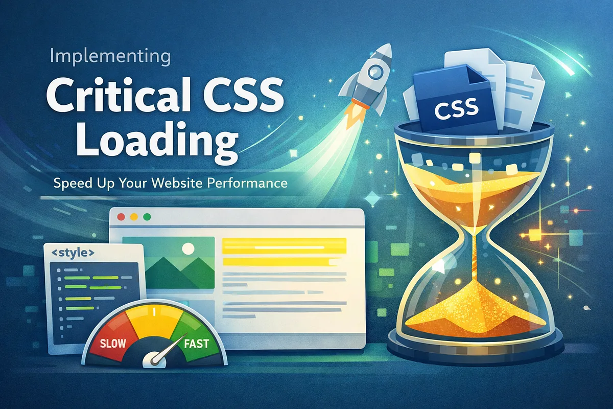
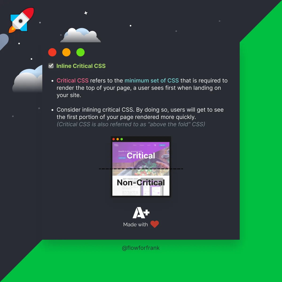
Critical CSS is the practice of extracting the above-the-fold portion of your stylesheet and inlining it directly into the document head so the browser can paint visible content before the rest of the CSS finishes downloading.
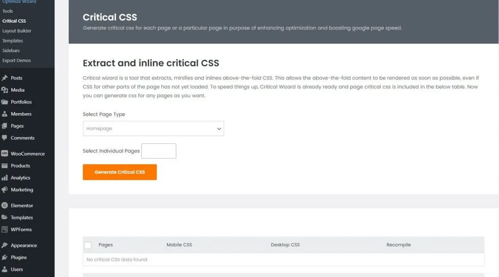
Honestly, most site owners learn this concept the hard way — after a Lighthouse audit screams at them about render-blocking resources. This critical CSS guide walks you through eleven practical tips that turn that audit warning into a measurable speed win.
The goal here is simple: get pixels on screen faster, keep your layout stable, and stop letting a bloated stylesheet hold your first impression hostage, and critical css tips is what the reader checks first. Focusing on critical CSS provides clear direction here. Whether you’re running a WordPress blog, a Shopify storefront, or a custom React app, the same principles apply. Let’s dig in.
Why Critical CSS Still Matters for Core Web Vitals
Before the tips, the critical css need the “why.” Every external stylesheet is a render-blocking resource. The browser downloads your HTML, finds a “ tag, and then sits on its hands until that file arrives and parses. On a slow 3G connection, a 200KB stylesheet can add a full second of blank white screen.
That blank screen is exactly what First Contentful Paint measures. Google’s Core Web Vitals program treats FCP and Largest Contentful Paint as ranking signals, so this isn’t just a vanity metric — it’s money.
Studies from web performance vendors consistently show that every extra second of load time drags conversion rates down by a noticeable margin.
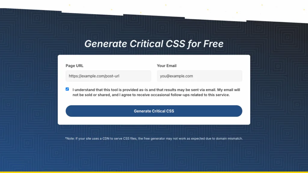
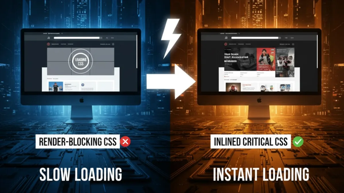
Inlining the styles needed for the first viewport lets the browser paint immediately. The rest of the CSS loads asynchronously in the background. Users see content, the page feels instant, and the audit warnings disappear. That’s the core bargain, and it’s why the technique remains a staple in any serious critical CSS checklist.
Tip 1: Define Your Fold Precisely Before Extracting Anything
Here’s the trap almost everyone falls into: the critical CSS run an automated extraction tool, paste the output, and call it a day. The problem is that “above the fold” is not a fixed pixel value. It shifts with viewport width, device pixel ratio, and even browser chrome height.
A phone in portrait might show only 640 pixels of vertical space. A 27-inch monitor could reveal 1,400 pixels or more. If you extract styles for a single viewport, you’ll either under-deliver (flash of unstyled content on desktop) or over-deliver (bloated inline block that defeats the purpose).
The fix is to decide on a realistic target set. Most teams pick a mobile viewport around 375×667 and a desktop viewport around 1440×900, then merge the required selectors.
According to field data from Chrome UX Report, roughly 60 to 70 percent of traffic on content sites is mobile, so bias your extraction toward the smaller screen.
When in doubt, err on the side of including slightly more CSS rather than less — a few extra kilobytes of inline styles beats a broken hero section.

Tip 2: Automate Extraction With Reliable Tooling
Manual extraction is a fool’s errand on any site with more than a handful of components. You need a build step. The good news is that the ecosystem has matured, and you have solid options depending on your stack.
For Node-based projects, tools like Critical, Penthouse, and Critters handle the heavy lifting. Penthouse runs a headless Chromium instance, loads your page, measures which rules actually apply to visible elements, and outputs a trimmed stylesheet.
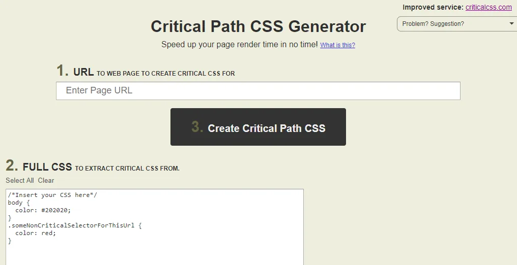
Critters is even more aggressive — it runs at build time with no browser dependency, which makes it fast enough for CI pipelines.
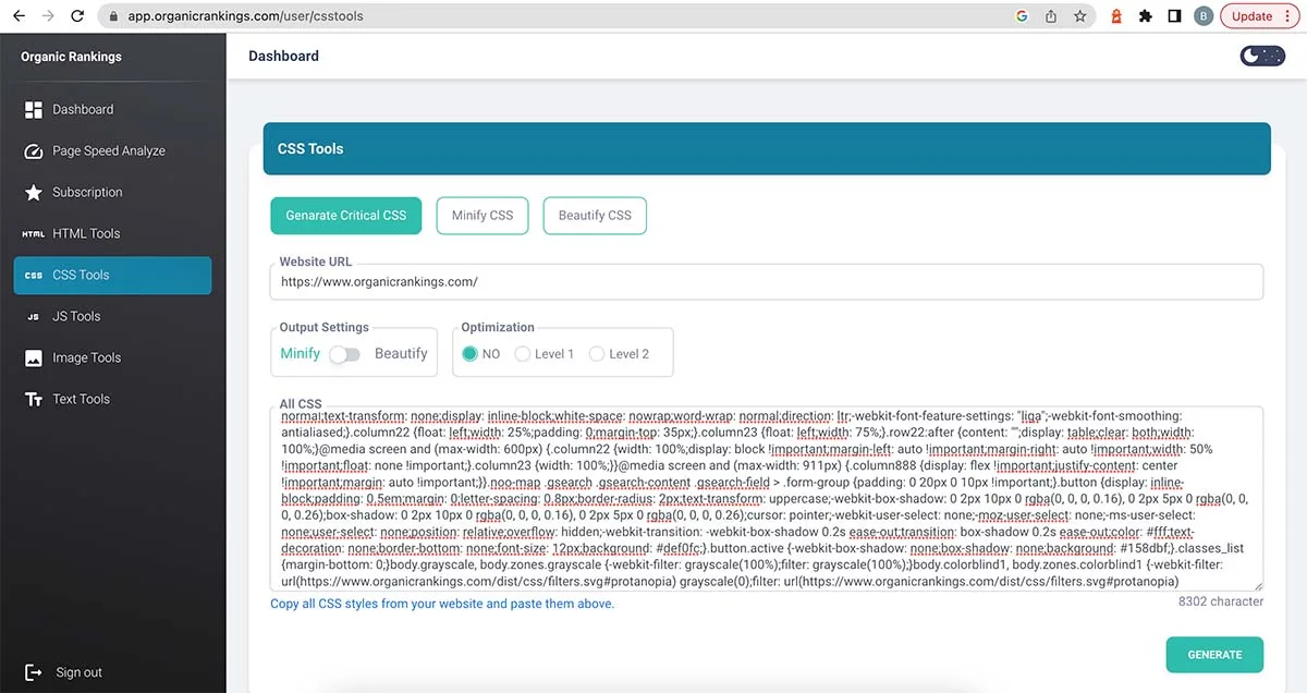
If you’re on WordPress, plugins like Autoptimize and WP Rocket bundle their own extraction engines. For Shopify, apps that generate critical CSS per template are widely available. The key is consistency: whatever tool you pick, run it on every deploy so the inline block never drifts out of sync with your live styles.
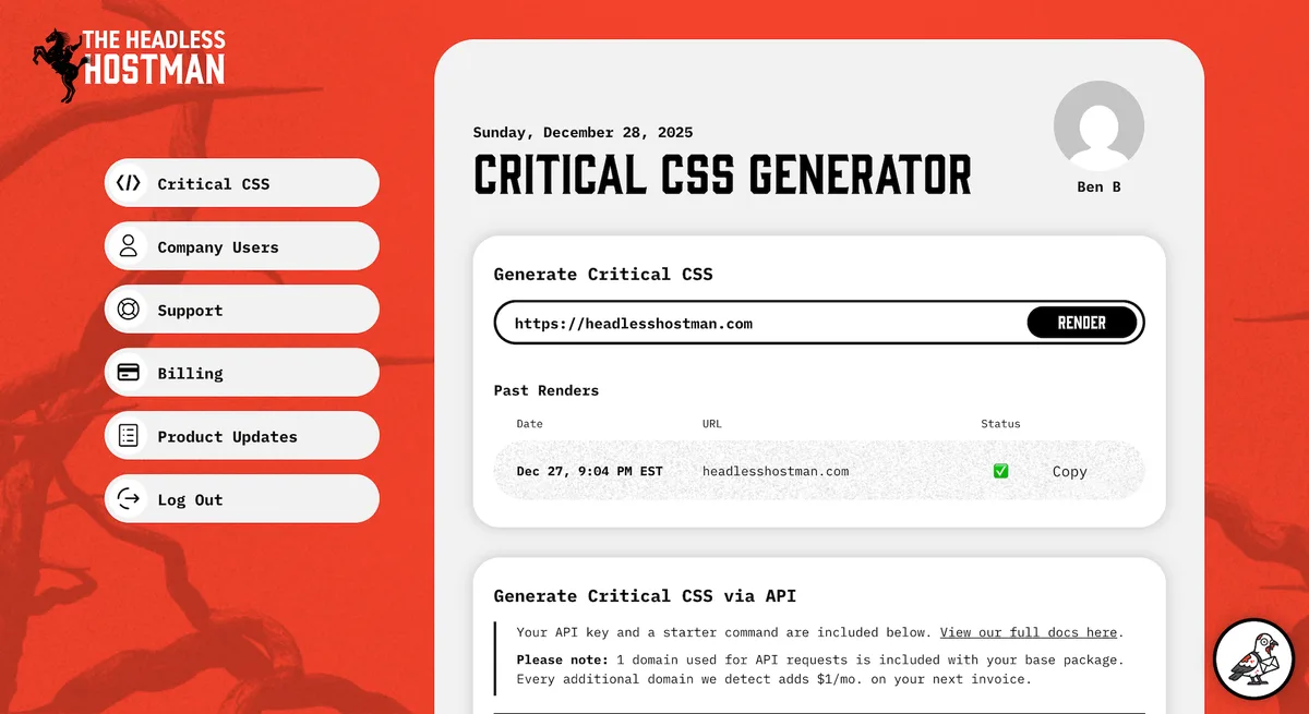
What to Look for in an Extraction Tool
Not all extractors are created equal. Effective execution in your critical CSS makes a tangible difference. You want one that respects media queries, handles pseudo-elements correctly, and can process multiple viewport widths in a single pass.
Bonus points if it supports “force include” rules — a whitelist of selectors that must always be inlined regardless of what the tool detects.
That force-include capability matters more than you’d think. Dynamic components like modals, dropdowns, and cookie banners often live outside the initial viewport but still need their base styles available immediately. Without a whitelist, you’ll get a flash of unstyled content the moment a user interacts.

Tip 3: Keep the Inline Block Under 14KB
This one is a hard rule, not a suggestion. The first TCP round trip can carry roughly 14 kilobytes of compressed data. If your inlined critical CSS fits within that budget, the browser paints on the very first packet — no extra round trips, no waiting.
Exceed it, and you’ve created a new bottleneck. The browser now needs a second round trip just to finish parsing your inline styles, which is arguably worse than the original problem because you’ve added bytes to the HTML document itself.
In practice, most well-optimized sites land between 8KB and 12KB of minified, gzipped inline CSS. If your extraction spits out 30KB, that’s a signal your design system is too heavy or your tool is including too much.
Trim unused utility classes, drop vendor prefixes for browsers you don’t support, and consider splitting the inline block by template type.
| Page Type | Typical Inline Budget | Common Bloat Source |
|---|---|---|
| Blog article | 6–9 KB | Icon fonts, comment widgets |
| E-commerce product page | 10–14 KB | Gallery sliders, variant swatches |
| Landing page | 8–12 KB | Hero animations, form styling |
| Dashboard app | 12–14 KB | Grid framework, chart containers |
Tip 4: Load the Full Stylesheet Asynchronously
Inlining alone doesn’t solve the problem — the critical css just moves it. The remaining CSS still needs to load, and if you leave that “ tag as-is, the browser will block rendering on it anyway. You’ve gained nothing.
The standard pattern uses the `media` attribute trick or a preload hint. The classic approach looks like this: a link tag with `rel=”preload”` and `as=”style”` fires off the request at high priority without blocking render, then a tiny inline script swaps it to a real stylesheet once it arrives.
A cleaner modern alternative is `rel=”preload”` combined with `onload` handlers. Some teams also use the `media=”print”` swap technique, which works in every browser but feels like a hack.
Pick one pattern, document it, and make sure your fallback “ tag includes a standard blocking stylesheet for users with JavaScript disabled — a small but real segment of your audience.</p>
<figure style=”margin:25px auto;text-align:center;max-width:800px;”><img src=”https://topseo.co.id/wp-content/uploads/2026/10/img_f697fc0cbab79ce8d6de47bf8cba6468.webp” alt=”critical css: Tip 11: Document the Process So It Survives Team Changes” loading=”lazy” decoding=”async” style=”width:100%;max-width:100%;height:auto;border-radius:8px;box-shadow:0 4px 12px rgba(0,0,0,0.06);” /></figure>
<h2>Tip 5: Never Inline the Same Rules Twice</h2> <p>Duplicate CSS is the silent killer of this whole strategy. When your extraction tool pulls in a rule and your full stylesheet also ships that same rule, you’ve paid for it twice — once in the HTML, once in the external file.</p> <p>The clean solution is to remove the inlined rules from the main stylesheet at build time. Effective execution in your critical css makes a tangible difference. Some tools do this automatically; others require a post-processing step. Either way, verify it. A simple diff between your inline block and your main CSS file will reveal the overlap.</p>
<figure style=”margin:25px auto;text-align:center;max-width:800px;”><img src=”https://topseo.co.id/wp-content/uploads/2026/10/img_da2df370e0f229b4213b7b1152cd3f03.webp” alt=”Common Critical CSS Mistakes That Undo Your Gains” loading=”lazy” decoding=”async” style=”width:100%;max-width:100%;height:auto;border-radius:8px;box-shadow:0 4px 12px rgba(0,0,0,0.06);” /></figure>
<p>I’ve seen sites shave 15 to 20 percent off their total CSS payload just by deduplicating. It’s unglamorous work, but it’s the kind of discipline that separates a real performance program from a one-off optimization. If you maintain a critical CSS checklist for your team, put deduplication near the top.</p> <h2>Tip 6: Handle Fonts and Icons Separately</h2> <p>Web fonts are their own beast. The browser can’t render text until the font file downloads or a fallback kicks in, which is why font-display strategies matter so much.</p>
<figure style=”margin:25px auto;text-align:center;max-width:800px;”><img src=”https://topseo.co.id/wp-content/uploads/2026/10/img_c685f59bb2d412c94f4eb12a9b0cef3f.webp” alt=”Frequently Asked Questions About Critical CSS” loading=”lazy” decoding=”async” style=”width:100%;max-width:100%;height:auto;border-radius:8px;box-shadow:0 4px 12px rgba(0,0,0,0.06);” /></figure>
<p>But there’s a critical CSS angle here too: your inline block should declare the `@font-face` rules with `font-display: swap` so text appears immediately in a system font.</p> <p>Icon fonts are worse. Maintaining clarity across your critical CSS remains essential. Many sites inline 40KB of icon font CSS for a handful of glyphs used above the fold.</p>
<p>The better move is to extract those icons as inline SVG for above-the-fold elements and load the full icon set lazily, or drop the font entirely in favor of an SVG sprite.</p>
<figure style=”margin:25px auto;text-align:center;max-width:800px;”><img src=”https://topseo.co.id/wp-content/uploads/2026/10/img_7d72cd034d0765c1a7806667c09b2645.webp” alt=”critical css: Where to Go from Here” loading=”lazy” decoding=”async” style=”width:100%;max-width:100%;height:auto;border-radius:8px;box-shadow:0 4px 12px rgba(0,0,0,0.06);” /></figure>
<p>One practical tip from the field: if your hero heading uses a custom font, preload that specific font file with `<link rel=”preload” as=”font” crossorigin>`. It’s a two-line change that routinely improves LCP by several hundred milliseconds on mobile connections.</p> <h2>Tip 7: Test Across Real Devices, Not Just Emulators</h2> <p>Emulators lie. Chrome DevTools throttling gives you a rough picture, but real 4G on a mid-range Android phone behaves differently — especially when the CPU is busy, which is exactly when render-blocking hurts most.</p>
<figure style=”margin:25px auto;text-align:center;max-width:800px;”><img src=”https://topseo.co.id/wp-content/uploads/2026/10/img_af9431fd6376320e8a2ab35a546a20be.webp” alt=”critical css” loading=”lazy” decoding=”async” style=”width:100%;max-width:100%;height:auto;border-radius:8px;box-shadow:0 4px 12px rgba(0,0,0,0.06);” /></figure>
<p>Run your critical CSS through WebPageTest with a real device profile, or better, use the field data in Chrome UX Report to see how actual users experience your LCP. Lab tools tell you what could happen; field data tells you what is happening.</p> <p>Pay special attention to the flash of unstyled content window. Maintaining clarity across your critical css remains essential. If your inline block is missing a rule that the async stylesheet provides, users on slow connections will see a visible reflow. That’s a worse experience than a slightly slower paint, so test on a throttled connection with cache disabled before you ship.</p>
<figure style=”margin:25px auto;text-align:center;max-width:800px;”><img src=”https://topseo.co.id/wp-content/uploads/2026/10/img_d26f0bf5c51f30636f72927111b53961.webp” alt=”critical css” loading=”lazy” decoding=”async” style=”width:100%;max-width:100%;height:auto;border-radius:8px;box-shadow:0 4px 12px rgba(0,0,0,0.06);” /></figure>
<h3>Building a Quick Regression Check</h3> <p>Set up a simple visual regression test the critical CSS screenshots your key templates at 375px and 1440px widths immediately after the inline styles apply. Compare against a baseline. Any layout shift beyond a small threshold flags a missing rule.</p> <p>This catches the subtle bugs — a misaligned grid, a collapsed container, a hero image that jumps — before they reach production. It takes an afternoon to set up and saves you from panicked hotfixes later.</p>
<figure style=”margin:25px auto;text-align:center;max-width:800px;”><img src=”https://topseo.co.id/wp-content/uploads/2026/10/img_22573570a163bd10b0d474f4b8828999.webp” alt=”critical css” loading=”lazy” decoding=”async” style=”width:100%;max-width:100%;height:auto;border-radius:8px;box-shadow:0 4px 12px rgba(0,0,0,0.06);” /></figure>
<h2>Tip 8: Segment by Template, Not by Site</h2> <p>A single global inline block is a compromise that serves no one well. Your homepage, product pages, and blog articles have wildly different above-the-fold layouts. Inlining the union of all three wastes bytes on every page.</p> <p>The smarter approach generates a separate critical CSS file per template. Your CMS or static site generator can map each page type to its own extraction profile, then inject the right block at render time.</p>
<figure style=”margin:25px auto;text-align:center;max-width:800px;”><img src=”https://topseo.co.id/wp-content/uploads/2026/10/img_3e2515e42ad73104dcb86d7ad4704047.webp” alt=”critical css” loading=”lazy” decoding=”async” style=”width:100%;max-width:100%;height:auto;border-radius:8px;box-shadow:0 4px 12px rgba(0,0,0,0.06);” /></figure>
<p>This is more build complexity, but the payoff is real — template-specific blocks often run 30 to 40 percent smaller than a global one.</p> <p>For WordPress sites, the critical CSS means hooking into the template hierarchy and caching per template. For Next.js or similar frameworks, it means generating the block at build time per route. The setup cost is front-loaded, but the ongoing performance gain compounds across every page view.</p>
<figure style=”margin:25px auto;text-align:center;max-width:800px;”><img src=”https://topseo.co.id/wp-content/uploads/2026/10/img_e7d8ed213ccf259af6d50d29d6121203.webp” alt=”critical css” loading=”lazy” decoding=”async” style=”width:100%;max-width:100%;height:auto;border-radius:8px;box-shadow:0 4px 12px rgba(0,0,0,0.06);” /></figure>
<h2>Tip 9: Audit and Prune Unused CSS Regularly</h2> <p>Critical CSS extraction is only as good as the stylesheet it draws from. If your main CSS file has accumulated years of dead rules — old campaign styles, deprecated components, orphaned utility classes — your extraction tool is working with garbage.</p> <p>Tools like PurgeCSS, UnCSS, and the coverage panel in Chrome DevTools reveal how much of your stylesheet actually gets used. It’s common to find that 60 to 80 percent of a legacy stylesheet is dead weight. Pruning that first makes every downstream optimization easier.</p>
<figure style=”margin:25px auto;text-align:center;max-width:800px;”><img src=”https://topseo.co.id/wp-content/uploads/2026/10/img_f6dc32cd2ada69fe2ed102b4a1e8eb9b.webp” alt=”critical css” loading=”lazy” decoding=”async” style=”width:100%;max-width:100%;height:auto;border-radius:8px;box-shadow:0 4px 12px rgba(0,0,0,0.06);” /></figure>
<p>Run a purge pass as part of your release process. Be careful with dynamically generated class names — safelist those explicitly so the purge doesn’t strip styles that only appear after user interaction. A well-maintained critical CSS best practices document should include a quarterly audit cadence.</p> <h2>Tip 10: Measure the Right Metrics After Deployment</h2> <p>The critical css can’t manage what you don’t measure, and the wrong metric will lead you astray. Track First Contentful Paint, Largest Contentful Paint, and Cumulative Layout Shift as your primary trio. Add Total Blocking Time if you want the full picture of interactivity.</p>
<figure style=”margin:25px auto;text-align:center;max-width:800px;”><img src=”https://topseo.co.id/wp-content/uploads/2026/10/img_2b459201ae4e37a146deee5176321a11.webp” alt=”critical css” loading=”lazy” decoding=”async” style=”width:100%;max-width:100%;height:auto;border-radius:8px;box-shadow:0 4px 12px rgba(0,0,0,0.06);” /></figure>
<p>Set up a dashboard that compares lab data (Lighthouse, WebPageTest) against field data (CrUX, your own RUM tool). Lab data tells you what changed in a controlled environment; field data tells you whether real users actually felt the improvement.</p> <p>Watch for regression after each deploy. Applying these principles to your critical CSS yields measurable results. A single new component with heavy CSS can blow your inline budget overnight. Automated budget checks in CI — fail the build if inline CSS exceeds 14KB — catch this before it ships.</p> <h2>Tip 11: Document the Process So It Survives Team Changes</h2> <p>The final tip is the least glamorous and the most important. Every performance technique decays when the person who implemented it leaves. Six months later, someone adds a blocking stylesheet tag, and the whole thing unravels.</p> <p>Write it down. Document which tool generates the inline block, where the force-include whitelist lives, how to regenerate after a design change, and what the size budget is. Put it in your onboarding docs. Add a comment in the code pointing to the documentation.</p> <p>Better yet, automate the guardrails. CI checks that fail on budget overruns, lint rules that flag blocking stylesheet tags, and a monthly report that surfaces any drift. The goal is to make the right thing the easy thing, so the optimization survives long after the initial enthusiasm fades.</p> <h2>Common Critical CSS Mistakes That Undo Your Gains</h2> <p>Even teams the critical CSS follow the tips above stumble on a few recurring pitfalls. The most frequent is forgetting to regenerate the inline block after a design refresh, which leaves users with a stale layout until the async stylesheet loads. The second is inlining rules that depend on JavaScript-applied classes, causing a visible flash when the script runs.</p> <p>Another classic: inlining styles for a component the critical css only appears below the fold, wasting precious bytes on something nobody sees on first paint. And then there’s the forgotten `<noscript>` fallback, which leaves a small but real slice of users staring at unstyled HTML.</p> <p>Audit for these quarterly. A short review catches most of them, and the payoff is a page that consistently paints fast across devices and connections.</p> <h2>Frequently Asked Questions About Critical CSS</h2>
<p>Here is an in-depth breakdown of key considerations regarding this section:</p>
<h3>Does Critical CSS Actually Improve SEO Rankings?</h3> <p>It improves the metrics Google uses as ranking signals — FCP, LCP, and CLS. Faster pages tend to rank better, and they definitely convert better. The technique isn’t a magic ranking button, but it removes a common technical obstacle that holds good content back.</p> <h3>How Much CSS Should be Inlined?</h3> <p>Aim for the smallest amount the critical CSS renders your first viewport correctly, ideally under 14KB compressed. Bigger isn’t better. If your inline block exceeds that budget, trim it or split it by template.</p> <h3>Can I Use Critical CSS on a WordPress Site?</h3> <p>Yes. Plugins like Autoptimize and WP Rocket generate inline blocks automatically, and you can pair them with a caching layer to serve template-specific versions. Just verify the output on a staging site before pushing to production.</p> <h3>What Happens if JavaScript is Disabled?</h3> <p>Your async stylesheet swap depends on JavaScript in most implementations. Always include a `<noscript>` fallback with a standard blocking stylesheet so those users still get a properly styled page.</p> <h3>Is Critical CSS Still Relevant With HTTP/2 and HTTP/3?</h3> <p>Absolutely. Applying these principles to your critical css yields measurable results. Multiplexing reduces the cost of multiple requests, but it doesn’t eliminate render-blocking behavior. The browser still waits for CSS before painting, so inlining the above-the-fold rules remains a valid optimization.</p> <p>For a deeper technical foundation, the <a href=”https://developer.mozilla.org/en-US/docs/Web/Performance/Critical_rendering_path” rel=”noopener”>MDN documentation on the critical rendering path</a> is worth bookmarking.</p> <h2>Where to Go from Here</h2> <p>Start small. Pick your highest-traffic template, run an extraction tool against it, inline the output, and measure the before-and-after FCP. Once you see the improvement, expand to other templates and automate the process in your build pipeline.</p> <p>The eleven tips above form a complete critical CSS checklist you can hand to any developer on your team. Combine them with regular audits, a documented process, and CI guardrails, and the gains will hold up long after the initial optimization sprint ends.</p> <p>Treat critical CSS as an ongoing discipline rather than a one-time fix. Sites evolve, designs change, and new components sneak in. The teams that win are the ones that build the practice into their workflow — and the results show up in faster paints, happier users, and healthier Core Web Vitals scores across the board.</p>
<p><a href=”https://topseo.co.id” rel=”nofollow noopener”>related article archive</a></p>
<script type=”application/ld+json”>
{
“@context”: “https://schema.org”,
“@type”: “Article”,
“headline”: “Critical CSS: 11 Powerful Tips for Better Results”,
“inLanguage”: “en-US”,
“author”: {
“@type”: “Organization”,
“name”: “TOP SEO”,
“url”: “https://topseo.co.id”
},
“publisher”: {
“@type”: “Organization”,
“name”: “TOP SEO”,
“url”: “https://topseo.co.id”
},
“datePublished”: “2026-10-28T15:58:57+00:00”,
“dateModified”: “2026-10-28T15:58:57+00:00”,
“description”: “Critical CSS is the practice of extracting the above-the-fold portion of your stylesheet and inlining it directly into the document head so the browser can paint visible content before the rest of the”,
“image”: [
“https://topseo.co.id/wp-content/uploads/2026/10/img_d706f048fe2dba67e929925b2dc0e336.webp”
],
“mainEntityOfPage”: “https://topseo.co.id/critical-css/”
}
</script>
<script type=”application/ld+json”>
{
“@context”: “https://schema.org”,
“@type”: “FAQPage”,
“mainEntity”: [
{
“@type”: “Question”,
“name”: “Does Critical CSS Actually Improve SEO Rankings?”,
“acceptedAnswer”: {
“@type”: “Answer”,
“text”: “It improves the metrics Google uses as ranking signals — FCP, LCP, and CLS. Faster pages tend to rank better, and they definitely convert better. The technique isn’t a magic ranking button, but it removes a common technical obstacle that holds good content back.”
}
},
{
“@type”: “Question”,
“name”: “How Much CSS Should be Inlined?”,
“acceptedAnswer”: {
“@type”: “Answer”,
“text”: “Aim for the smallest amount that renders your first viewport correctly, ideally under 14KB compressed. Bigger isn’t better. If your inline block exceeds that budget, trim it or split it by template.”
}
},
{
“@type”: “Question”,
“name”: “Can I Use Critical CSS on a WordPress Site?”,
“acceptedAnswer”: {
“@type”: “Answer”,
“text”: “Yes. Plugins like Autoptimize and WP Rocket generate inline blocks automatically, and you can pair them with a caching layer to serve template-specific versions. Just verify the output on a staging site before pushing to production.”
}
},
{
“@type”: “Question”,
“name”: “What Happens if JavaScript is Disabled?”,
“acceptedAnswer”: {
“@type”: “Answer”,
“text”: “Your async stylesheet swap depends on JavaScript in most implementations. Always include a “ fallback with a standard blocking stylesheet so those users still get a properly styled page.”
}
},
{
“@type”: “Question”,
“name”: “Is Critical CSS Still Relevant With HTTP/2 and HTTP/3?”,
“acceptedAnswer”: {
“@type”: “Answer”,
“text”: “Absolutely. Multiplexing reduces the cost of multiple requests, but it doesn’t eliminate render-blocking behavior. The browser still waits for CSS before painting, so inlining the above-the-fold rules remains a valid optimization.”
}
}
]
}
</script>
<!– TOPSEO: keywords=”critical css, critical css guide, critical css tips, critical css best practices, critical css checklist” description=”” –>