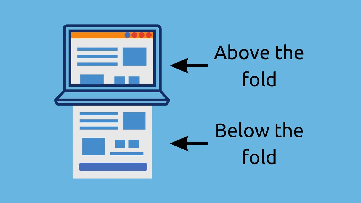
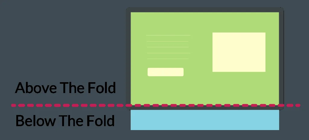
Above the fold content is the portion of a page a visitor sees before scrolling, and it decides whether the rest of your work ever gets read. Think of it as the handshake before the conversation. Nobody owes you their attention past the first screen.
This is the parent topic behind every conversion rate debate, every heat map argument, and every redesign meeting that ran too long. So let’s treat it properly, from definition to execution, with the kind of detail that actually changes how you build pages.
What is Above the Fold Content, Exactly?
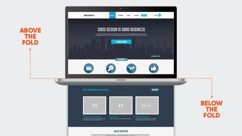
The term borrows from newspaper publishing. Focusing on above the fold content provides clear direction here. Broadsheets were folded in half for delivery, and whatever sat in the top half of the front page got seen on a newsstand. Editors fought over that space because it was the only guaranteed eyeball time they had.
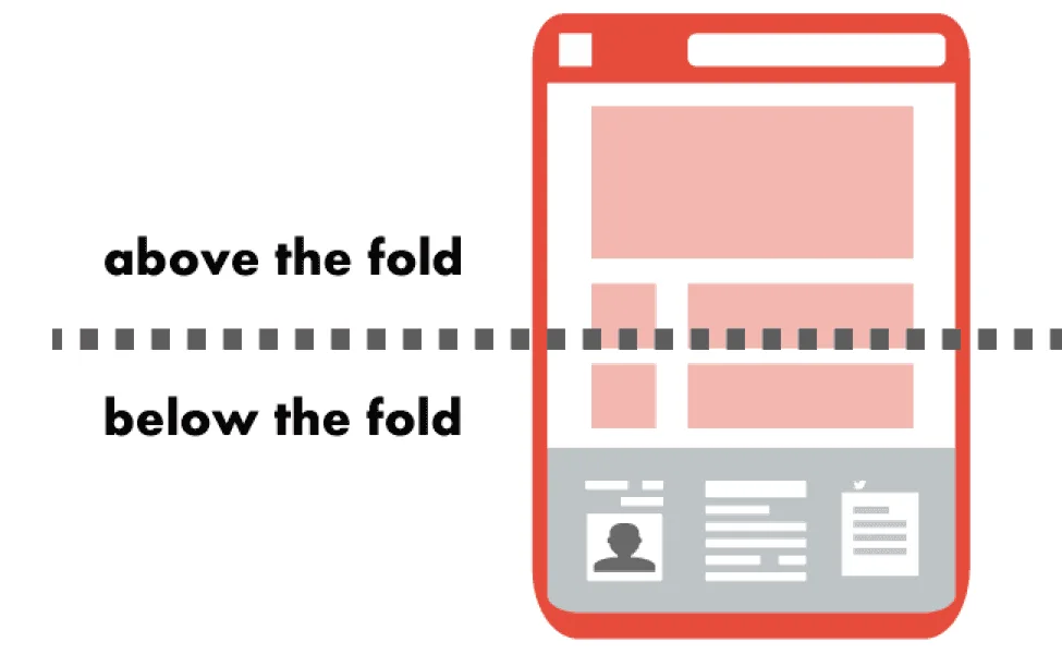
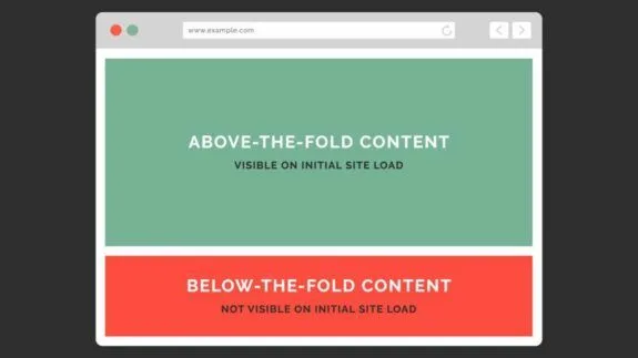
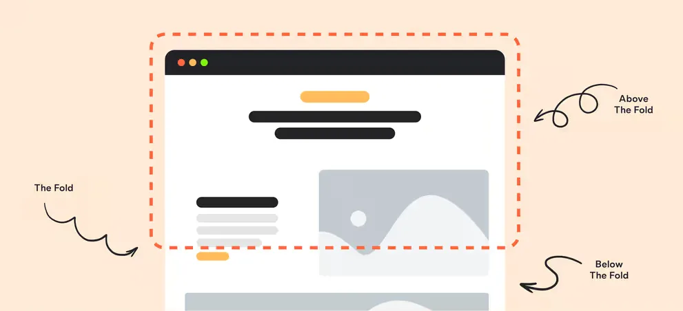
Digital inherited the logic and, honestly, sharpened the Above the fold content. On a screen, the fold is simply where the viewport ends. Everything above that invisible line loads in the first impression; everything below waits for a scroll signal that may never come.
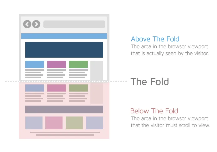
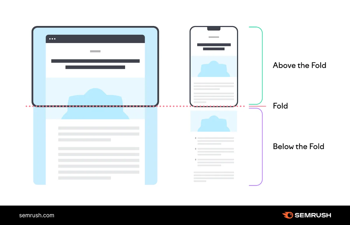
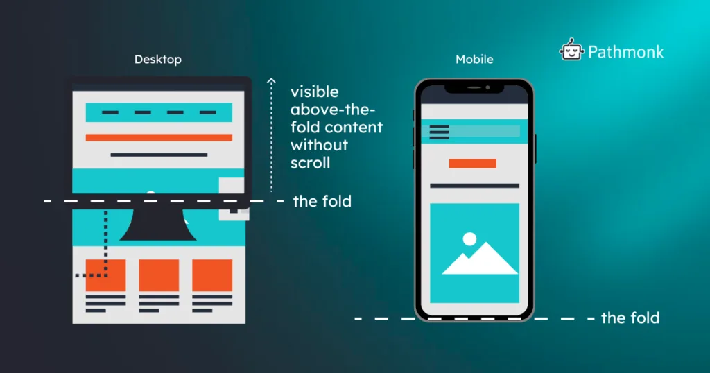
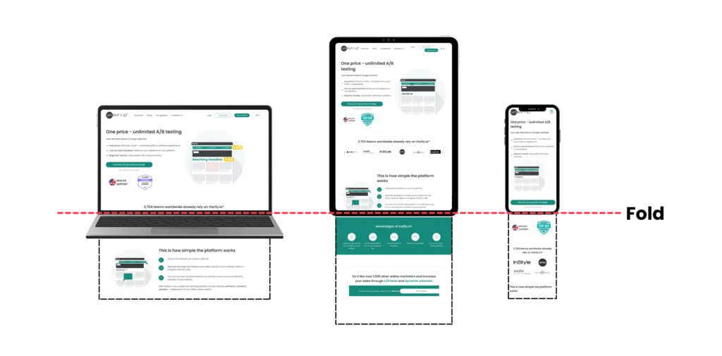
Here’s the part most people get wrong: the fold is not a fixed pixel value. Refining each detail of your above the fold content strengthens this section. It moves. It shifts with screen size, browser chrome, device orientation, and font rendering.
A fold position that looks generous on a 27-inch monitor can choke a phone into showing nothing but a logo and a hero image.
Why the Fold is Not a Fixed 600 Pixels Anymore
The old advice said design for 600 pixels tall and the Above the fold content’re safe. That number came from desktop-era display math and it aged badly. Mobile viewports started shrinking while phones got physically taller, laptop screens got shorter and wider, and browser toolbars began eating vertical space at unpredictable rates.
Practically, the above the fold content means you should stop measuring in pixels and start measuring in content units. Ask a different question: how many meaningful elements survive in the smallest realistic viewport? On a 375-pixel-wide phone with browser UI active, you might have 550 vertical pixels to work with. That’s enough for a headline and a subhead, maybe a button, and not much else.
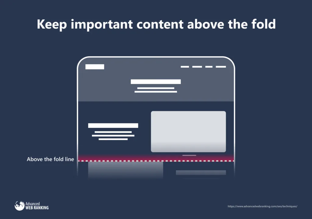
Test on real devices, not just a resizable browser window. Effective execution in your Above the fold content makes a tangible difference. Grab three phones from different price tiers plus an older laptop. The differences will surprise you, and that surprise is exactly the insight most teams skip.
The Core Job of Above the Fold Content: Answer Three Questions Fast
Visitors run a silent interrogation in the first two seconds. What is this? Is it for me? What do I do next? If your above the fold content doesn’t answer all three, the visitor bounces with a shrug you’ll never see in analytics.
The “what is the above the fold content” question wants clarity, not cleverness. A vague poetic headline fails here even if it wins design awards. The “is it for me” question wants a specific audience signal, a price hint, a use case, or a location. The “what next” question wants a visible, unambiguous action.
Notice that none of those three questions require a video, a carousel, or an animated gradient. Most above the fold content failures are clarity failures dressed up as aesthetic ones.
Clarity Beats Cleverness Every Single Time
A headline the Above the fold content requires a second read has already lost. This is the hill I’ll die on after watching hundreds of session recordings: the wittiest headlines produce the longest hesitation pauses before the first click.
Try a blunt test on your own page. A thoughtful approach to above the fold content reinforces your qualifications. Cover everything except the headline and subheadline. Hand it to someone unfamiliar with your business and ask what you sell. If they hesitate, rewrite. That’s the whole diagnostic.
Specificity is the fastest fix. “Helping Businesses Grow” says nothing. “Bookkeeping For Independent Restaurants Under 50 Seats” says everything, and the right visitor feels personally addressed.
A Practical Above the Fold Content Checklist for Every Page
You wanted something you can hand to a designer or developer on Monday morning. Here it is. Run this above the fold content checklist on every template you own, not just the homepage, because category pages and service pages often carry worse fold problems than the front door.
- Headline states the offering in plain language. One line, no puns, no internal jargon. Reads correctly when the reader is distracted and half-scrolling.
- Subheadline names the audience or the outcome. This is where specificity lives. Mention who it’s for, what changes, or what it costs in broad terms.
- Primary action is visible without scrolling. One button, high contrast, verb-driven label. Secondary actions are allowed but must be visually subordinate.
- Brand identity is legible in under a second. Logo plus one supporting signal. If a stranger can’t tell what kind of company this is, you’ve over-designed.
- Value proposition is specific enough to be falsifiable. “Fast” is unfalsifiable. “Delivered in 48 hours” is a claim someone can check.
- Social proof sits within the first screen where possible. A rating, a client count, a recognizable logo strip. Small, quiet, credible.
- Navigation stays minimal and predictable. Five primary links maximum. Every extra link is a competing exit.
- Load time is under 2.5 seconds for the hero area. Largest Contentful Paint above three seconds is a fold problem disguised as a performance problem.
- Contrast passes accessibility thresholds. Text on hero images fails constantly. Overlay scrims and solid panels fix it cheaply.
- The design holds at 320 pixels wide. Not 375. Test the smallest realistic width and confirm nothing critical clips or stacks out of view.
Print it. Structuring your above the fold content around proven patterns ensures impact. Tape it to a monitor. Most redesign arguments dissolve once everyone agrees on the same ten items.
Above the Fold Content Best Practices That Survive Real Traffic
Best practices earn their name only when they hold up under messy real-world conditions: slow phones, distracted users, odd referral sources. These above the fold content best practices pass that test because they’re structural rather than stylistic.
Lead With the Outcome, Not the Origin Story
Founders love the “the Above the fold content started in a garage” opening. Visitors mostly don’t care until they already trust you. Put the outcome in the fold and the origin story in the About page where it belongs.
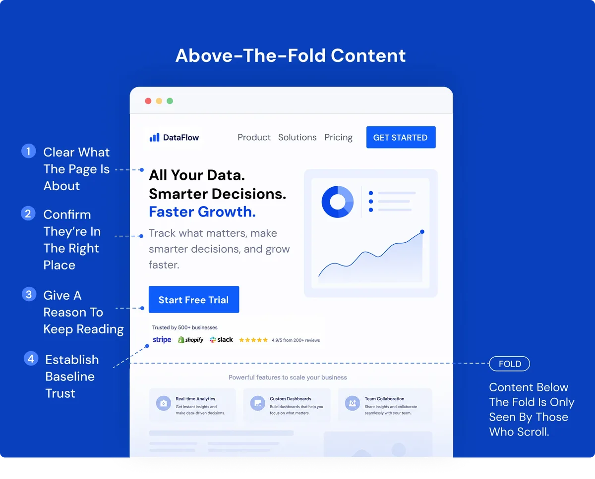
The above the fold content framing works because it maps directly to the visitor’s internal monologue. They’re not shopping for your history. They’re shopping for a change in their own situation.
Design for the Thumb, Not Just the Eye
Roughly half your traffic is one-handed on a phone. Anything in the bottom third of the first screen competes with a thumb that’s already reaching.
That means the primary button shouldn’t sit exactly at the fold edge on mobile; it should sit comfortably above it.
Sticky headers complicate this further. Proper attention to your above the fold content sets a strong baseline. A 60-pixel sticky navigation bar consumes real estate from every screen, especially on small devices. Test with the header rendered, not just in design specs.
Keep Hero Media Optional, Not Mandatory
Full-bleed video feels premium and costs conversion when the Above the fold content delays paint. If the video adds informational value, keep it. If it’s ambience, consider a static frame with the same composition and a fraction of the payload.
A useful rule: the hero media should earn its weight by answering one of the three questions. Developing your above the fold content with precision highlights key strengths. Decoration doesn’t qualify.
Reserve Space for Social Proof from Day One
Retrofitting a trust element into a tight layout always looks bolted on. Maintaining clarity across your Above the fold content remains essential. Design the slot early, even before you have reviews to fill it. Ratings, customer counts, and certification badges slot in naturally when the layout anticipates them.
Above the Fold Content Tips for Higher Engagement and Lower Bounce
These are the practical above the fold content tips that produce measurable movement. They’re cheap to test, fast to implement, and mostly invisible to visitors when done well.
- Reduce the headline to seven words or fewer. Shorter headlines read in a single fixation. Longer ones require a second pass, which is a second chance to leave.
- Cut adjectives, add numbers. “Powerful analytics” is forgettable. “Track 40 metrics in one dashboard” is memorable, comparable, and specific.
- Use one action color across the whole interface. Multiple bright buttons of equal weight create choice paralysis. One primary color, one primary action.
- Move price qualifiers into the fold when price is the objection. “From $X” or “No setup fee” preempts the most common hesitation before it forms.
- Kill the rotating carousel. Slider engagement drops after the first slide in nearly every test I’ve reviewed. Show one message properly.
- Add a single trust signal, not five. One rating beats four stacked badges. Too much proof reads as insecurity.
- Write button labels as first-person outcomes. “Get My Report” outperforms “Submit” in most A/B tests, though the gap narrows on utilitarian interfaces.
- Keep the fold consistent across pages. Visitors compare subpages, and a layout that shifts wildly between them erodes trust.
- Use real copy in design mockups. Lorem ipsum hides the biggest risk: the actual headline that’s twice as long as the placeholder.
- Track scroll depth, not just bounce rate. A high bounce from a page that answers the question fully isn’t a failure.
Pick two or three of the above the fold content per sprint. Test them individually. Stacked changes create results you can’t attribute, which means you learn nothing even when the numbers improve.
How to Measure Whether Your Above the Fold Content Actually Works
Measurement is where most teams go lazy. They check bounce rate, feel something, and either panic or celebrate. Neither reaction is grounded until you look at four metrics together.
Scroll depth tells the above the fold content how far people travel. Time-on-page tells you whether they lingered. Click-through on the primary action tells you whether the message led somewhere. And a session recording sample of 50 sessions tells you what the numbers can’t: hesitation, misclicks, and confusion.
The Four Metrics Worth Tracking Together
Bounce rate alone is a trap. Someone who found the phone number in the fold and called immediately registers as a bounce, even though the page did its job perfectly. Pair it with intent signals or you’re optimizing for a metric that actively punishes good above the fold content.
Scroll depth is more honest. If 70% of visitors never scroll past the first screen, then 70% of your page is furniture. That’s not a failure state necessarily; it’s data. It tells you whether the fold carries the full message or functions as a teaser.
Interpreting Heat Maps Without Fooling Yourself
Click maps show where people click, not where the above the fold content look. Someone tapping a non-linked headline is telling you it looks clickable, which is a fixable design problem. Rage-click clusters on static text are the clearest signal you’ll get.
Scroll maps are more useful for fold decisions. The heat drop-off curve shows you the exact point where attention ends. If that cliff sits just below your hero, your above the fold content is overstuffed or your scroll cue is missing.
One caveat worth stating plainly: heat map data from a tool that only samples a small percentage of sessions can mislead on low-traffic pages. Combine it with session recordings and you’ll see the full picture.
Above the Fold Content Guide for Mobile Screens
Mobile is where the fold punishes everyone equally. There’s simply not enough vertical space to cram in a desktop layout, and shrinking it produces a page where nothing is legible.
A sound approach is to treat mobile as the primary design and desktop as the generous version. Do the opposite and you’ll spend weeks fixing overflow. Think about the visual hierarchy on a phone. Eye, thumb, and scroll gesture are all competing for one narrow column.
Prioritization and Hierarchy on a Narrow Viewport
Order of importance on a phone: what the above the fold content is, then the action, then the supporting proof. Not logo, not navigation menu, not a hero slider. Those can come after the message lands.
The headline should own the top third. The action button should sit within easy thumb reach. Social proof, if it’s in the fold at all, gets one compact line.
One underrated trick: use visual weight to fake hierarchy. A heavy weight headline paired with a light subhead reads faster than a headline plus decorative subhead with extra copy.
Above the Fold Content and Search Results: the Modern View
For years, an old heuristic suggested pages needed enough content above the fold to look substantive to search evaluators. That guidance was widely misread, and the misreading damaged a lot of otherwise fine pages.

The real issue wasn’t fold position. It was intent matching and layout quality. Google’s Page Layout guidance and the Helpful Content framework both circle the same principle: pages that exist to serve ads at the expense of the visitor get filtered out. Pages that answer the query clearly, regardless of layout, don’t.
So treat the fold as a UX concern, not a ranking lever. Build it for people, and the search consequences tend to follow. If you’re optimizing the fold exclusively for crawlers, you’re solving the wrong problem.
Why “Content Above the Fold” Doesn’t Mean What It Used To
Older SEO advice conflated “above the fold” with “the top of the page’s main content area.” That’s a different question: how much of the primary message appears before any interstitial, ad, or layout block interrupts it.
On a news article, the fold question is whether the headline and lede appear without an ad wall. On a product page, it’s whether price and shipping surface quickly. Same word, two entirely different design conversations.
Both matter. Neither is solved by pixel math.
Common Mistakes That Kill Above the Fold Content Performance
Most failures follow recognizable patterns. Naming them makes them easier to spot before launch day rather than three weeks into a paid campaign.
- The clever-but-cryptic headline. Reviewer favorite, visitor mystery. The fix is reading it aloud to someone outside the company.
- A brand hero that ignores the product. Beautiful lifestyle photography with zero information. Aesthetics earn a scroll; information earns a click.
- Two competing buttons. “Sign up” and “Learn more” sitting side by side at identical visual weight invites hesitation. Primary and secondary should be obvious at a glance.
- Auto-playing audio or motion. The most reliable bounce generator ever invented. Never autoplay sound, and pause motion off-screen.
- Navigation that swallows the message. Oversized sticky menus that take 120 pixels of a 600-pixel viewport leave no room for the offering.
- Hidden or missing calls-to-action. A button obscured by design flourish may as well not exist. Contrast, size, and position must all cooperate.
- Copy written for company insiders. Internal jargon makes visitors feel they’re in the wrong place. Write for a stranger with an adjacent problem.
- Cookie and newsletter overlays on load. Anything that blocks the fold instantly costs a sliver of trust. Ask for permission later, or make it tiny.
- Hero video with no fallback frame. Slow connections see a blank box where your brand should be. Set a poster image.
- Designing for one screen size in isolation. A fold that only works at 1440p is a fold that fails for the majority of visitors.
The two-button problem deserves extra attention. It’s the most common, most fixable, and most expensive of the group. Every additional competing action at the fold meaningfully reduces conversion on the primary action. Pick one winner.
Above the Fold Content Checklist: a Ten-Minute Audit You Can Run Today
The above the fold content don’t need a research budget to improve this. You need a checklist you’ll actually use, ten minutes, and the willingness to look at your page the way a stranger would.
The audit works on any page: homepage, landing page, service page, product detail. Run it before launch, and again thirty days later when you’ve stopped seeing the flaws.
- Squint test. Zoom out or squint at your page. Can you still identify the offering and the action? If everything blurs evenly, your hierarchy is unformed.
- Stranger test. Show the fold to someone unfamiliar with your business. Ask them to describe what you sell, who it’s for, and what they’d click first. Any hesitation is a finding.
- Small-screen test. Open the page on a 320-pixel-wide viewport. Confirm the headline, key proof, and primary action all fit without horizontal scroll.
- Slow-connection test. Throttle the connection. Watch what appears in the first two seconds. If the fold is blank for longer, the message is late.
- Accessibility contrast check. Run a contrast checker on every text-on-image pair. Fix anything below the WCAG AA ratio.
- Distraction count. Count every clickable element in the fold. If the number exceeds six, cull until only the essentials remain.
- Copy length test. Read the headline aloud. If you run out of breath, chop it. Seven to ten words is a healthy ceiling.
- Trust-signal inventory. Confirm at least one piece of credible proof exists in the first screen. Ratings, certification, or a recognizable logo, sized appropriately.
- Action-color uniqueness. Check that exactly one bright, primary action color appears in the fold. Secondary actions should be muted.
- Overlay inventory. Disable every consent banner, chat bubble, and newsletter popup. Recheck the fold. If the layout collapses without them, the design is too tight.
The above the fold content last one catches teams constantly. The chat widget looks small in isolation and simultaneously hides your primary button on a small screen. Audit with the canvas covered.
Above the Fold Content Checklist: a Comparison Table for Layout Types
Different page types demand different folds. What works for a SaaS landing page falls flat on a news article or a product detail page. This table is a quick reference for how the same checklist translates across common layouts.
| Page Type | Primary Fold Goal | Must-Have Elements | Watch Out For |
|---|---|---|---|
| Homepage | Orient the visitor and offer one clear next step | Headline, audience signal, one CTA, minimal nav | Hero bloat, oversized slider, zero proof |
| SaaS Landing | Convert intent from a paid ad | Problem statement, outcome promise, primary CTA, logo strip | Feature dump, detached headline from ad copy |
| Ecommerce Product | Price and add-to-cart in view | Product image, price, shipping signal, buy button | Hidden price, gallery absorbing vertical space |
| Blog / Article | Deliver the headline and first paragraph | Headline, byline, lede, publish date | Interstitial ads, newsletter overlays on load |
| Service Page | Establish location or niche fit | Specific headline, service list snippet, contact CTA | Generic copy, hidden phone number on mobile |
| Signup / Checkout | Reduce abandonment anxiety | Step indicator, price, trust badge, form start | Unexpected fees, aggressive upsells, distracting links |
Print this alongside the checklist. The two together answer most launch-day arguments without a meeting.
How to Test and Iterate on the Fold Over Time
Optimization isn’t a one-time event. Traffic sources shift, ad creative changes, seasonal interest moves your visitors’ mood. The fold that converted in a quiet period can lose its edge during a promotion.

The testing cadence the above the fold content works: one structural test per quarter, one copy test per month, and continuous passive monitoring of scroll depth. That’s it. Anything more aggressive produces overlapping effects with no clear attribution.
What to A/B Test First When Results Look Flat
Start with the headline. It’s the single highest-leverage element and the easiest to test with confidence. A headline test usually moves conversion by a wider margin than any button color test, and it doesn’t require a design change.

Next test the primary CTA label. Outcome-focused verbs beat generic ones in most tests. Then test the proof element. Ratings, logos, and count-based measures each have different emotional weight, so try them one at a time.
Resist testing the hero image until the earlier tests are settled. Image tests are noisy, and their results rarely hold across devices. The exception is when the image contains critical information, such as a product shot for a physical good.

Reading Results Honestly
Two things kill test results: insufficient sample size and premature stopping. A test that reaches significance after fifty visitors and then reverses by the hundredth is more common than most teams realize.
Run to the planned sample. Pre-commit before you start. If you don’t have the traffic to reach significance on a small change, then don’t test small changes. Test structural ones or test nothing.
What Most Teams Get Wrong About the Fold
The above the fold content’s a persistent myth that visitors “never scroll.” They scroll, and they scroll plenty. The real problem is that many pages give them no reason to continue. Friction, not laziness, is the enemy.
Another myth treats the fold as a hard boundary. It isn’t. It’s a soft threshold, and the most effective pages design a scroll cue into the layout so that the fold becomes an invitation rather than a cutoff point.
Visitors Do Scroll, but They Need a Reason
A peek of the next section, a chevron icon, or a headline the above the fold content continues below the fold can all trigger a scroll. The key is giving the eye something worth reaching for, and most pages neglect this entirely.
Test this directly. Take your highest-value section and reposition it just below the fold. If engagement drops meaningfully, the fold is functioning as a wall. If engagement holds, you’ve identified a scalable layout pattern.
When a Minimal Fold Beats a Busy One
Minimalism wins in contexts where the visitor is already committed: post-purchase pages, member dashboards, and article pages with an established readership. On a cold visit from a paid ad, minimal folds underperform because they fail the “is it for me” test.
Match your design to the intent level. Cold traffic needs reassurance and specificity. Warm traffic needs only direction.
Real-World Examples: How Above the Fold Content Plays Out in Practice
Two scenarios illustrate what actually changes when the above the fold content audit the fold. Both are common enough that you’ll likely recognize your own site in one of them.
A Local Service Business With a Vanishing Fold on Mobile
A neighborhood HVAC contractor had a homepage that worked beautifully on a desktop monitor. On a phone, the sticky navigation, oversized logo hero, and hero video pushed the “Call Now” button entirely below the fold.
The fix took two hours of engineering time: shorten the navigation, replace the video with a poster frame, move the phone number into a button the above the fold content persists. Over the following three weeks, phone inquiries from mobile visitors increased by a margin the team hadn’t expected. No copy changes, no new photography, no paid ads.
The lesson wasn’t about design taste. The business had always been good at the thing it sold. The fold was simply hiding the phone number from the people most likely to call.
A B2B SaaS Page With Too Many Choices
A mid-market software company saw its paid campaign underperform despite strong ad copy. Clear alignment with your above the fold content builds confidence from the start. Their trial landing page offered four actions above the fold: start a trial, book a demo, read documentation, and sign in.
The team cut it to one primary action with a small “or book a demo” text link, moved sign-in to the header, and added a logo strip that had previously been buried three sections down. They kept the ad copy exactly as it was.
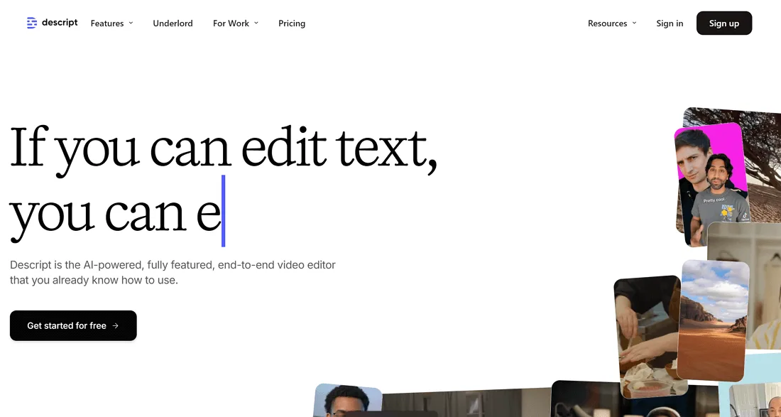
Conversion on the primary action roughly doubled over the next month. Integrating above the fold content into your workflow produces consistent quality. Nothing about the offer changed. The offer was just visible now.
Above the Fold Content Tips for Teams Without a Designer
Small businesses and lean marketing teams often handle this without dedicated design support. That’s workable. You don’t need typography credentials to get the fold right, just a willingness to sacrifice decoration for clarity.
Use a template. Targeted refinements to your above the fold content streamline the entire review. A good template handles the layout math for you. Then strip it back. Your job is subtraction, not addition.
The Minimum Viable Fold
A minimum viable fold has four parts. A clear headline. A subhead that names the audience or outcome. One primary button. One form of proof. That’s enough. Anything more is optional.
Building outward from the above the fold content four elements helps teams avoid the trap of cramming. Every extra element gets justified against the four, and most of them fail the test.
Consider testing the “no hero image” version of your page. On text-heavy offerings, it often outperforms the version with photography. Visitors come for information, and the blank space earns back the attention.
Where DIY Design Goes Wrong
The most common DIY failure is forgetting mobile. Full-bleed text on a phone often overflows or truncates. Test before publishing, not after.
Second failure: too many fonts and colors competing for attention. Two fonts and one accent color is a complete system. More is clutter.
Third: placeholder copy left in place. Lorem ipsum has launched more confusing pages than most teams would admit.
Frequently Asked Questions About Above the Fold Content
These are the questions that come up most often in audits and workshops. Each is answered directly, then unpacked with a bit more depth for the situations where the short answer isn’t quite enough.
What is Above the Fold Content on a Website?
The above the fold content’s the portion of a page visible in the viewport before any scrolling. On a standard desktop, that’s roughly the top 600 to 800 pixels. On a phone, it’s usually less.
Its job is to answer three questions quickly: what is this, is it for me, what do I do next. If any of those go unanswered, the visitor has to decide whether scrolling is worth it, and most won’t bother.
How Tall Should the Fold Be?
The above the fold content’s no universal answer because the fold is a moving target. Design for the smallest realistic viewport, which is typically a phone around 320 to 375 pixels wide with browser chrome active.
At that size, expect roughly 500 to 600 pixels of usable vertical space. Design the essential message to fit in that window and let the layout breathe on larger screens through responsive scaling.
Does Above the Fold Content Still Affect SEO?
Not directly, at least not through a fixed pixel rule. Search engines care about intent matching, page quality, and layout intrusiveness. A page that hides its main answer behind ads or interstitials will be penalized regardless of fold position.
Practically, a clean fold improves engagement signals, time on page, and scroll depth. Those correlate with positive outcomes, though they aren’t direct ranking factors. Build for people, and the search consequences usually cooperate.
Should Every Page Have a Call-To-Action in the Fold?
No. Blog articles and documentation often work better with a softer approach. A newsletter prompt, a related-content link, or a “contact us” button tucked into the header is usually enough.
Transactional pages, though, should have a primary action visible in the fold. If your visitor intends to buy or sign up, hiding the button invites them to leave and think about it.
How Do You Handle Cookie Banners and Consent Overlays?
Consent overlays are legally required in many regions and can’t be eliminated. You can make them less intrusive: small banners rather than full-screen takeovers, positioned at the bottom where they cover secondary content.
Test the fold with the banner active. If your primary CTA disappears behind it, redesign the interaction, not the banner. The banner isn’t going anywhere.
Does a Video Hurt Above the Fold Content Performance?
The above the fold content depends on load behavior and value. A video that delays the headline costs conversion on slow connections. A video that replaces several paragraphs of explanation and loads behind a poster frame is often worth the trade.
Use a poster image so the fold paints immediately. Add auto-play without sound as an enhancement, not a requirement. Test with and without to see how your audience responds.
What’s the Difference Between the Fold and the Hero Section?
They overlap but aren’t identical. The hero is a designed element, typically a large banner with a headline and image. The fold is a viewport boundary. On a tall enough screen or narrow enough hero, the hero section fits inside the fold cleanly. On a small phone, the hero may extend well below it.
Is Above the Fold Content Different for Mobile and Desktop?
Here is an overview of the key details and practical takeaways for Is Above the Fold Content Different for Mobile and Desktop?:
Pulling It All Together: a Repeatable Framework for Above the Fold Content
For verified reference and background research, consult the authoritative informational resource on this topic.