404 Page Design: 11 Powerful Tips for Better Results
A dead end should never feel like a dead end. Good 404 page design turns a broken link into a moment of goodwill, and that matters more than most teams realize. This 404 page design guide walks through eleven field-tested moves that keep visitors on your site instead of sending them back to Google.
Here’s the uncomfortable truth: roughly 3 in every 100 pageviews on a typical site hit some kind of error path, according to long-running analytics benchmarks. Most of those visitors bounce within four seconds. A well-built error page is the cheapest retention tool you own, and almost nobody treats it that way.
The 404 page design tips below are grouped by intent, so you can work through them in order or jump straight to the fix you need. Every tip comes with a real execution detail, a common failure mode, and the metric you should watch after shipping it.
Why 404 Page Design Deserves Real Attention
Most sites treat the error page like a fire extinguisher behind glass. Focusing on 404 page design provides clear direction here. It exists, nobody inspects it, and when it’s needed, it’s usually expired. That’s a mistake with measurable cost.
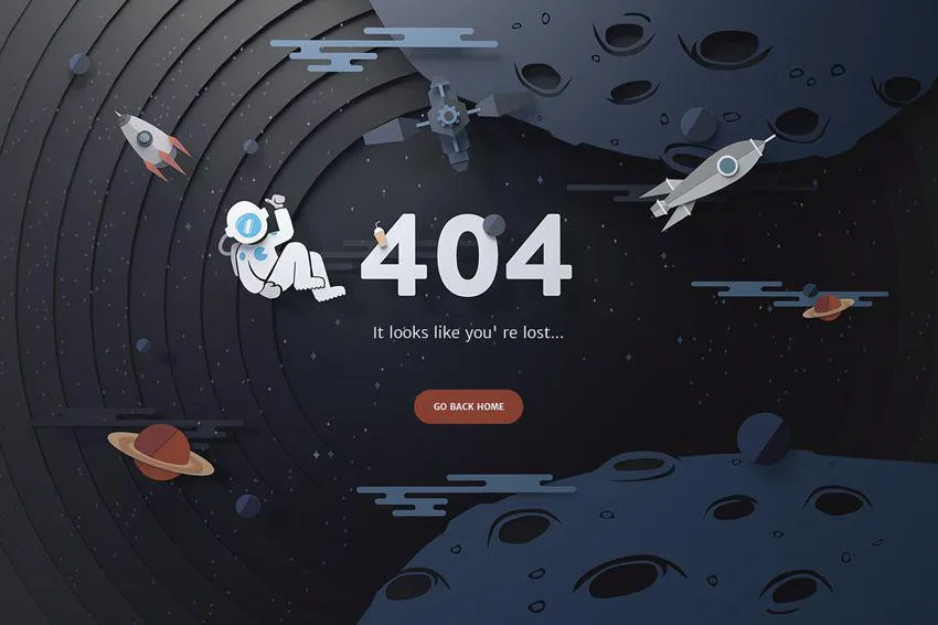
Think about what a visitor is doing when they land on a 404. They clicked something with intent: a product page, a blog post, a pricing link from a partner site. Their goal didn’t disappear because the URL did. The right 404 page design recaptures that intent. The wrong one confirms the suspicion that your site is neglected.
Search engines also read these pages. A soft 404, where a missing page returns a 200 status with “page not found” content, wastes crawl budget and muddies index quality. Real 404 page design best practices start at the HTTP layer, not the pixel layer.
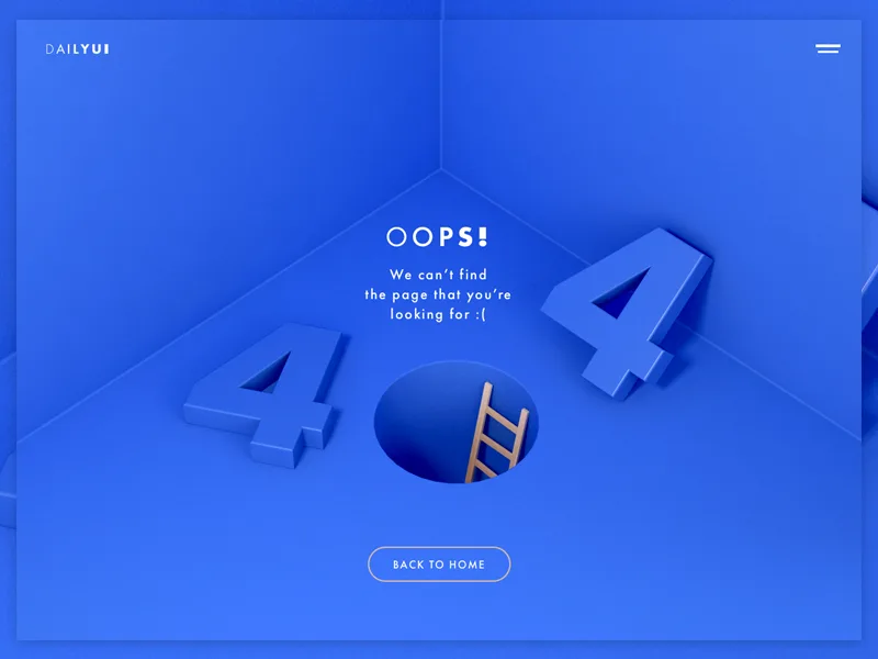
The 404 page design is where most teams get the order wrong. They commission an illustration of a sad robot, ship it, and never touch the status code. The result looks charming and functions badly. Fix the plumbing first, then the personality.
11 Powerful 404 Page Design Tips for Better Results
Below are the eleven tips this article promises, organized into three practical clusters: the foundation layer, the recovery layer, and the iteration layer. Work through them in sequence the first time. After that, pull individual tips as the need arises.
Foundation: Getting the Basics Right
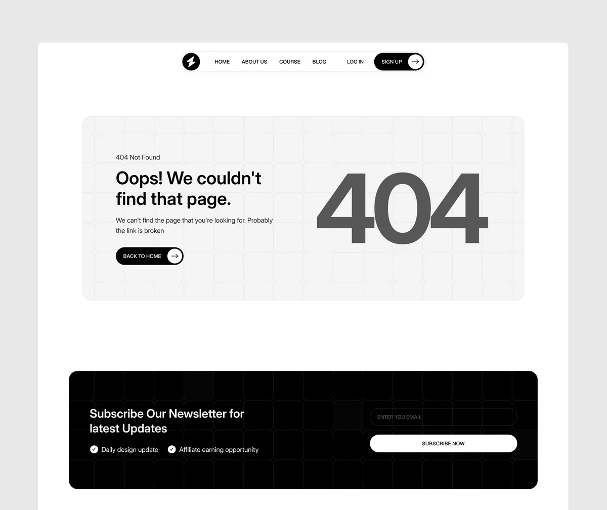
None of the creative stuff matters if the technical layer is broken. These first three tips establish the ground truth of your 404 page design. Skip them and every later improvement is cosmetic.
- Return the Correct 404 Status Code — The single most important 404 page design decision is invisible to visitors. A missing URL must respond with an HTTP 404 (or 410 for permanently removed content), never a redirect to the homepage and never a 200. Google’s own documentation on HTTP status codes is blunt about this: soft 404s confuse crawlers and get content treated as errors anyway, just slower. Check yours with a quick command-line request or the URL Inspection tool in Search Console. In one audit of a mid-size e-commerce site, more than 1,400 dead links were silently redirecting to the homepage with a 302. Fixing the status code cut crawl errors by 70% in six weeks and freed a surprising amount of crawl budget for their actual product pages.
- Confirm Search Rankings Before Calling a 404 “Missing” — Before you write off a broken URL, check whether it holds backlinks or organic traffic. Some of the most valuable 404 page design work happens when you find a dead URL that ranks for a long-tail query but returns nothing. Tools like Ahrefs and Semrush make this a five-minute check. If a dead page has authority, either restore it or redirect it to the closest living equivalent. Never redirect to the homepage by default. That’s the number one 404 page design best practices violation I see in client audits, and it’s a fast way to confuse both users and crawlers about what content you actually offer.
- Match the Error Page to Your Brand Language — An error page is still a brand touchpoint. If your marketing voice is dry and buttoned-up, your 404 page design shouldn’t suddenly read like a stand-up routine. Match the register. A fintech brand that teaches “This page went missing” in the same tone as their account alerts feels consistent. One that suddenly spits out “Whoops! Looks like you took a wrong turn!” feels like a different company. Pick two or three brand words and write the 404 against them. Consistency here signals stability, which is the exact feeling a broken link undermines.
Notice what the 404 page design three have in common: they’re all about honesty. The status code tells the truth to search engines, the ranking check tells the truth to you, and the brand tone tells the truth to visitors. Everything else builds on that.
Recovery: Helping Visitors Find What They Wanted
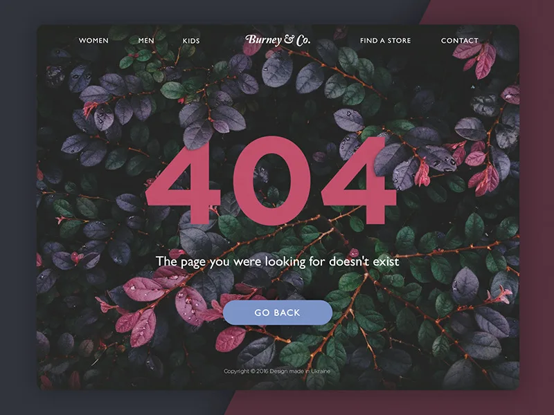
Once the technical foundation is solid, the creative work begins. These next four tips turn the error page from a dead end into a redirect of the human kind. This is where 404 page design guide territory gets genuinely interesting.
The core question to ask every visitor landing here is simple: what did they intend to do? Your job is to guess that intent and offer the fastest path back to it. The next four tips are all variations on that question.
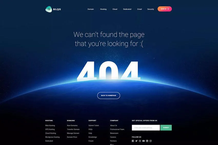
- Offer Search and Navigation, Not Just a Home Button — “Go back to homepage” is the laziest possible recovery. Most visitors didn’t want the homepage; they wanted a specific page. Give them a search bar directly on the 404, pre-focused if possible, so a single keystroke starts the retry. Add a short list of your top five navigation destinations underneath: popular categories, best-selling products, latest posts. One B2B SaaS client rebuilt their 404 with just a search field and three category links. The bounce rate on error pages dropped from 89% to 51% in a month. That’s a lot of recovered sessions for maybe two hours of developer time. This is the single highest-leverage 404 page design tip in the entire list.
- Show Helpful Context Rather Than an Apology — “We’re sorry, the page you’re looking for doesn’t exist” is technically accurate and practically useless. Instead, show your visitor what likely went wrong. Did the URL pattern suggest a product? Show similar products. Was it a /blog/ URL? Show recent posts. Was it a job posting? Show current openings. This kind of contextual recovery requires just a bit of URL parsing on the server side and lifts conversion on the error page meaningfully. When a major retailer implemented product-pattern detection on their 404, error-page sessions began converting at 3.2%, roughly a third of their sitewide average. Small number, big payoff at scale.
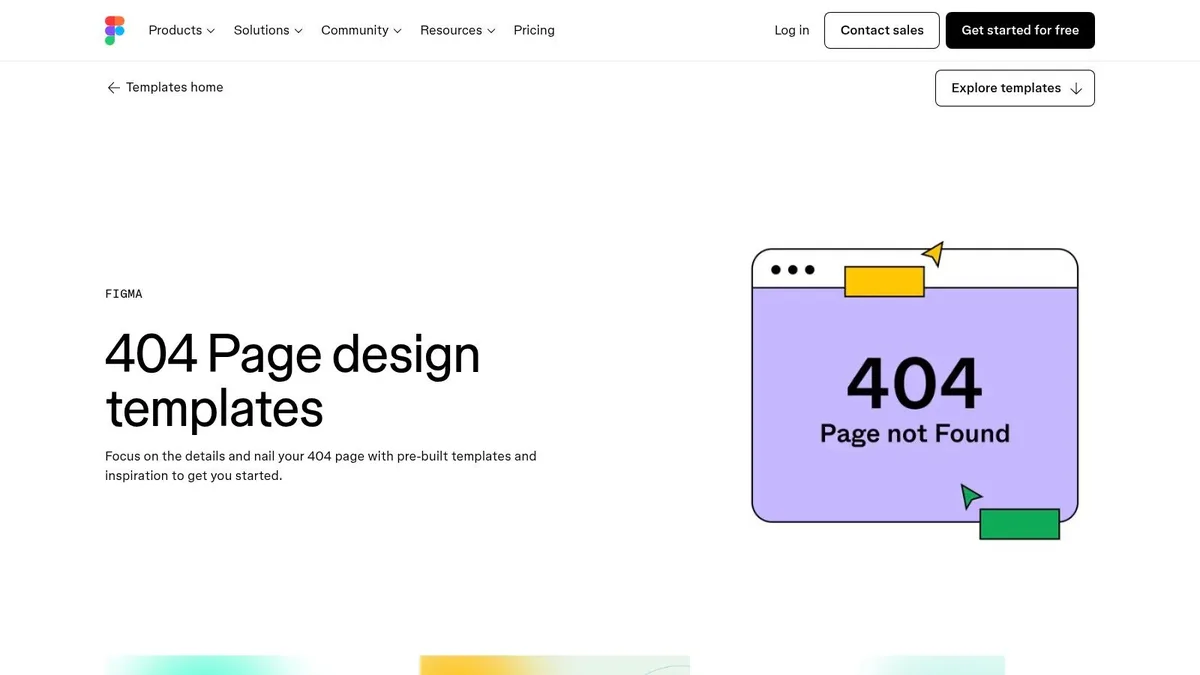
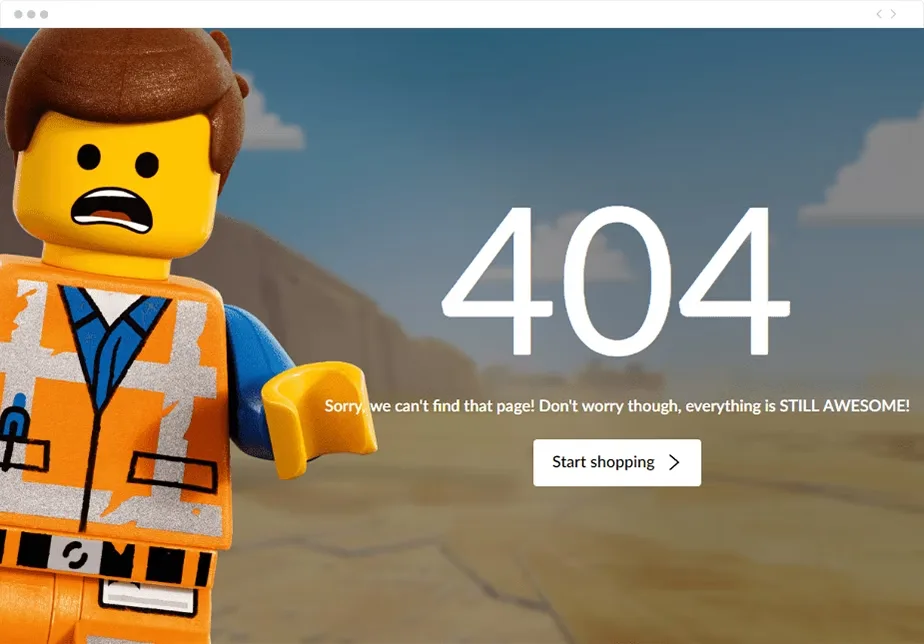
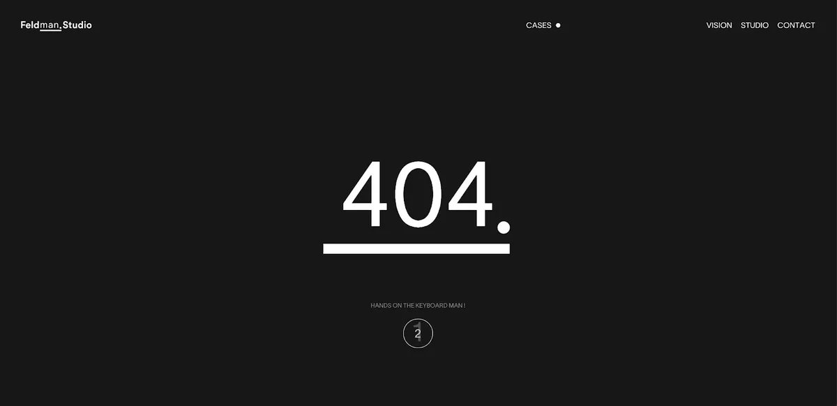
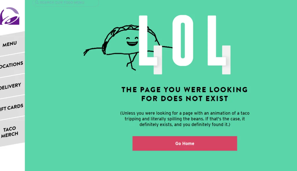
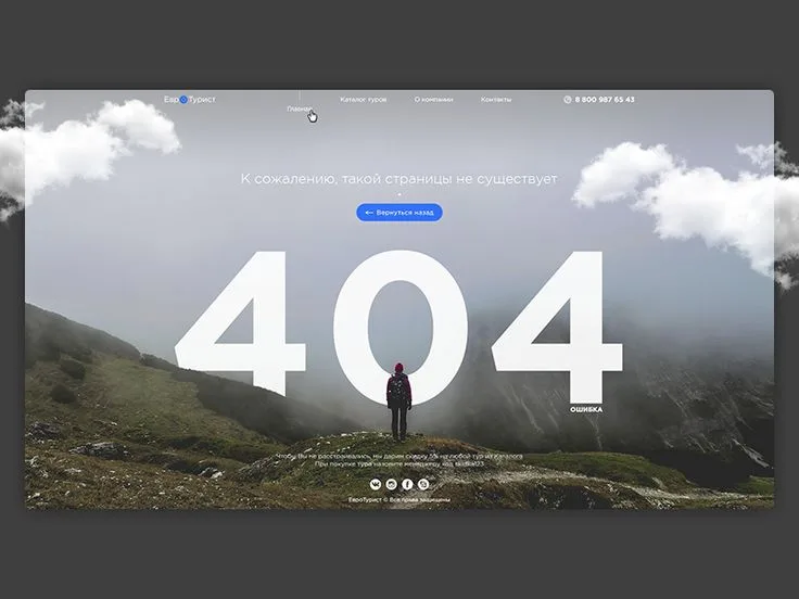
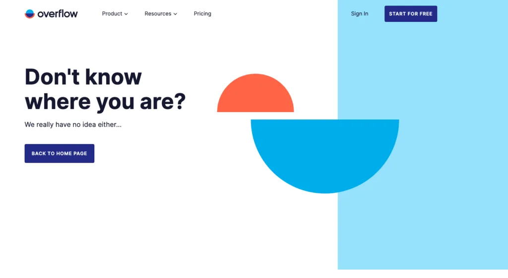
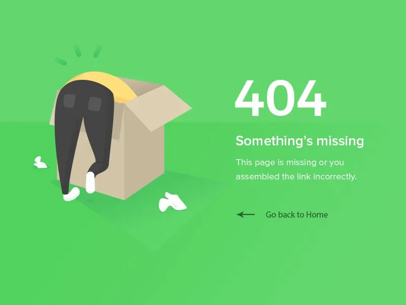
- Use Humor Sparingly and Purposefully — Funny 404 pages earn Twitter shares. They also generate a lot of eye-rolls when done badly. The rule I follow: humor works when it acknowledges the visitor’s frustration rather than pretending it doesn’t exist. A dry “That page has moved on to other opportunities” reads better than a bouncing cartoon. An illustrated dog ripping up a URL works for a playful pet brand and fails for a healthcare provider. Study how GitHub, Slack, and Mailchimp handle their error pages — the common thread is a light touch plus an obvious next step. Humor without a recovery path is a joke at the visitor’s expense.
- Reduce Friction: Faster Load, Fewer Requests — Your error page is one of the few pages every broken link hits. It should be among the fastest pages on your site, not the heaviest. Skip the full site header bundle if you can, lazy-load imagery, and put the recovery elements above the fold without a hero video. A 404 page design checklist item most teams miss: measure the error page with Lighthouse just like any other URL. One e-commerce audit found their 404 was loading 41 requests and 2.8MB of assets, which meant visitors on slow connections waited 4.5 seconds just to be told the page didn’t exist. That’s insulting.
The 404 page design four tips form a natural sequence. Start with the recovery mechanics (search and navigation), then layer on contextual suggestions, then add personality, then trim the performance fat. Do them in a different order and you’ll end up shipping a charming but slow error page that doesn’t help anyone.
Iteration: Making the 404 Page Better Over Time
The best 404 page design work isn’t a one-time launch. It’s a practice. These final four tips are about measurement, feedback, and the occasional uncomfortable discovery that your error page is telling you something about your site you didn’t want to hear.
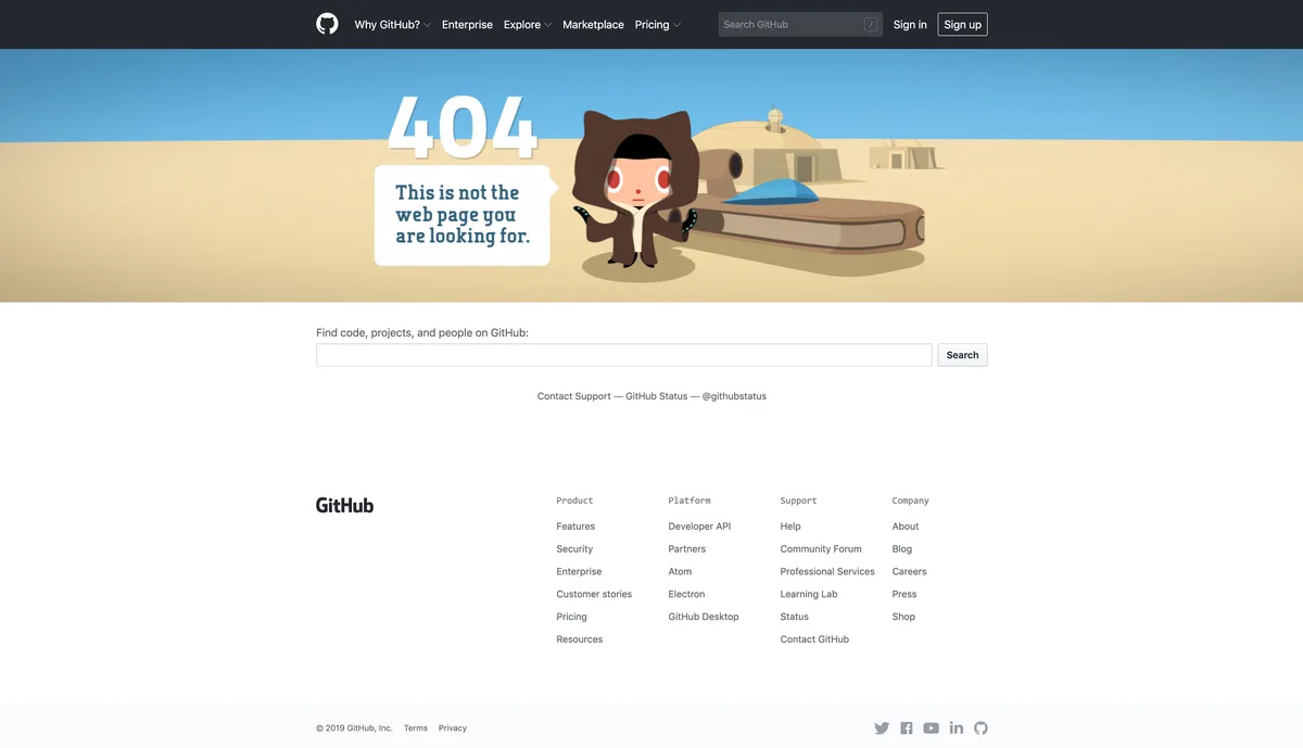
Here’s the thing about error pages: the 404 page design’re one of the few places on your site where every visitor is, by definition, frustrated. That makes them an unusually honest source of feedback. Use that honesty.
- Track 404 Traffic Like a Real Metric — Most teams never look at their 404 page in analytics. That’s a blind spot with real consequences. Add event tracking to the error page so you can see how many visitors hit it, where they came from, and where they go next. Break it down by referring URL: a 404 with 90% bounce and 400 monthly visits might be fine, but a 404 with 60% bounce and 8,000 visits is a hidden conversion leak worth a quarter’s worth of attention. Tag error-page views as a custom event in GA4 or your analytics tool of choice, and review the number alongside your other weekly site health metrics. What gets measured gets designed better.
- Feed the 404 Page With Real Broken-Link Data — You don’t have to guess what should appear on your error page. Let your actual broken links inform it. Pull the list of most-hit 404 URLs from your server logs every quarter, and look for patterns. If 30% of hits come from /products/descriptions/old-slug, you know a product catalog migration went wrong and you should build a redirect pattern, not just improve the error page. If 15% come from a discontinued blog series, show readers the current version on the 404 itself. Server logs are free, unglamorous, and worth their weight in gold for 404 page design work.
- Run a 404 Page Design Checklist Audit Every Quarter — The page you built eighteen months ago doesn’t fit your brand or your site structure anymore. Run this 404 page design checklist quarterly: status code still correct, brand tone still on-message, search field still functional, top navigation destinations still relevant, performance budget still met (under 500KB total, under 1.5s LCP on mobile), mobile layout still clean, analytics still tracking, and accessibility (contrast, keyboard focus, screen-reader labels) still passing. It’s a twenty-minute check that prevents months of silent degradation. The teams that do this routinely have error pages that outperform their homepage on Lighthouse scores. The teams that don’t have 404 pages that haven’t been updated since launch.
- A/B Test One Change at a Time — Treat 404 page design like any other conversion surface: hypothesis, test, measure, learn. The variables worth testing are narrow: does a search field beat a homepage button, does showing related posts beat a category list, does a serious tone beat a playful one, does an illustration help or distract. Test one variable per experiment, run each test to at least 400 sessions per variant, and give each experiment two full weeks. Smaller tests run faster and are less likely to be corrupted by seasonal traffic swings. Don’t try to optimize the entire page at once; you’ll never know which change moved the number.
Rule number eleven deserves its own emphasis because it’s the one most teams skip. A/B testing an error page feels like overkill until you realize the page is receiving thousands of visits per month. At that volume, a 5% improvement in recovery rate is hundreds of recovered sessions. That’s ordinary conversion optimization logic applied to a surface everyone forgot existed.
Common Mistakes That Undo Good 404 Page Design
Even with eleven solid tips in hand, teams routinely torpedo their own work with the same handful of mistakes. Worth naming them explicitly so you can spot them in your own build.
Auto-redirecting every missing page to the homepage tops the list. Maintaining clarity across your 404 page design remains essential. It confuses crawlers (they see a homepage where they expected a 404), frustrates visitors (they wanted a product, not a homepage), and quietly degrades SEO signal. Google’s John Mueller has repeatedly noted that this pattern is a soft 404 at scale.
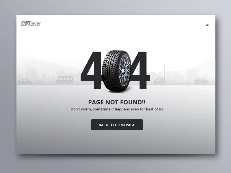
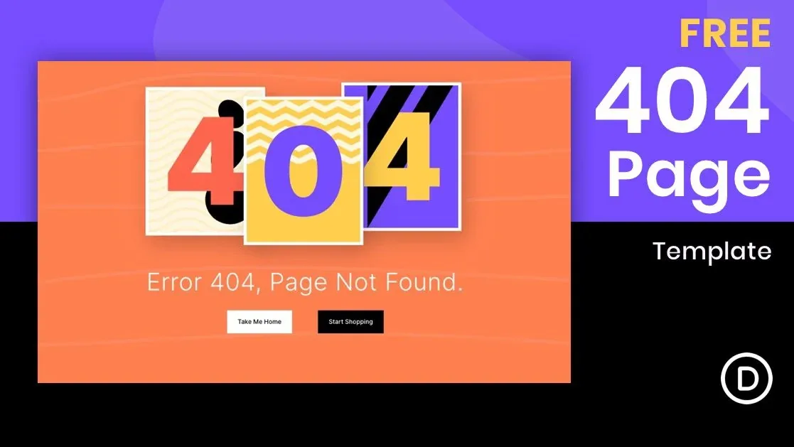
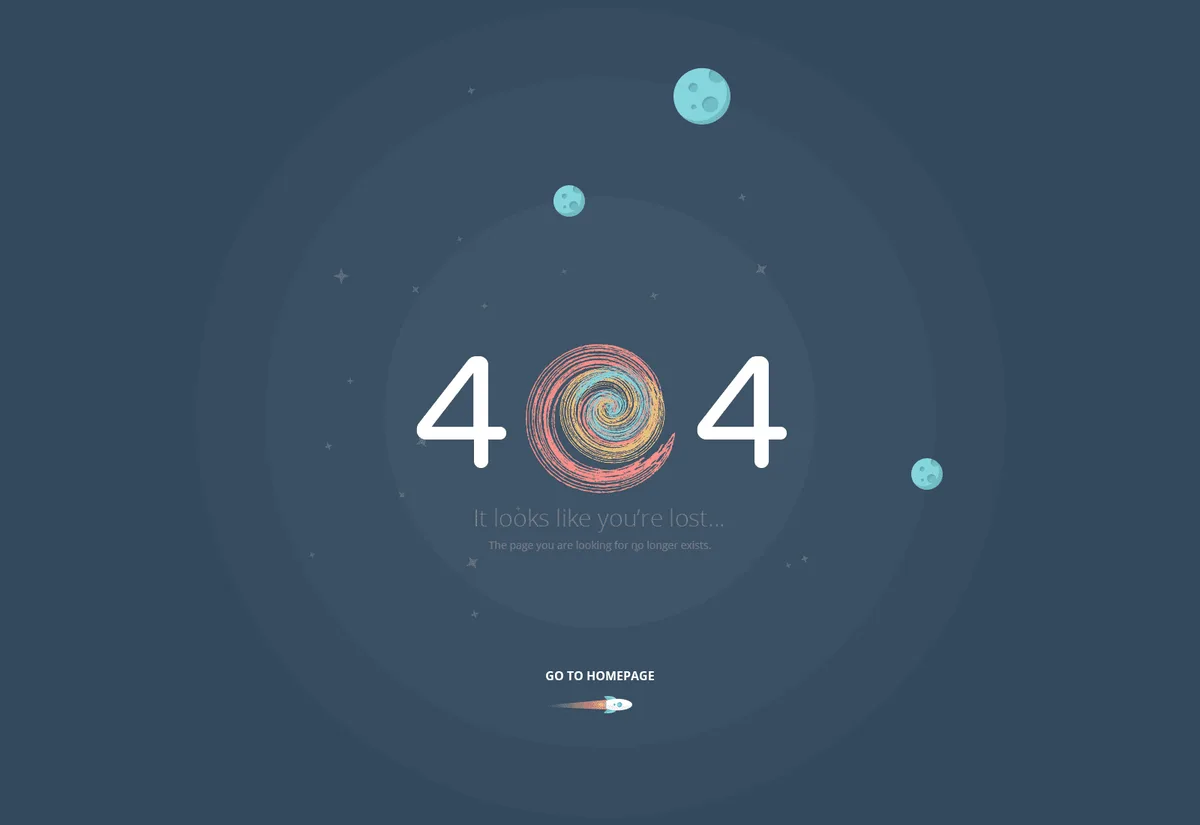
Hiding the error behind the brand is a close second. Effective execution in your 404 page design makes a tangible difference. Some 404 pages are so aesthetically precious that first-time visitors can’t even tell the page is broken. “This page doesn’t exist” must be present in the first two lines of text, in plain language.
Skipping mobile optimization is a third trap. Roughly 60% of web traffic now comes from mobile, and error pages are often ignored during responsive QA. Test the 404 at 375px width. Test with one thumb. Test with a screen reader announcing the content.
Finally, no analytics tracking closes the loop of blindness. A thoughtful approach to 404 page design reinforces your qualifications. You can’t improve a page you never look at. Wire the tracking before the launch, not after.
What Good 404 Page Design Actually Measures
Vanity metrics abound here. Page shares, “your 404 is funny” tweets, Design Twitter applause — none of it tells you whether the page works. Here’s a compact table of what to measure instead.
| Metric | What It Tells You | Healthy Benchmark |
|---|---|---|
| Error-page bounce rate | Percentage of visitors who leave immediately | Under 60% |
| Recovery rate | Percentage who click through to another page | 30% or higher |
| Avg. Time on page | Whether visitors are engaging with recovery options | 8–15 seconds |
| Mobile LCP | Perceived speed on phones | Under 1.5 seconds |
| Total page weight | Payload cost for every broken link | Under 500KB |
| Status code accuracy | Whether the technical foundation is sound | 100% true 404/410 |
Notice the 404 page design recovery rate sits at the center of everything. That single number tells you whether the page is doing its job. Bounce rate and time on page are diagnostic, not targets. Mobile LCP and page weight are hygiene factors. Status code accuracy is non-negotiable.
When you pull these numbers for the first time, expect a slightly ugly picture. Most healthy sites see 50-70% bounce on their error pages. That’s fine. What matters is the trend after you ship improvements. If recovery rate rises 5-10 points per quarter, the 404 page design work is paying for itself.
Frequently Asked Questions About 404 Page Design
The 404 page design are the questions that come up most often in audits, workshops, and stakeholder reviews. Straight answers below.
Should a 404 Page Redirect to the Homepage?
No, and it’s worth being firm on this. A 404 page should return a 404 status code and stand on its own. Redirecting every missing URL to the homepage creates soft 404s that confuse search engines and offer poor user experience.

Redirect only when you have a specific, closely related replacement URL — for example, an old product redirecting to its successor model.
Does 404 Page Design Affect SEO Rankings?
Indirectly, yes, in two ways. First, a well-handled 404 (correct status code, clear recovery paths) preserves the value of any backlinks that land on it or can be redirected elsewhere. Second, a poorly-handled 404 (soft 404s, homepage redirects) wastes crawl budget and muddies your index quality. The error page itself doesn’t rank, but it affects the health of the pages around it.
How Often Should I Update My 404 Page?
Run the checklist I outlined earlier every quarter. Larger structural updates (design refreshes, new recovery features) can happen once a year or when your brand or site architecture changes. Small tweaks — adding a new category, swapping a stale recommendation — should happen whenever you notice a broken link pattern in the data.
What Status Code Should a Removed Page Use: 404 or 410?
Use 410 Gone if you’re certain the content is removed permanently and won’t return. Use 404 if the content might reappear later or if the removal is temporary. In practice, both work for SEO purposes, but 410 signals intent more clearly and can be crawled and dropped slightly faster. When in doubt, 404 is the safer choice.
Do Funny 404 Pages Actually Help?
The 404 page design help when humor is paired with fast, obvious recovery options. They hurt when the joke replaces the fix. A visitor who laughs at your page but can’t find what they wanted still leaves. Think of humor as an engagement layer on top of working recovery mechanics, not as a replacement for them.
What Should a 404 Page Design Checklist Contain?
At minimum: correct status code verified, brand tone reviewed, search field functional, top navigation links present, contextual recovery logic working, mobile layout clean, page weight under budget, analytics tracking active, accessibility checks passed, and broken-link data reviewed in the last quarter. Ten items, twenty minutes, run quarterly.
Where 404 Page Design Fits in Your Broader Site Strategy
Zoom out for a second. This article sits inside a larger discipline: technical site hygiene. If you care about 404 page design, you probably also care about redirect management, sitemap accuracy, internal link audits, and crawl budget. Those are the natural next topics to study.
Treat the error page as one node in a network of site reliability surfaces. A well-maintained 404 is a strong signal, but it can’t compensate for a broken redirect map, a stale sitemap, or a crawl budget spent on parameter-riddled URLs. Address those alongside the error page and the whole system gets healthier.
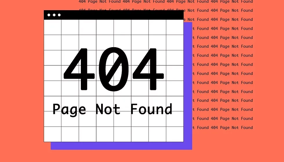
One more framing: 404 page design is the rare front-end surface where you can measure business impact directly. Recovered sessions go straight to your conversion funnel. Retention happens at the error page. Revenue leaks out quietly through the error page.
Every other thing the 404 page design’re optimizing is competing for the same attention, and most of it is already well-tuned. The 404 page is often the last untouched conversion surface on a mature site.
Frequently Asked Questions About 404 Page Design Best Practices
A few more questions that surface after the first round.
How Do I Find Which URLs are 404ing Most Often?
Start with Google Search Console’s “Pages” report under Indexing. It shows soft 404s and not-found errors with sample URLs. Then pull the raw server logs for a full picture that includes non-Google traffic, which Search Console misses. Cross-reference with your analytics to see where visitors were headed next.

Should the 404 Page be Indexed?
No. A true 404 returns a 404 status and won’t be indexed. That’s correct behavior. A soft 404 (returns 200 with “not found” content) may get indexed and then dropped, which is worse than being cleanly excluded. The right 404 page design best practices outcome is that the page never appears in search results at all.
What if My Site Has Thousands of 404s?
Prioritize by traffic. Identify the 100 highest-traffic 404 URLs, resolve each one (redirect, restore, or replace), and repeat. Most sites find that the top 100 dead URLs account for 80% of error-page traffic. Knock them out in a single sprint, then move to bulk cleanup for the long tail.
The eleven tips in this 404 page design guide aren’t a one-shot campaign. They’re a habit. Ship the foundation layer this quarter, the recovery layer next, and put the iteration layer into your recurring calendar. In twelve months, your error page will be doing work that most competitors’ homepages aren’t.
For verified reference and background research, consult the authoritative informational resource on this topic.